Exit-intent Popup React component
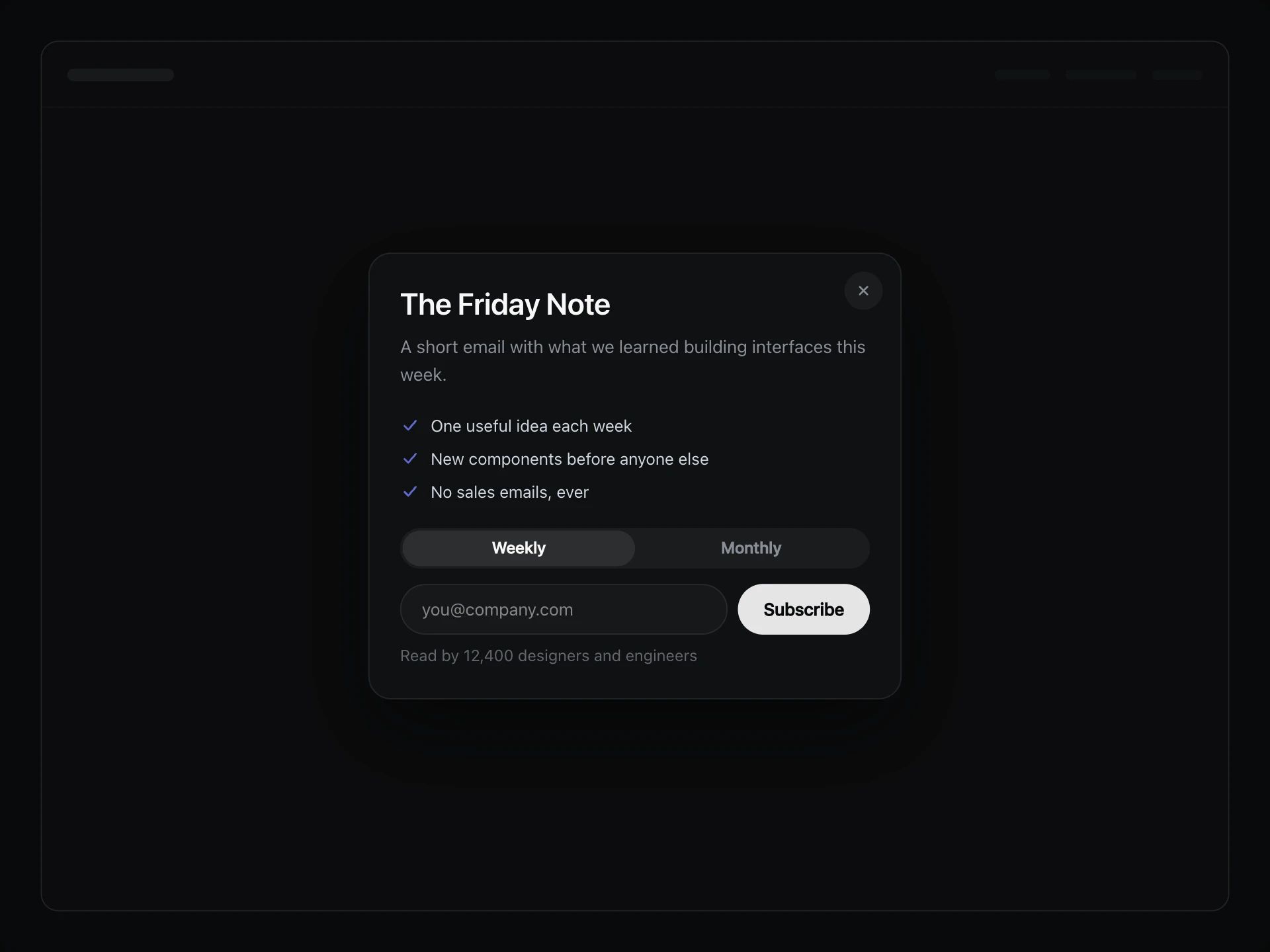
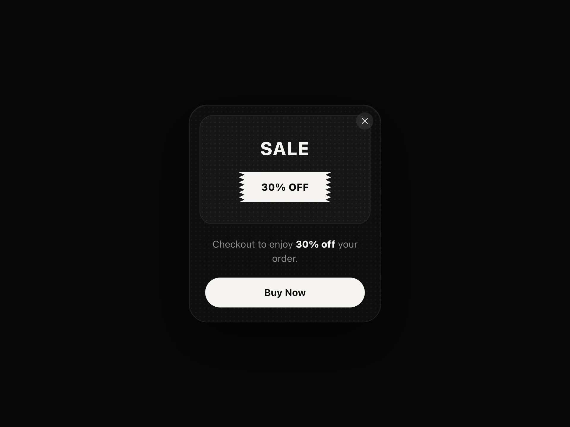
A last offer shown as someone is about to leave: it opens when the pointer heads for the top of the window, or on a fast scroll up on phones, and stays away once closed.
About the Exit-intent Popup component
Exit-intent Popup makes one last offer at the moment someone is leaving, so it never interrupts anyone who's still reading. It waits for the pointer to head for the tabs or the address bar.
Phones have no pointer, so a fast scroll back up the page plays the same role. Once closed it stays away for as long as you choose.
When to use it
Use it on pricing and checkout pages, where one good offer can change someone's mind.
Show it once and make the offer real. Popups that keep coming back cost more trust than they win.
Installation
Add the Exit-intent Popup component to your project with the shadcn CLI. It lands in components/exit-intent-popup.tsx as plain React + Tailwind CSS source you own and can edit.
npx shadcn@latest add @reactframe/exit-intent-popupProps
<ExitIntentPopup /> accepts 14 props, all optional. It also accepts the usual <div> attributes, like className, style, id and aria-*, and passes them to its root element.
| Prop | Type | Default |
|---|---|---|
| theme | "dark" | "light" | "dark" |
| title | string | "Before you go" |
| message | string | "Take 20% off your first year. It's yours for the next 24 hours." |
| code A coupon to copy. Leave empty to hide it. | string | "STAY20" |
| fineprint The small line under the code. | string | "Works on any annual plan." |
| action | { label: string; href?: string; onClick?: () => void } | { label: "Claim my discount" } |
| dismissLabel | string | "No thanks" |
| boundary Watch this element instead of the whole page. The popup then stays inside it. | React.RefObject<HTMLElement | null> | — |
| armAfterMs Wait this long after load before watching, in milliseconds. | number | 1500 |
| rememberDays Days to stay away once closed. Use 0 to show it every time. | number | 7 |
| storageKey | string | "exit-intent-popup" |
| defaultOpen Starts open. | boolean | false |
- theme"dark" | "light"Default: "dark"
- titlestringDefault: "Before you go"
- messagestringDefault: "Take 20% off your first year. It's yours for the next 24 hours."
- code
A coupon to copy. Leave empty to hide it.
stringDefault: "STAY20" - fineprint
The small line under the code.
stringDefault: "Works on any annual plan." - action{ label: string; href?: string; onClick?: () => void }Default: { label: "Claim my discount" }
- dismissLabelstringDefault: "No thanks"
- boundary
Watch this element instead of the whole page. The popup then stays inside it.
React.RefObject<HTMLElement | null> - armAfterMs
Wait this long after load before watching, in milliseconds.
numberDefault: 1500 - rememberDays
Days to stay away once closed. Use 0 to show it every time.
numberDefault: 7 - storageKeystringDefault: "exit-intent-popup"
- defaultOpen
Starts open.
booleanDefault: false
Show all 14 propsShow fewer
| onShow | () => void | — |
| onClose | () => void | — |
- onShow() => void
- onClose() => void
Exit-intent Popup FAQ
- What triggers it?
- The pointer leaving through the top edge. On touch screens, a fast scroll up the page.
- How long does it stay away?
- rememberDays sets it. Use 0 to show it every time.
- Can it watch one part of a page?
- Yes. Pass boundary with a ref, and it opens inside that element.
- Is it accessible?
- Yes. It's a dialog that takes focus, keeps Tab inside, closes on Escape and returns focus afterwards.