Simple Hero Section React component
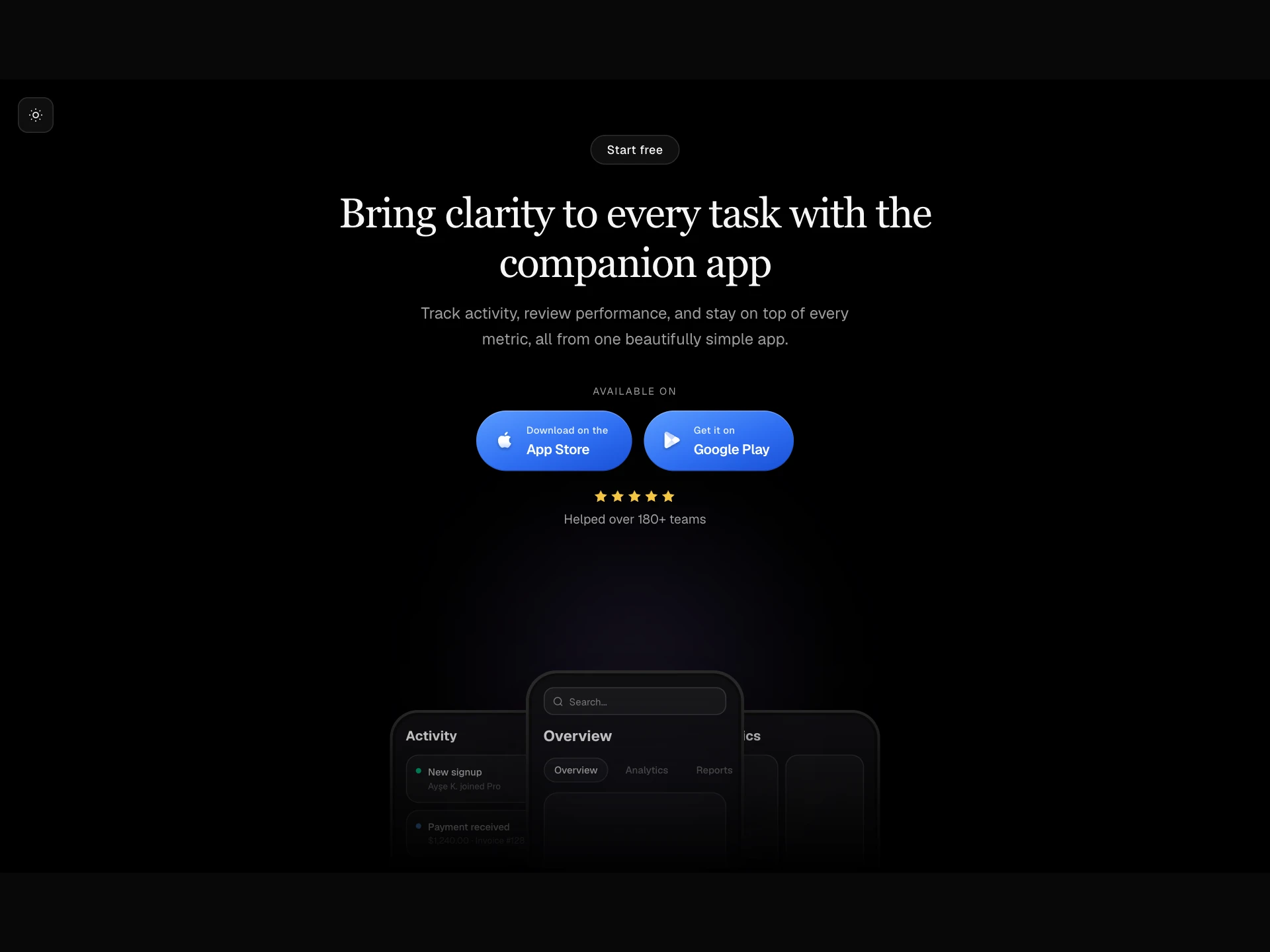
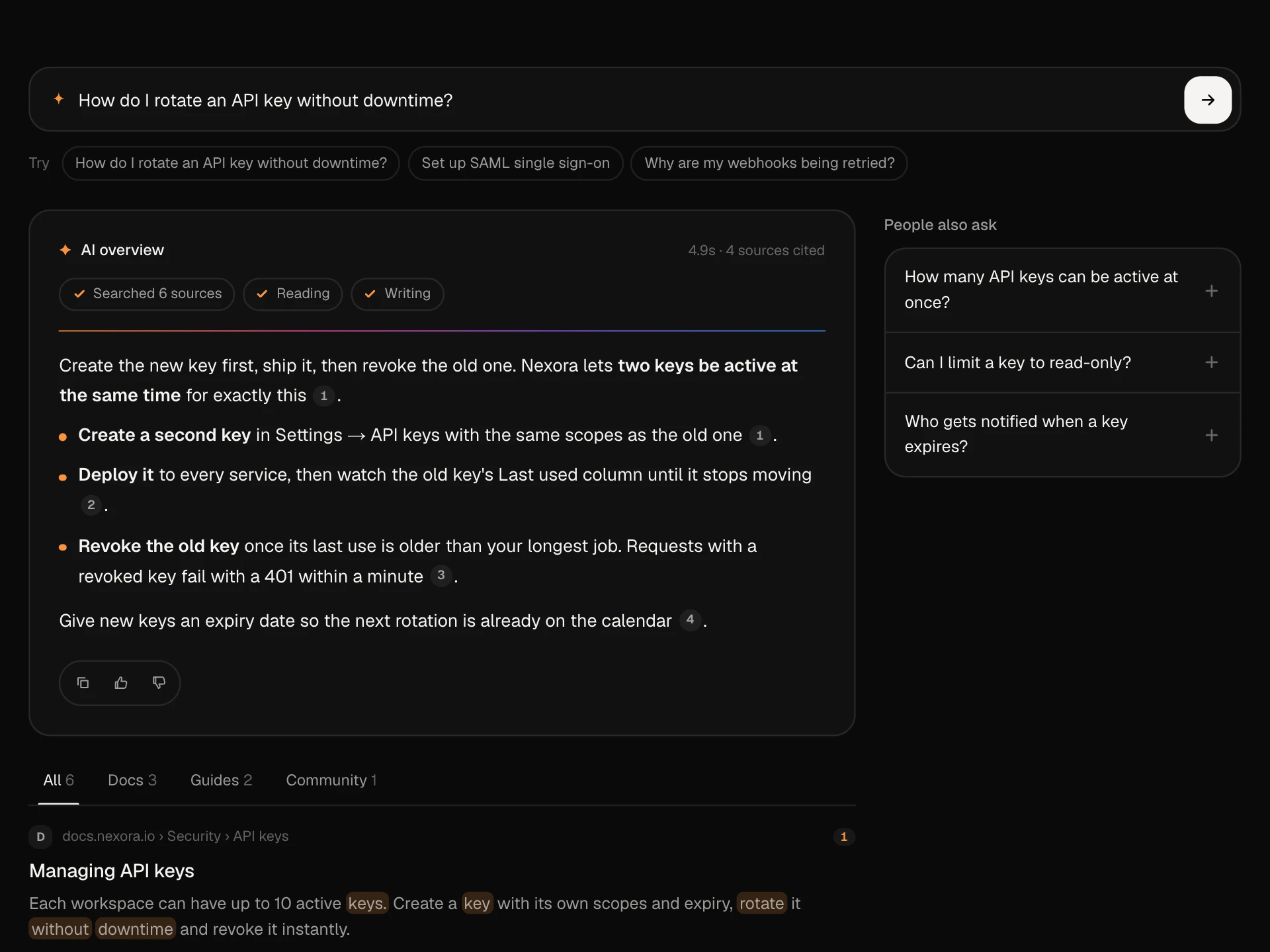
A landing page hero with an announcement pill, a headline whose words blur in one by one with an accent highlight, two buttons, avatar and rating proof, and a product window that rises in, over a grid and a glow that drifts toward the pointer.
About the Simple Hero Section component
Simple Hero Section is the top of a landing page in one block: an announcement pill, a headline, a short description, two buttons, a line of social proof and a product visual. Every part is optional, so it works as a plain headline-and-button hero too.
The headline is split into words that rise and un-blur one after another, and the words you name in highlight get an accent gradient. A soft glow follows the pointer over a faint grid. Without a media prop it shows a drawn product window, so the hero looks finished before you have a screenshot.
When to use it
Use it as the first section of a SaaS, app or product landing page.
Pass your own screenshot or video as media, or null for a text-only hero on a blog or docs home.
Installation
Add the Simple Hero Section component to your project with the shadcn CLI. It lands in components/simple-hero-section.tsx as plain React + Tailwind CSS source you own and can edit.
npx shadcn@latest add @reactframe/simple-hero-sectionOr copy the source by hand and install its dependencies:
npm install motion clsx tailwind-mergeProps
<SimpleHeroSection /> accepts 13 props, all optional.
| Prop | Type | Default |
|---|---|---|
| announcement Small pill above the title, e.g. a launch. Pass null to hide it. | { tag?: string; label: string; href?: string } | null | { tag: "New", label: "Roadmaps now sync with your code", href: "#" } |
| title | string | "Plan the whole quarter in one afternoon" |
| highlight Part of the title to set in the accent style. Must appear in the title. | string | "one afternoon" |
| description | string | "Specs, roadmaps and releases in one calm workspace. Your team always knows what ships ne… |
| primaryAction | { label: string; href?: string; onClick?: () => void } | null | { label: "Start for free", href: "#" } |
| secondaryAction | { label: string; href?: string; onClick?: () => void } | null | { label: "Book a demo", href: "#" } |
| proof Social proof under the buttons. Pass null to hide it. | { avatars?: string[]; text: string; rating?: number } | null | { avatars: DEFAULT_AVATARS, text: "Loved by 9,000+ product teams", rating: 4.9 } |
| media Shown under the text with a soft fade at its bottom edge. Defaults to a drawn product window; pass null to hide. | React.ReactNode | — |
| align | "center" | "left" | "center" |
| accent Accent used for the highlighted words and the background glow. | string | "#7C8CFF" |
| interactive Background glow drifts toward the pointer. | boolean | true |
| theme | "dark" | "light" | "dark" |
- announcement
Small pill above the title, e.g. a launch. Pass null to hide it.
{ tag?: string; label: string; href?: string } | nullDefault: { tag: "New", label: "Roadmaps now sync with your code", href: "#" } - titlestringDefault: "Plan the whole quarter in one afternoon"
- highlight
Part of the title to set in the accent style. Must appear in the title.
stringDefault: "one afternoon" - descriptionstringDefault: "Specs, roadmaps and releases in one calm workspace. Your team always knows what ships ne…
- primaryAction{ label: string; href?: string; onClick?: () => void } | nullDefault: { label: "Start for free", href: "#" }
- secondaryAction{ label: string; href?: string; onClick?: () => void } | nullDefault: { label: "Book a demo", href: "#" }
- proof
Social proof under the buttons. Pass null to hide it.
{ avatars?: string[]; text: string; rating?: number } | nullDefault: { avatars: DEFAULT_AVATARS, text: "Loved by 9,000+ product teams", rating: 4.9 } - media
Shown under the text with a soft fade at its bottom edge. Defaults to a drawn product window; pass null to hide.
React.ReactNode - align"center" | "left"Default: "center"
- accent
Accent used for the highlighted words and the background glow.
stringDefault: "#7C8CFF" - interactive
Background glow drifts toward the pointer.
booleanDefault: true - theme"dark" | "light"Default: "dark"
Show all 13 propsShow fewer
| className | string | — |
- classNamestring
Collections
Use-case pages that compare Simple Hero Section with the other components that do a similar job.
npm dependencies
Installed for you by the shadcn CLI.
Simple Hero Section FAQ
- How do I use my own screenshot?
- Pass any node as media, for example media={<img src="/app.png" alt="The app" />}. The block adds the rise-in animation and a fade into the background at the bottom. Pass media={null} to hide the visual.
- How does the highlight work?
- Set highlight to a part of the title, for example highlight="one afternoon". Those words get a gradient from your accent colour to the text colour. If the text is not found in the title, nothing is highlighted.
- Can I left-align it?
- Yes, align="left" puts the text, buttons and proof on the left. The media stays full width under the text.
- Is the animated headline readable by screen readers?
- Yes. The h1 carries the full title in aria-label and the animated word spans are hidden from assistive technology. With reduced motion turned on, the words and the pointer glow do not animate.
- How do I turn off the moving glow?
- Set interactive={false}. The grid and a centred glow stay, but nothing follows the pointer.