Blog Section React component
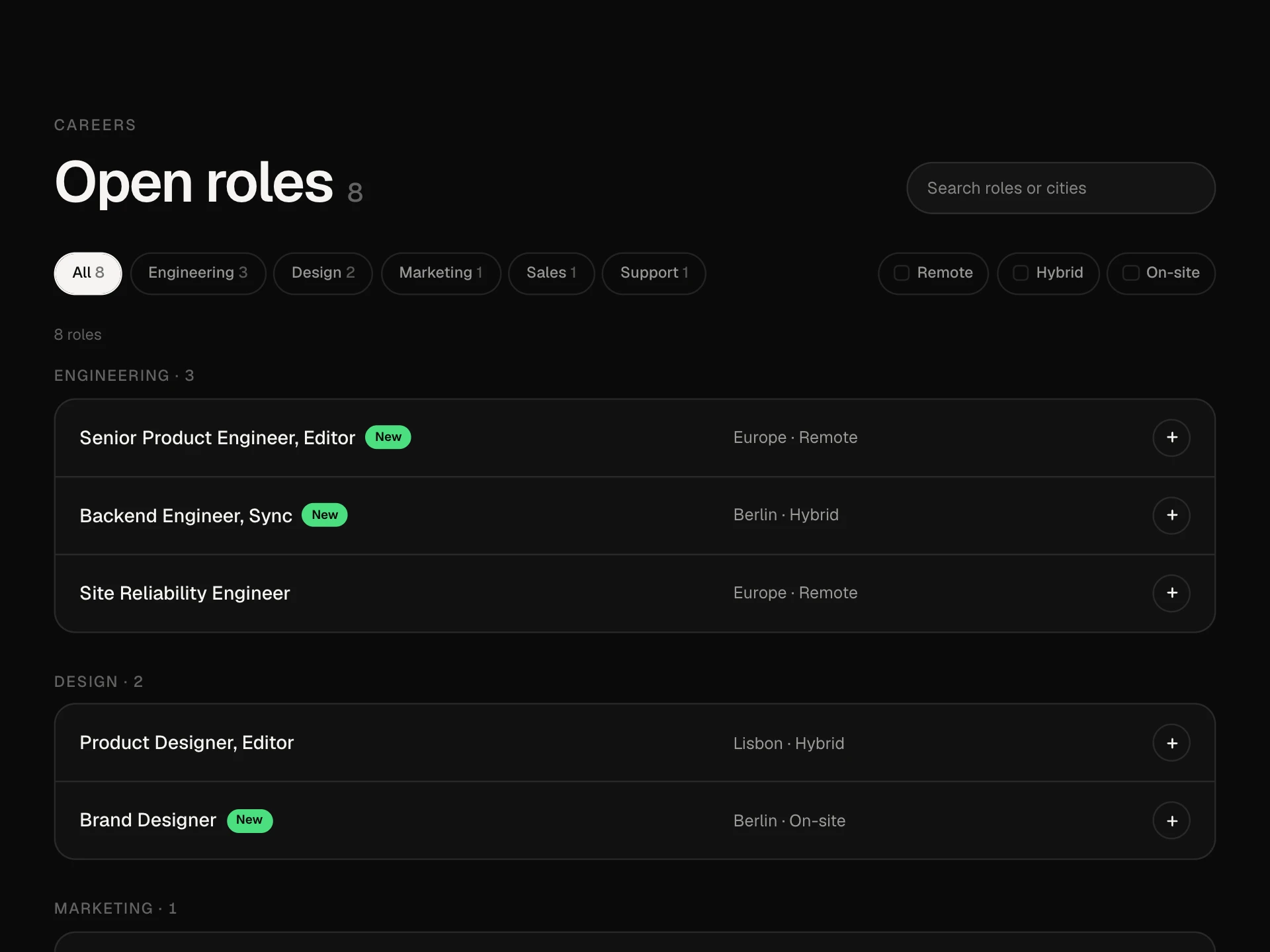
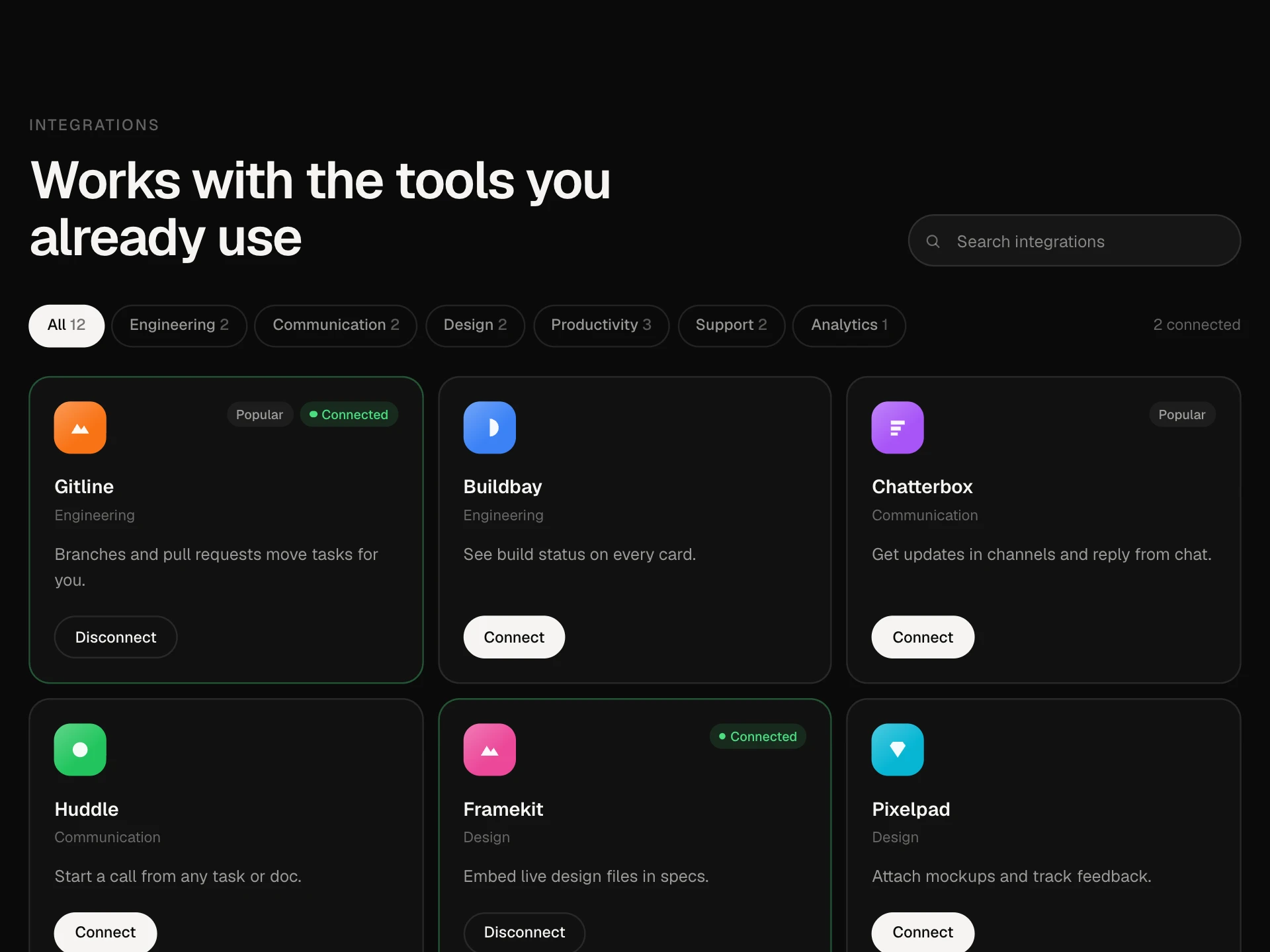
A blog section with a featured post card, category tabs with a sliding pill, an editorial list of posts where a thumbnail follows the cursor over each row, and a Show more button that reveals posts in pages.
About the Blog Section component
Blog Section brings your latest writing onto a landing page or blog home. The first post gets a large featured card with its image, excerpt, author and read time; the rest sit in a calm editorial list with the date, title, category and author on each row.
Category tabs filter the list, and Show more reveals posts a page at a time. On wide screens, hovering a row makes its cover image float next to the cursor, so the list stays clean but still visual.
When to use it
Use it on a blog index, a newsroom or as a 'Latest from the blog' section on a marketing page.
Turn off the cursor preview and categories for a short list of three or four posts in a footer area.
Installation
Add the Blog Section component to your project with the shadcn CLI. It lands in components/blog-section.tsx as plain React + Tailwind CSS source you own and can edit.
npx shadcn@latest add @reactframe/blog-sectionOr copy the source by hand and install its dependencies:
npm install motion clsx tailwind-mergeProps
<BlogSection /> accepts 10 props, all optional.
| Prop | Type | Default |
|---|---|---|
| eyebrow | string | "Blog" |
| title | string | "Notes from the team" |
| description | string | "What we learn building a planning tool: product, design, engineering and how we work." |
| posts The first post is featured; the rest go in the list. | BlogPost[] | DEFAULT_POSTS |
| pageSize Posts shown in the list before "Show more". | number | 4 |
| categories Category tabs built from the posts. | boolean | true |
| hoverPreview A thumbnail follows the cursor over list rows on wide screens. | boolean | true |
| viewAllHref | string | null | "#" |
| theme | "dark" | "light" | "dark" |
| className | string | — |
- eyebrowstringDefault: "Blog"
- titlestringDefault: "Notes from the team"
- descriptionstringDefault: "What we learn building a planning tool: product, design, engineering and how we work."
- posts
The first post is featured; the rest go in the list.
BlogPost[]Default: DEFAULT_POSTS - pageSize
Posts shown in the list before "Show more".
numberDefault: 4 - categories
Category tabs built from the posts.
booleanDefault: true - hoverPreview
A thumbnail follows the cursor over list rows on wide screens.
booleanDefault: true - viewAllHrefstring | nullDefault: "#"
- theme"dark" | "light"Default: "dark"
- classNamestring
npm dependencies
Installed for you by the shadcn CLI.
Blog Section FAQ
- Which post is featured?
- The first post in the posts array. Sort your posts before passing them, or put a pinned post first.
- How does the cursor preview work?
- When the block is at least 860px wide and the pointer is over a row with an image, that image follows the cursor in a small tilted card. It is hidden on phones, with reduced motion, or when hoverPreview is false.
- Where do the categories come from?
- From the category of the posts after the featured one, in the order they first appear. The tabs only show with two or more categories; set categories={false} to hide them.
- Is the date formatted for me?
- No, date is shown as you pass it, so you control the format and language. The list drops a trailing year to keep rows short.
- Is it accessible?
- Every post is a real link, the tabs use aria-pressed, the preview image is decorative, the count is announced, and Show more moves focus to the first newly shown post.