Portfolio Grid Block React component
A portfolio grid with wide and tall tiles packed densely, a sliding category filter that reflows the grid, hover reveals with client and year, and a lightbox with details, next and previous, keyboard arrows and Escape.
About the Portfolio Grid Block component
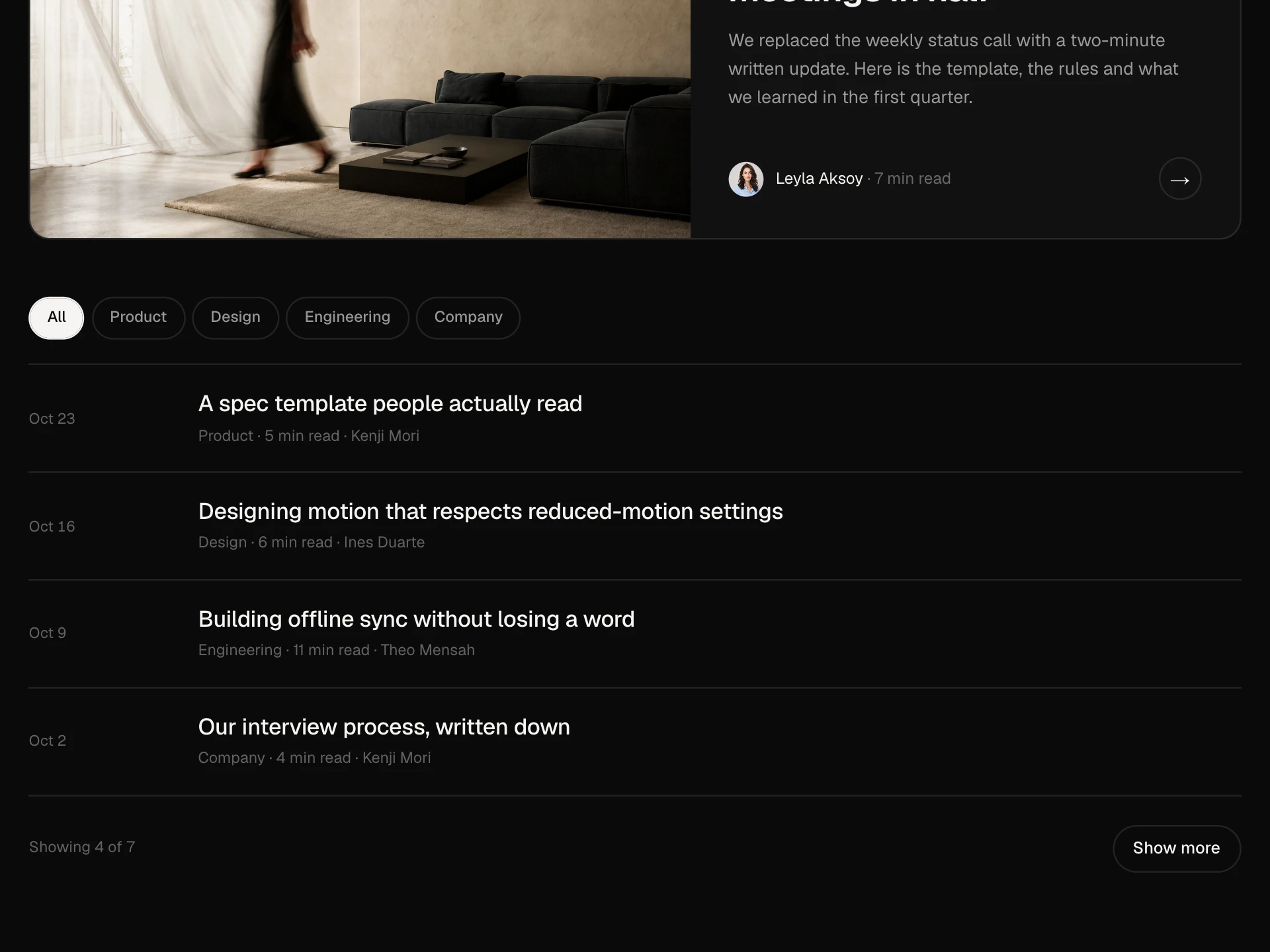
Portfolio Grid Block shows projects as a packed grid of image tiles. Tiles can be normal, wide (two columns) or tall (two rows), and the grid fills gaps automatically, so a mix of landscape and portrait work looks deliberate. A sliding filter at the top shows one category at a time and the tiles glide into their new places.
Hovering or focusing a tile zooms the image a little and reveals the client and year. Clicking opens a lightbox with a large image, the description and details, and next and previous buttons; arrow keys step through the projects, Escape closes and focus goes back to the tile you opened.
When to use it
Use it on a studio, agency, photographer or freelancer site to show selected work.
Turn off the lightbox and give items an href if every project has its own case study page.
Installation
Add the Portfolio Grid Block component to your project with the shadcn CLI. It lands in components/portfolio-grid-block.tsx as plain React + Tailwind CSS source you own and can edit.
npx shadcn@latest add @reactframe/portfolio-grid-blockOr copy the source by hand and install its dependencies:
npm install motion clsx tailwind-mergeProps
<PortfolioGridBlock /> accepts 8 props, all optional.
| Prop | Type | Default |
|---|---|---|
| eyebrow | string | "Selected work" |
| title | string | "Interiors, campaigns and portraits" |
| description | string | "A small studio for brands that care how things feel. Pick a category, or open any projec… |
| items | PortfolioItem[] | DEFAULT_ITEMS |
| filters Show the category filter chips. | boolean | true |
| lightbox Open a lightbox with details and next/previous when an item is clicked. | boolean | true |
| theme | "dark" | "light" | "dark" |
| className | string | — |
- eyebrowstringDefault: "Selected work"
- titlestringDefault: "Interiors, campaigns and portraits"
- descriptionstringDefault: "A small studio for brands that care how things feel. Pick a category, or open any projec…
- itemsPortfolioItem[]Default: DEFAULT_ITEMS
- filters
Show the category filter chips.
booleanDefault: true - lightbox
Open a lightbox with details and next/previous when an item is clicked.
booleanDefault: true - theme"dark" | "light"Default: "dark"
- classNamestring
npm dependencies
Installed for you by the shadcn CLI.
Portfolio Grid Block FAQ
- How do I choose the tile sizes?
- Set size on each item to "wide" (two columns), "tall" (two rows) or leave it as normal. The grid uses dense auto flow, so it back-fills gaps. On phones every tile is one column.
- Where do the filter categories come from?
- From the category of each item, in the order they first appear, after All. The filter only shows when there are at least two categories; set filters={false} to hide it.
- Can a tile link to a case study instead of opening the lightbox?
- Set lightbox={false} and the tiles stay as plain buttons, or keep the lightbox and give items an href to show a View project link inside it.
- Is the lightbox accessible?
- It is a modal dialog labelled by the project title. Focus moves into it, Tab stays inside, Escape and the close button return focus to the tile, arrow keys move between projects and the page behind does not scroll.
- Which image sizes work best?
- Use images at least 1200px wide; they are cropped with object-cover to fill each tile, so keep the subject near the centre. Wide tiles suit landscape photos and tall tiles portraits.