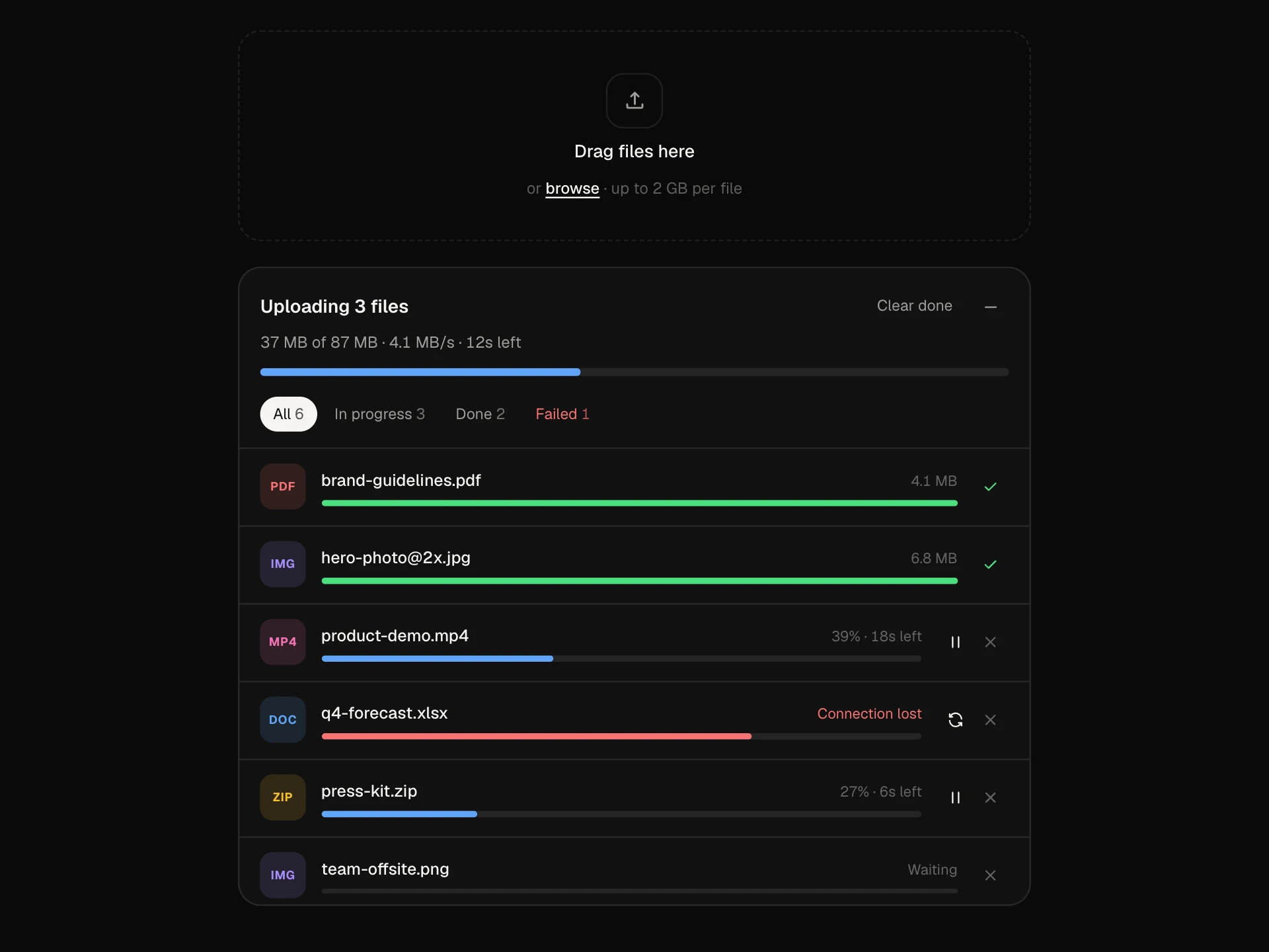
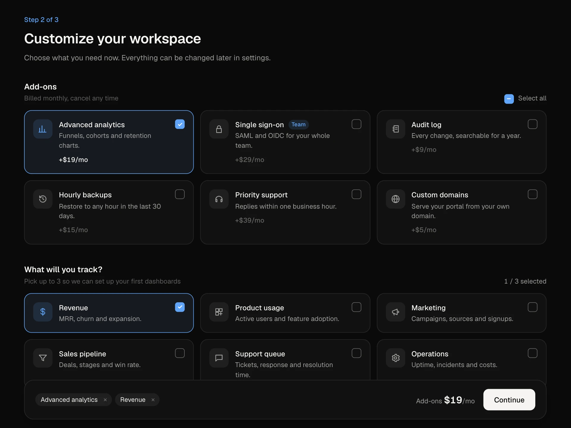
Date Range Picker with Presets React component
A dashboard date range control: a trigger that shows the range and its comparison, a popover with presets, typed start and end dates, a two-month calendar where the range previews as you hover, future days disabled, a compare-to period drawn under the calendar, and Apply updating the numbers and chart behind it.
About the Date Range Picker with Presets component
Date Range Picker with Presets is the date control dashboards need: common ranges in one click, a two-month calendar for anything else, and a comparison period so every number has context.
Picking feels direct. Click a start day and the range follows your pointer until you click the end, future days can't be chosen, and the comparison period is drawn right under the calendar. Typed dates work too, and Apply updates everything behind the picker.
When to use it
Use it at the top of analytics dashboards, reports, billing history and anywhere data is filtered by date.
To pick a single date in a form, a simple date picker is enough.
Installation
Add the Date Range Picker with Presets component to your project with the shadcn CLI. It lands in components/date-range-picker-presets.tsx as plain React + Tailwind CSS source you own and can edit.
npx shadcn@latest add @reactframe/date-range-picker-presetsOr copy the source by hand and install its dependencies:
npm install motion clsx tailwind-mergeProps
<DateRangePickerPresets /> accepts 6 props (required ones are marked *).
| Prop | Type | Default |
|---|---|---|
| today | string | "2026-11-12" |
| defaultValue | object | — |
| defaultValue.compare* | "none" | "previous" | "year" | — |
| defaultOpen | boolean | true |
| onApply | (value: DateRangeValue & { compareRange: Range | null }) => void | — |
| theme | "dark" | "light" | "dark" |
| className | string | — |
- todaystringDefault: "2026-11-12"
- defaultValueobject
- defaultValue.compare*"none" | "previous" | "year"
- defaultOpenbooleanDefault: true
- onApply(value: DateRangeValue & { compareRange: Range | null }) => void
- theme"dark" | "light"Default: "dark"
- classNamestring
npm dependencies
Installed for you by the shadcn CLI.
Date Range Picker with Presets FAQ
- Which presets are included?
- Today, last 7, 30 and 90 days, this month, last month and year to date, all counted from the today prop. Edit the presets list to add your own, such as last quarter.
- How does the comparison work?
- Previous period uses the same number of days just before the range. Previous year uses the same dates one year earlier. The comparison is shown under the calendar and passed to onApply as compareRange.
- What can I type in the date fields?
- Dates like 'Nov 12, 2026' or '2026-11-12'. Invalid or future dates turn the field red, and the range only changes when the date is valid, on blur or Enter.
- Why pass today?
- Presets and the future-day limit depend on today. Passing it from the server keeps the server and browser renders identical, even around midnight or across time zones.
- Is it accessible?
- The trigger opens a labelled dialog, presets are options, each day is a button that announces its date and whether it starts, ends or sits inside the range, arrow keys move between days, and the day count updates politely.