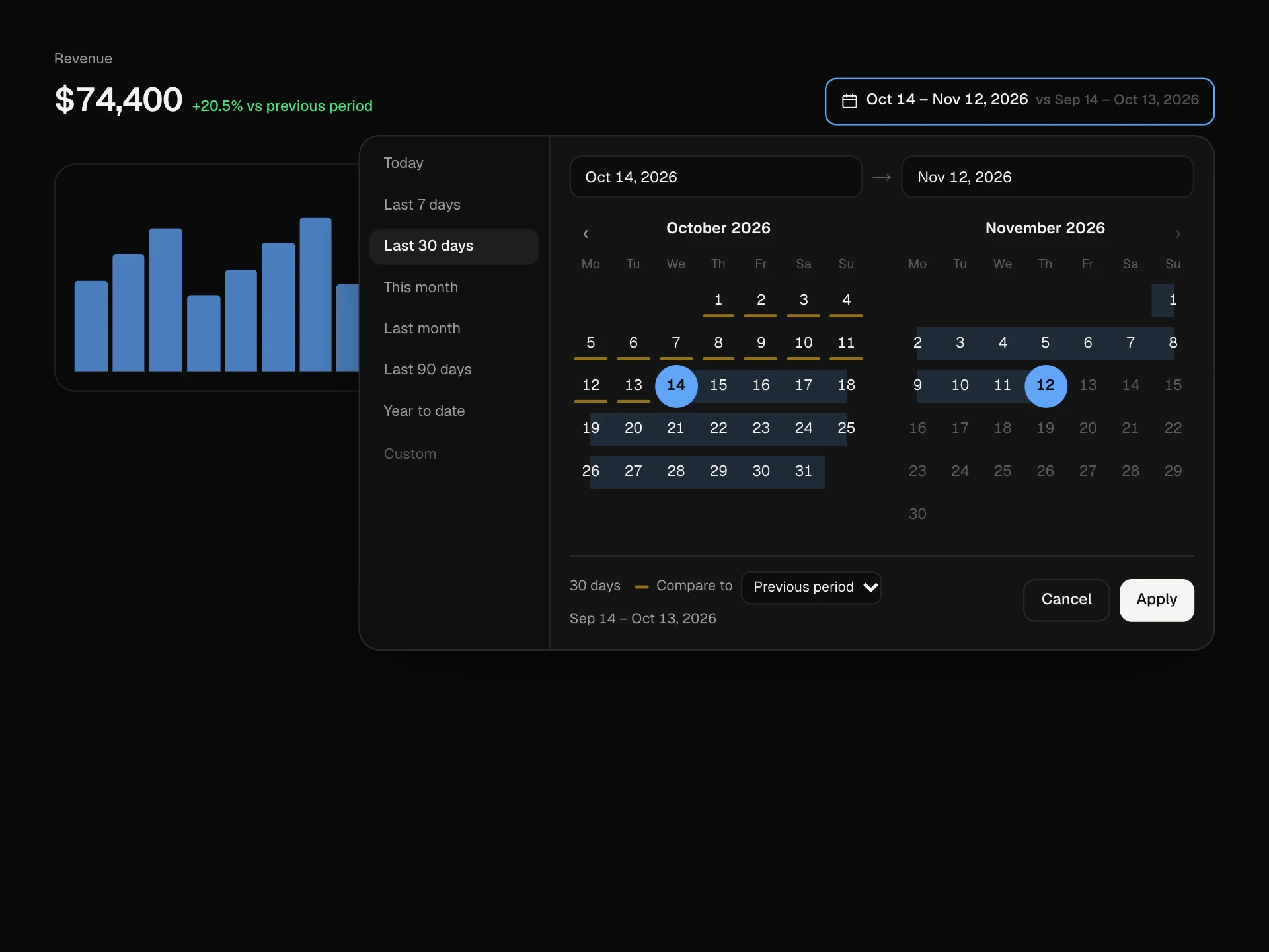
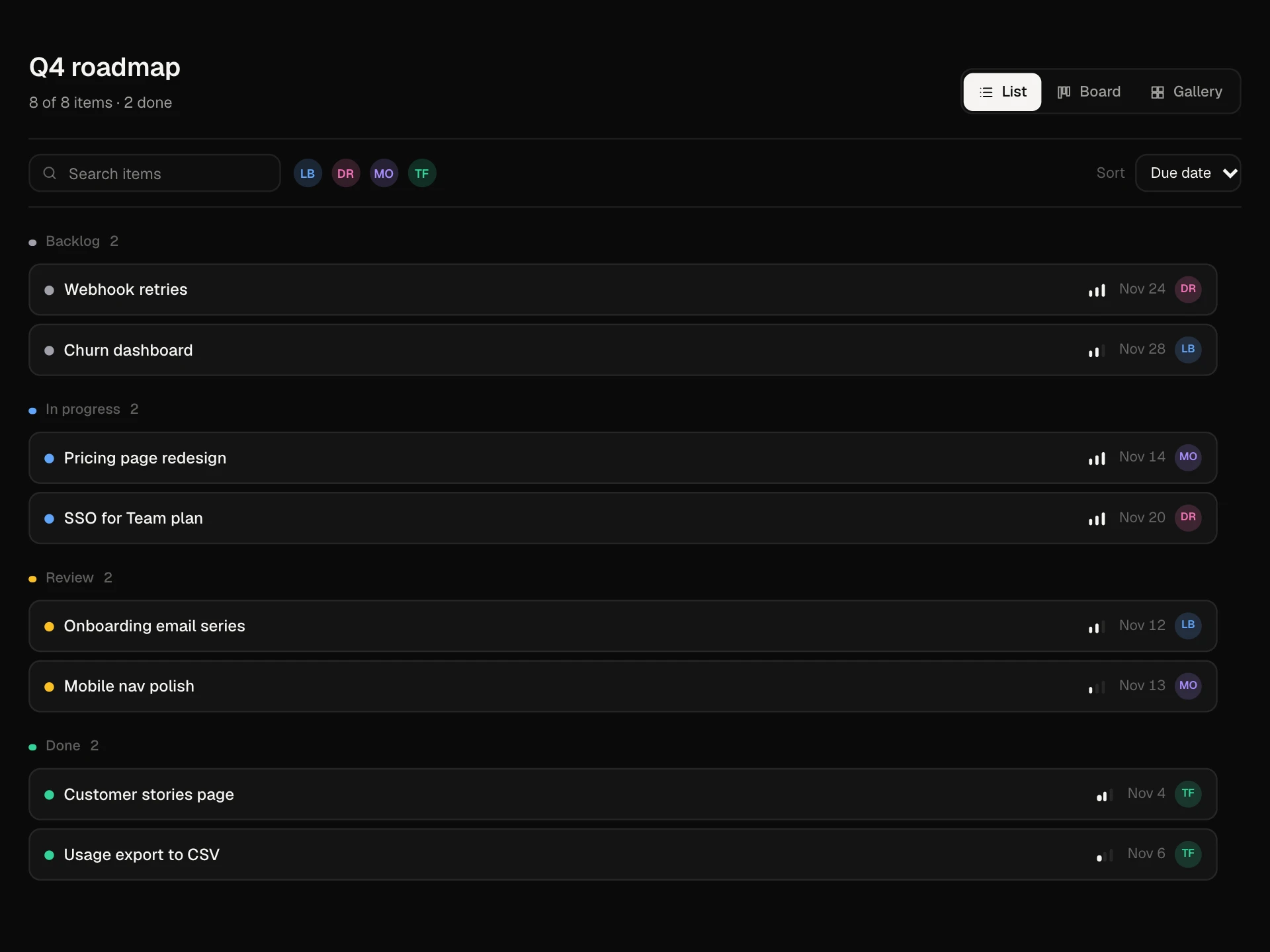
Checkbox Selection Cards React component
A multi-select onboarding step built from checkbox cards: priced add-ons with a select-all that shows a mixed state, and topics limited to three that lock the rest and shake when you try a fourth. Choices appear as removable chips in a sticky summary with an animated monthly total and Continue.
About the Checkbox Selection Cards component
Checkbox Selection Cards lets people pick several options at once, with enough room on each card to explain what it is and what it costs. This block is an onboarding step with priced add-ons and a set of topics where only three can be chosen.
It handles the details for you: Select all shows a mixed state when only some are picked, the topic group locks once three are chosen and gently shakes if someone tries a fourth, and every choice shows up as a chip next to a running monthly total.
When to use it
Use it for onboarding questions, add-ons and extras, interests, notification topics, permissions or any multi-choice question where each option needs a sentence.
If only one option can be chosen, use Radio Group Cards instead.
Installation
Add the Checkbox Selection Cards component to your project with the shadcn CLI. It lands in components/checkbox-selection-cards.tsx as plain React + Tailwind CSS source you own and can edit.
npx shadcn@latest add @reactframe/checkbox-selection-cardsOr copy the source by hand and install its dependencies:
npm install motion clsx tailwind-mergeProps
<CheckboxSelectionCards /> accepts 5 props, all optional.
| Prop | Type | Default |
|---|---|---|
| groups | { id: string; title: string; hint: string; max?: number; options: SelectionOption[] }[] | GROUPS |
| defaultSelected | string[] | ["analytics", "revenue"] |
| onContinue | (selected: string[], monthlyTotal: number) => Promise<void> | void | — |
| theme | "dark" | "light" | "dark" |
| className | string | — |
- groups{ id: string; title: string; hint: string; max?: number; options: SelectionOption[] }[]Default: GROUPS
- defaultSelectedstring[]Default: ["analytics", "revenue"]
- onContinue(selected: string[], monthlyTotal: number) => Promise<void> | void
- theme"dark" | "light"Default: "dark"
- classNamestring
npm dependencies
Installed for you by the shadcn CLI.
Checkbox Selection Cards FAQ
- Are these real checkboxes?
- Yes. Each card wraps a native checkbox that is visually hidden, so clicks anywhere on the card, the space bar and screen readers all work as expected.
- How does the limit work?
- Set max on a group. Once that many are chosen, the other cards dim and are marked aria-disabled, and trying one shows a short message explaining the limit.
- What does the mixed Select all mean?
- When some but not all options in a group are selected, the box shows a dash and the native checkbox is set to indeterminate. Clicking it selects everything in the group.
- How do I save the choices?
- Pass onContinue. It receives the selected ids and the monthly total of priced options. Return a Promise to keep the spinner until your API answers.
- Is it accessible?
- Groups are fieldsets with legends and hints, every card has a description linked to its checkbox, focus rings the whole card, the counter and total update politely, and chips have labelled remove buttons.