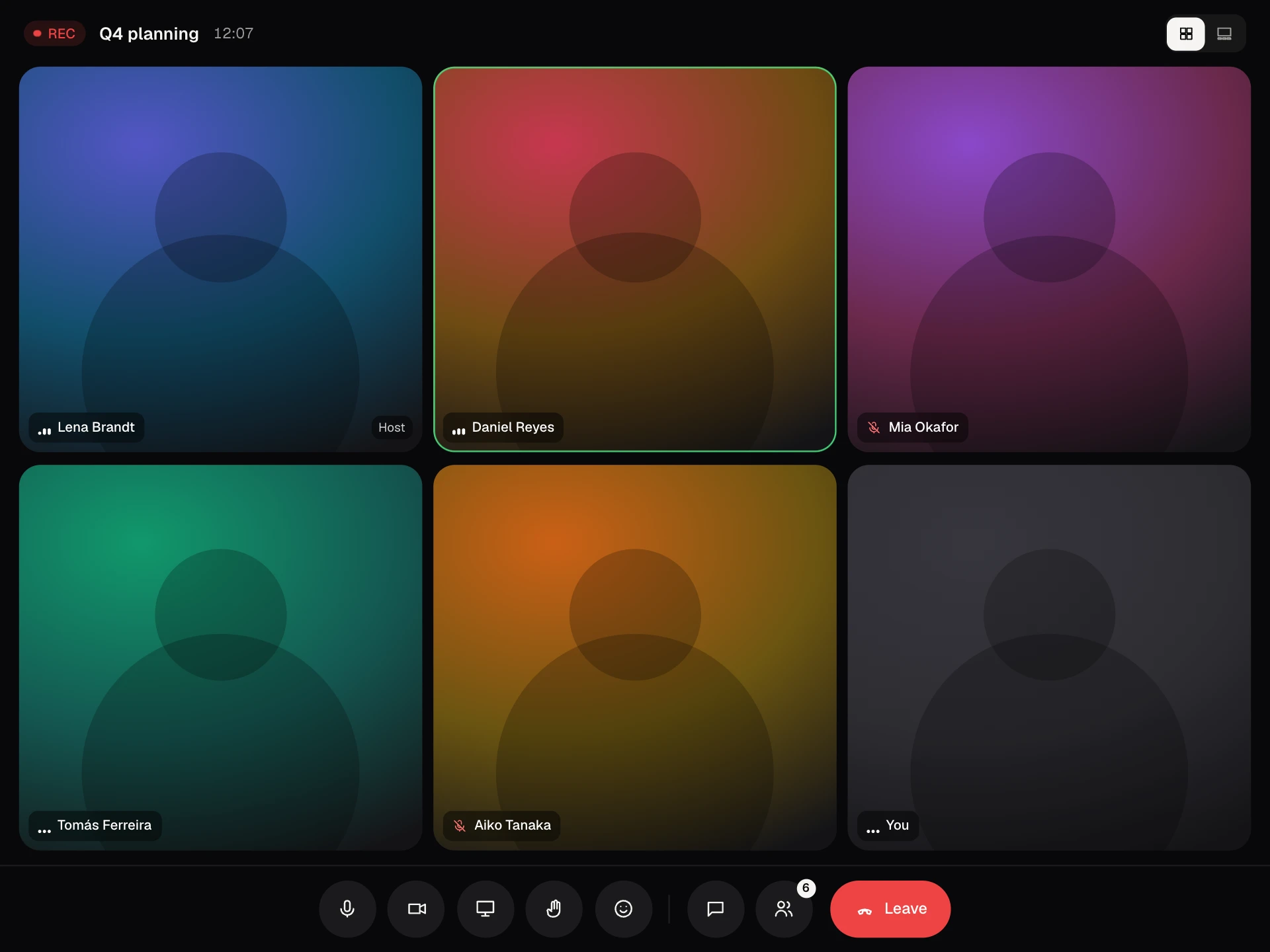
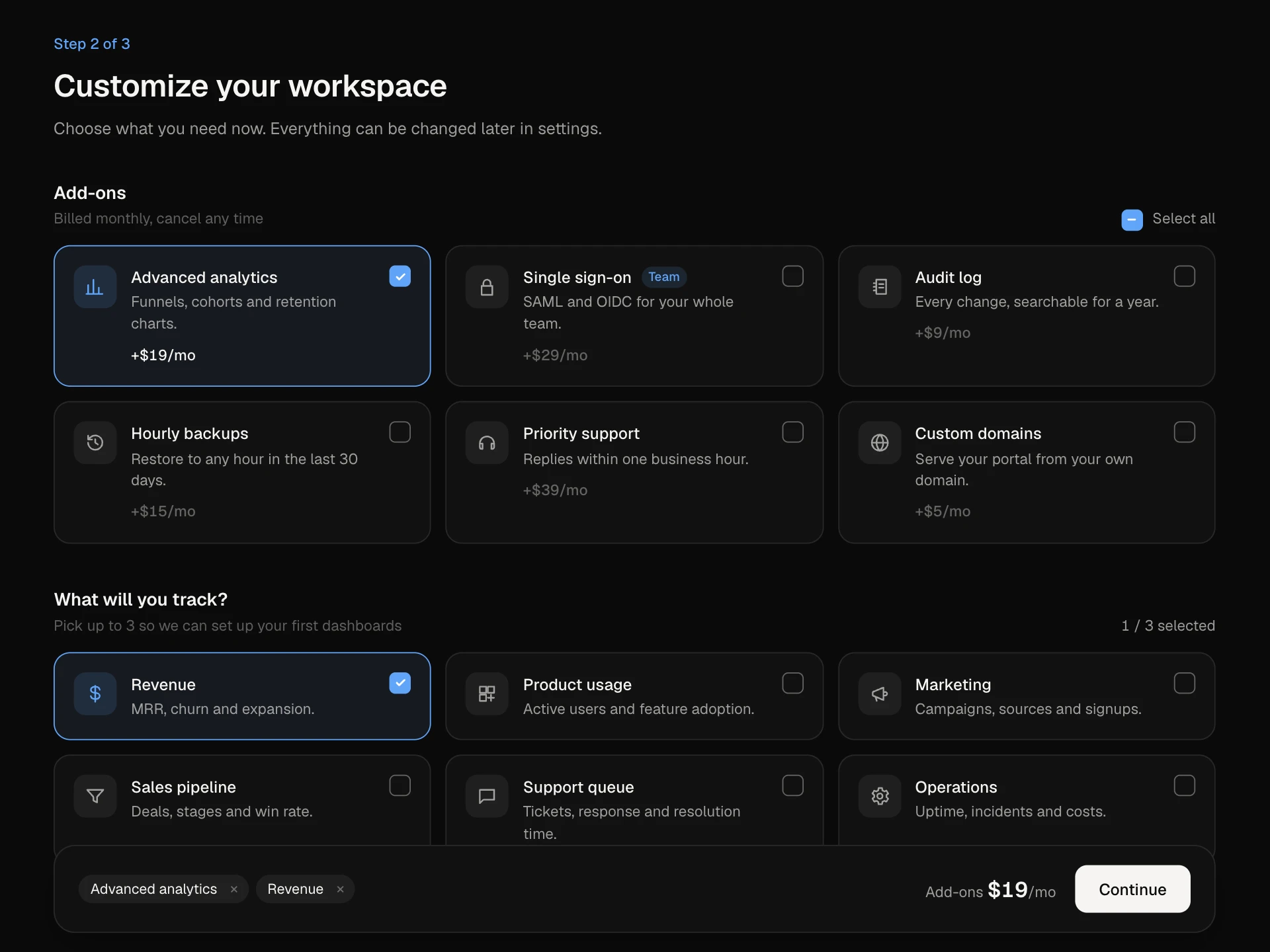
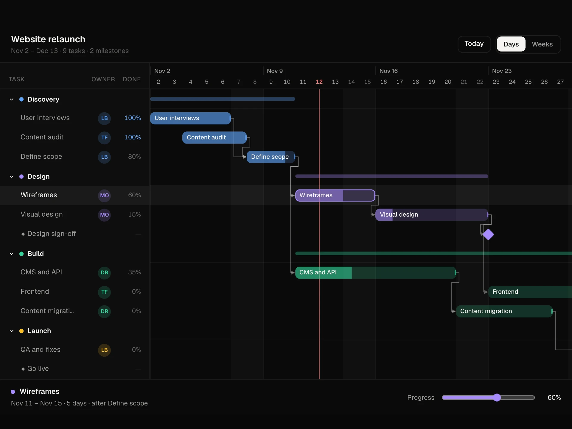
Multi View Switcher React component
One set of items shown as a list grouped by status, a board with columns or a gallery of cards, and every card flies to its new place when you switch. Search, owner filters and sorting apply to all views, 1 / 2 / 3 switch views from the keyboard, and changing an item's status in the details panel moves it to its new group.
About the Multi View Switcher component
Multi View Switcher shows the same items three ways: a list grouped by status, a board with a column per status, and a gallery of cards. When you switch, every card moves smoothly from where it was to where it belongs, so people never lose their place.
Search, owner filters and sorting carry across views. Click any item to open its details, and changing its status there moves it into the right group or column as you watch.
When to use it
Use it for roadmaps, task lists, content calendars, asset libraries or any collection people browse in different ways.
Keep the item fields the same in every view so the switch feels like one set of things being rearranged.
Installation
Add the Multi View Switcher component to your project with the shadcn CLI. It lands in components/multi-view-switcher.tsx as plain React + Tailwind CSS source you own and can edit.
npx shadcn@latest add @reactframe/multi-view-switcherOr copy the source by hand and install its dependencies:
npm install motion clsx tailwind-mergeProps
<MultiViewSwitcher /> accepts 5 props, all optional.
| Prop | Type | Default |
|---|---|---|
| items | { id: string; title: string; status: Status; owner: string; priority: Priority; due: string; cover: string }[] | ITEMS |
| defaultView | "list" | "board" | "gallery" | "list" |
| onItemsChange | (items: ViewItem[]) => void | — |
| theme | "dark" | "light" | "dark" |
| className | string | — |
- items{ id: string; title: string; status: Status; owner: string; priority: Priority; due: string; cover: string }[]Default: ITEMS
- defaultView"list" | "board" | "gallery"Default: "list"
- onItemsChange(items: ViewItem[]) => void
- theme"dark" | "light"Default: "dark"
- classNamestring
npm dependencies
Installed for you by the shadcn CLI.
Multi View Switcher FAQ
- How does the morph between views work?
- Each item uses the same layoutId in every view inside a LayoutGroup. Motion measures where the card was and where it is now, then animates the difference. With reduced motion turned on, views switch instantly.
- Can I remember the chosen view?
- Yes. Pass defaultView from a saved preference and store the new value when it changes, for example in local storage or the URL.
- Can I add a table or timeline view?
- Yes. Add a value to the view list, an icon, and a layout that renders the shared card. Cards will morph into the new view automatically.
- How do I save status changes?
- Pass onItemsChange. It receives the full list whenever a status changes in the details panel.
- Is it accessible?
- The view control is a radiogroup with arrow keys and 1 / 2 / 3 shortcuts, owner filters are toggle buttons, every card is a button that reads its status, owner and due date, and the status picker in details is a radiogroup.