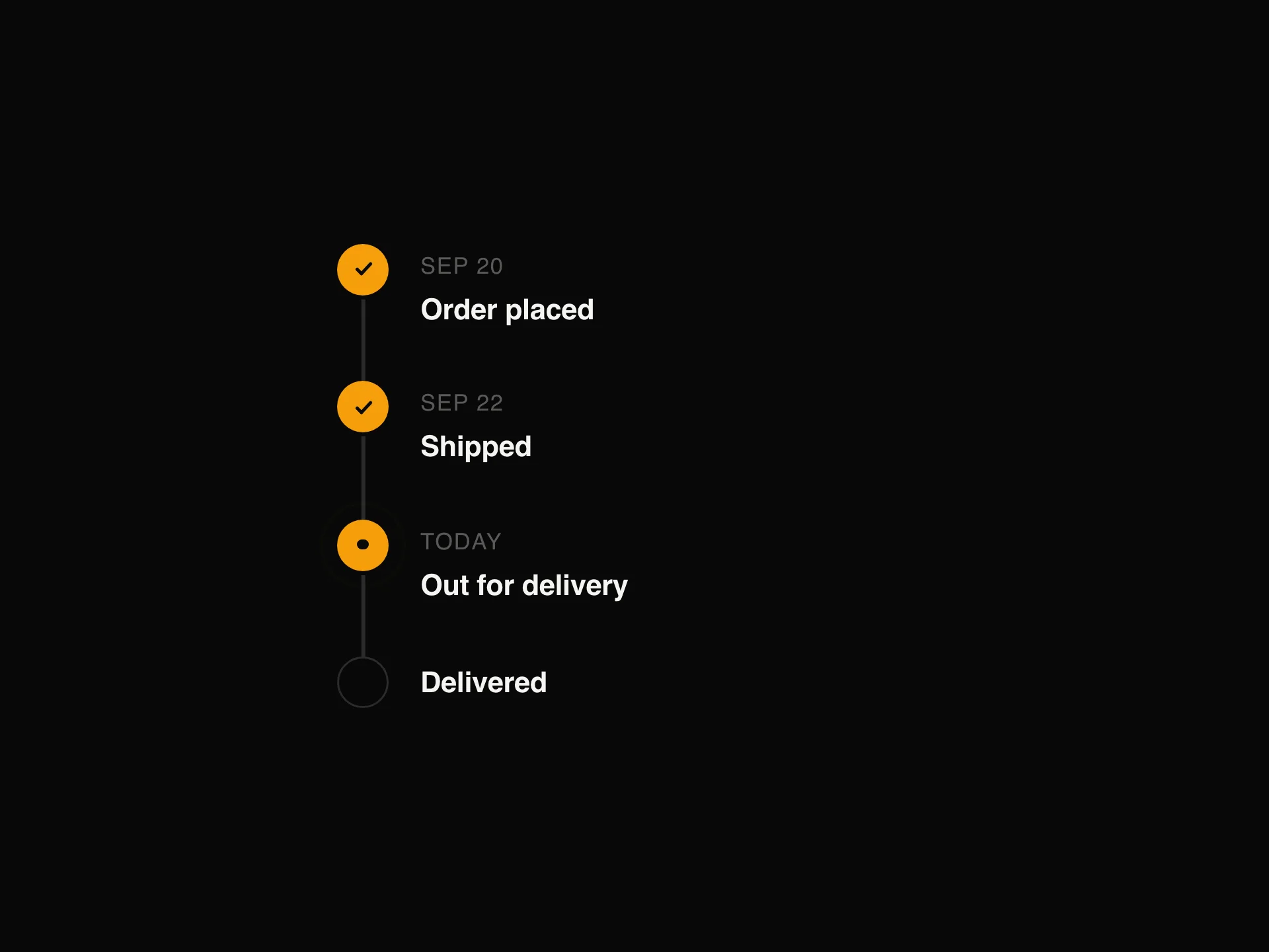
Dot Pager Indicator React component
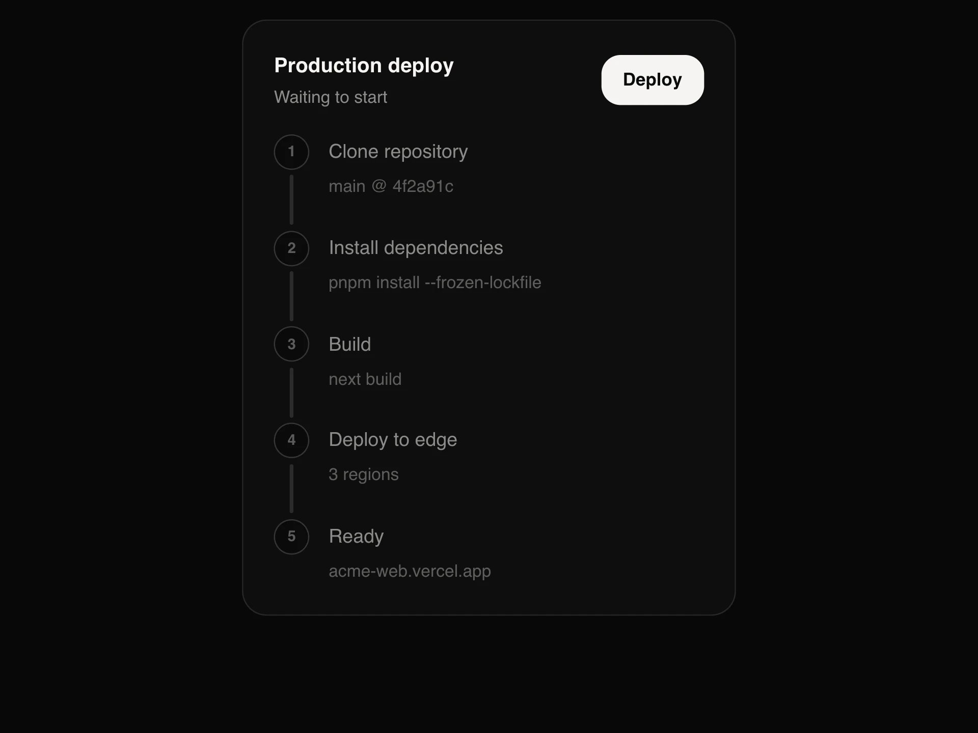
Dots that show where you are in a carousel or onboarding flow: the active dot stretches into a pill, a progress style fills the pill and moves on by itself like stories, and a window style shows five dots out of many and shrinks the edge ones. Clickable and keyboard friendly.
When to use the Dot Pager Indicator component
Use Dot Pager Indicator under carousels, onboarding flows, stories and image galleries to show position and let people jump between pages.
For numbered steps with titles, use Stepper or Vertical Progress Steps; for long lists of pages, use Pagination.
Installation
Add the Dot Pager Indicator component to your project with the shadcn CLI. It lands in components/dot-pager-indicator.tsx as plain React + Tailwind CSS source you own and can edit.
npx shadcn@latest add @reactframe/dot-pager-indicatorOr copy the source by hand and install its dependencies:
npm install motion clsx tailwind-mergeProps
<DotPagerIndicator /> accepts 13 props (required ones are marked *).
| Prop | Type | Default |
|---|---|---|
| count* | number | — |
| value Zero-based index of the current page. | number | — |
| defaultValue | number | 0 |
| onValueChange | (index: number) => void | — |
| variant pill: the active dot stretches into a pill. progress: the active pill fills over `duration` ms, then moves on by itself. window: for many pages, shows `visible` dots and shrinks the ones at the edges. | "pill" | "progress" | "window" | "pill" |
| duration progress: time per page in ms. | number | 4000 |
| paused progress: pause autoplay (e.g. while the pointer is over the carousel). | boolean | false |
| visible window: how many dots to show at once. | number | 5 |
| size | "sm" | "md" | "lg" | "md" |
| interactive Clicking a dot jumps to that page. Off: a read-only indicator. | boolean | true |
| label | string | "Slides" |
| theme | "dark" | "light" | "dark" |
- count*number
- value
Zero-based index of the current page.
number - defaultValuenumberDefault: 0
- onValueChange(index: number) => void
- variant
pill: the active dot stretches into a pill. progress: the active pill fills over `duration` ms, then moves on by itself. window: for many pages, shows `visible` dots and shrinks the ones at the edges.
"pill" | "progress" | "window"Default: "pill" - duration
progress: time per page in ms.
numberDefault: 4000 - paused
progress: pause autoplay (e.g. while the pointer is over the carousel).
booleanDefault: false - visible
window: how many dots to show at once.
numberDefault: 5 - size"sm" | "md" | "lg"Default: "md"
- interactive
Clicking a dot jumps to that page. Off: a read-only indicator.
booleanDefault: true - labelstringDefault: "Slides"
- theme"dark" | "light"Default: "dark"
Show all 13 propsShow fewer
| className | string | — |
- classNamestring
FAQ
- Which variant should I use?
- pill for a handful of pages, progress when slides advance by themselves (stories, hero rotators), window when there are more pages than dots should show.
- Is it accessible?
- Interactive dots are buttons named 'Go to slide n' with aria-current on the active one and arrow-key, Home and End support. Read-only mode announces 'n of count' instead.
- Can autoplay pause?
- Pass paused (for example while the pointer is over the carousel). Reduced-motion users never get autoplay.