Photo Review Gallery React component
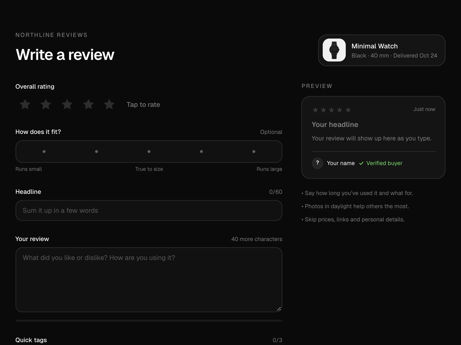
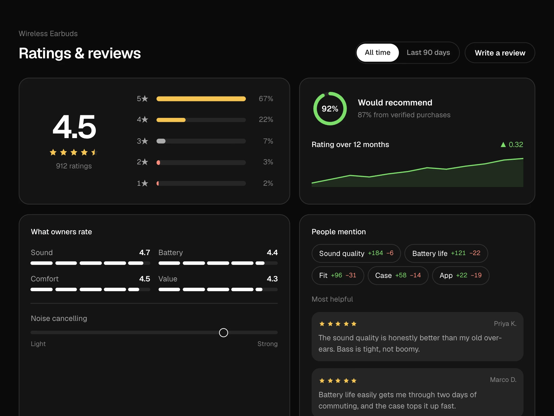
A customer photo wall for a product: a mosaic with a featured photo and quote, All / 5 stars / Verified filters, a +N tile, a lightbox with the photo, rating, review, verified badge, helpful vote, thumbnails, arrow keys and swipe, plus an Add your photos button that previews picked images.
About the Photo Review Gallery component
Photo Review Gallery shows a product the way customers actually use it. A mosaic leads with a featured photo and its quote, and filters narrow it to five-star or verified photos.
Any photo opens a lightbox with the full review beside it: rating, date, a verified badge and a helpful vote. Shoppers move through photos with arrows, the keyboard or a swipe, and can start their own review by adding photos, which preview right away.
When to use it
Put it on product pages between the rating summary and the full review list, especially for products where looks, size or fit matter.
With fewer than three photos, show them inside the review list instead; an almost empty mosaic draws attention to the gap.
Installation
Add the Photo Review Gallery component to your project with the shadcn CLI. It lands in components/photo-review-gallery.tsx as plain React + Tailwind CSS source you own and can edit.
npx shadcn@latest add @reactframe/photo-review-galleryOr copy the source by hand and install its dependencies:
npm install motion clsx tailwind-mergeCollections
Use-case pages that compare Photo Review Gallery with the other components that do a similar job.
npm dependencies
Installed for you by the shadcn CLI.
Photo Review Gallery FAQ
- What are focus, zoom and tone for?
- They let you frame a photo without editing it: focus is the CSS object-position, zoom scales the photo inside its tile and tone is an optional CSS filter. Most real photos only need focus.
- How does the +N tile work?
- The mosaic shows up to five photos. If more match the current filter, the last tile shows how many are left; open any photo to browse all of them in the lightbox.
- What happens with uploaded photos?
- Picked images (up to four) show as local previews with remove buttons, and onUpload receives the File objects so you can open your review form with them. Nothing is uploaded by the block itself.
- Can shoppers swipe on phones?
- Yes. Dragging the photo left or right past a short distance moves to the next or previous one; buttons and arrow keys do the same. Dragging is off for people who prefer reduced motion.
- Is it accessible?
- Tiles are buttons named with the author and rating, the lightbox is a modal dialog labelled with the position, focus goes to its close button and returns to the tile, the counter is announced, thumbnails mark the current photo and the helpful button shows its state.