Social Links React component
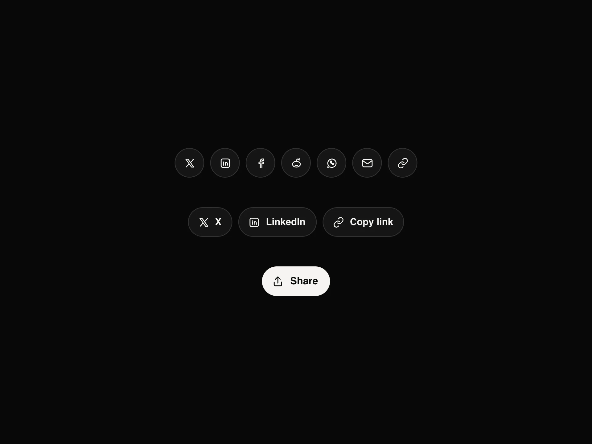
Links to your profiles in three styles: round icons that fill from the bottom and tilt on hover, a list with handles, follower counts and an out arrow, or a dock whose icons grow as the pointer comes near.
When to use the Social Links component
Use Social Links in footers, about and contact pages, author bios and link-in-bio pages, anywhere you point people to your own profiles.
To let visitors share the current page, use Share Buttons instead.
Installation
Add the Social Links component to your project with the shadcn CLI. It lands in components/social-links.tsx as plain React + Tailwind CSS source you own and can edit.
npx shadcn@latest add https://reactframe.com/r/social-links.jsonOr copy the source by hand and install its dependencies:
npm install motion clsx tailwind-mergeProps
<SocialLinks /> accepts 4 props, all optional.
| Prop | Type | Default |
|---|---|---|
| links | { network: SocialNetwork; href: string; handle?: string; followers?: string; label?: string }[] | DEFAULT_LINKS |
| variant icons: round buttons that fill on hover. list: rows with handle and followers. dock: icons that grow as the pointer nears. | "icons" | "list" | "dock" | "icons" |
| theme | "dark" | "light" | "dark" |
| className | string | — |
- links{ network: SocialNetwork; href: string; handle?: string; followers?: string; label?: string }[]Default: DEFAULT_LINKS
- variant
icons: round buttons that fill on hover. list: rows with handle and followers. dock: icons that grow as the pointer nears.
"icons" | "list" | "dock"Default: "icons" - theme"dark" | "light"Default: "dark"
- classNamestring
FAQ
- Which style should I pick?
- Icons for footers and tight spaces, list when handles and follower counts matter (about or link-in-bio pages), dock as a playful centrepiece.
- Are these the official logos?
- No, they're simple monochrome marks drawn to match the rest of the set. Swap in official logos if a platform's brand rules require them.
- Are the links accessible?
- Each is a real link with the network's name as its label, inside a nav labelled Social links; external ones open in a new tab safely.