Scroll Progress Bar React component
Reading progress in three forms: a thin spring-smoothed bar, a corner ring with the percentage that becomes a back-to-top button at the end, or a track split into your page's sections that labels the current one and jumps to any other.
When to use the Scroll Progress Bar component
Use Scroll Progress Bar on long reads: blog posts, docs, case studies, terms. It tells people how much is left, which makes them more likely to finish.
Use sections for structured docs so readers can see and jump between parts; use circle when you'd otherwise add a separate back-to-top button.
Installation
Add the Scroll Progress Bar component to your project with the shadcn CLI. It lands in components/scroll-progress-bar.tsx as plain React + Tailwind CSS source you own and can edit.
npx shadcn@latest add https://reactframe.com/r/scroll-progress-bar.jsonOr copy the source by hand and install its dependencies:
npm install motion clsx tailwind-mergeProps
<ScrollProgressBar /> accepts 9 props, all optional.
| Prop | Type | Default |
|---|---|---|
| variant bar: thin line. circle: ring with a percentage that turns into back-to-top. sections: one segment per heading. | "bar" | "circle" | "sections" | "bar" |
| position Where the bar or the sections sit. | "top" | "bottom" | "top" |
| sectionSelector Headings that split the page into sections (sections variant). | string | "h2" |
| height | number | 3 |
| color | string | — |
| contained Follow the nearest scrollable ancestor instead of the window. | boolean | false |
| container Follow this scroll box instead of the window; place the indicator in a positioned parent around it. | React.RefObject<HTMLElement | null> | — |
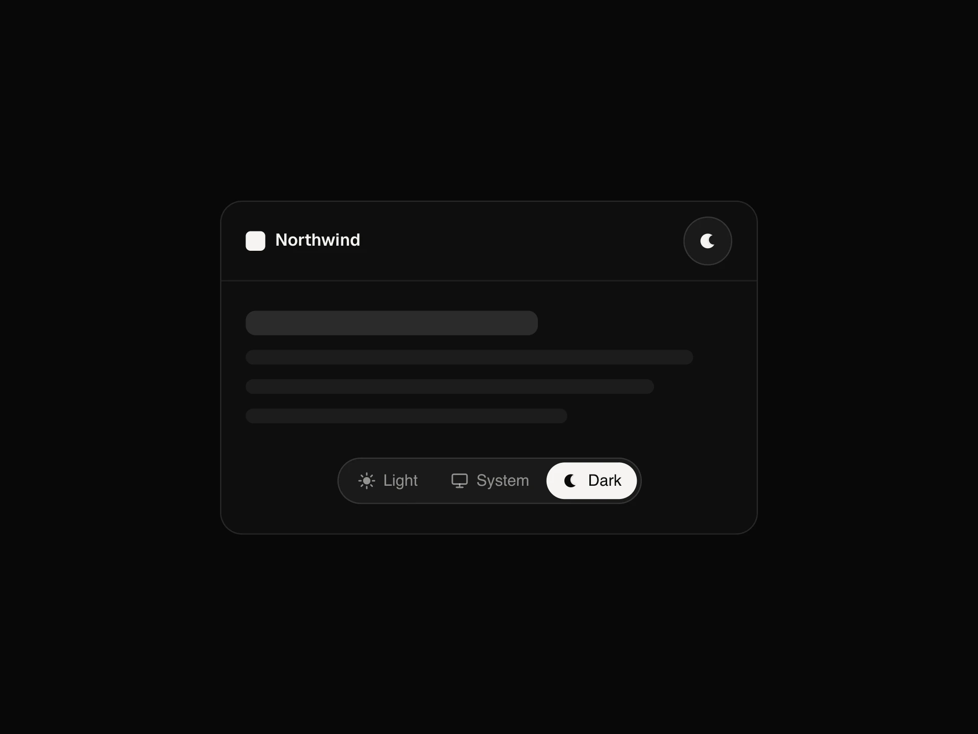
| theme | "dark" | "light" | "dark" |
| className | string | — |
- variant
bar: thin line. circle: ring with a percentage that turns into back-to-top. sections: one segment per heading.
"bar" | "circle" | "sections"Default: "bar" - position
Where the bar or the sections sit.
"top" | "bottom"Default: "top" - sectionSelector
Headings that split the page into sections (sections variant).
stringDefault: "h2" - heightnumberDefault: 3
- colorstring
- contained
Follow the nearest scrollable ancestor instead of the window.
booleanDefault: false - container
Follow this scroll box instead of the window; place the indicator in a positioned parent around it.
React.RefObject<HTMLElement | null> - theme"dark" | "light"Default: "dark"
- classNamestring
FAQ
- Where do the sections come from?
- From the headings matched by sectionSelector (h2 by default). Each section's segment is as wide as that part of the page is long, and clicking one scrolls there.
- Does it work inside a scrolling panel?
- Yes. Pass container with a ref to the scroll box and place the indicator in a positioned parent next to it, or set contained to follow the nearest scrollable ancestor.
- Why does the bar lag slightly?
- It's spring-smoothed so it glides instead of jittering with every wheel tick. With reduced motion it follows the scroll exactly.