Theme Toggle React component
A light / dark switch that morphs a sun into a moon, or a Light · System · Dark control with a sliding pill; it remembers the choice, follows the OS in System mode, writes the theme to <html>, and can grow the new theme out of the button in a circle.
When to use the Theme Toggle component
Use Theme Toggle in headers, footers and settings pages of any site that supports light and dark mode. The icon version fits a toolbar; the segmented version lets people pick System so the site follows their device.
Add a tiny script in <head> that applies the stored theme before paint if you want to avoid a flash on first load.
Installation
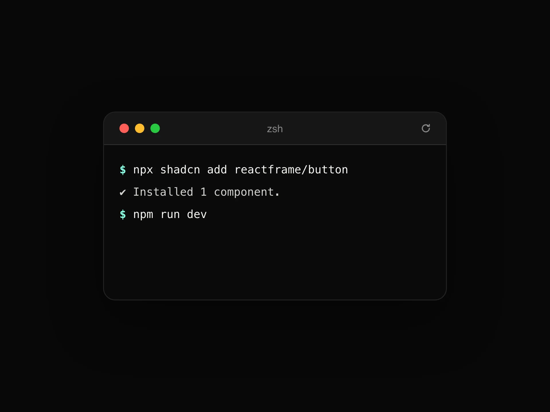
Add the Theme Toggle component to your project with the shadcn CLI. It lands in components/theme-toggle.tsx as plain React + Tailwind CSS source you own and can edit.
npx shadcn@latest add https://reactframe.com/r/theme-toggle.jsonOr copy the source by hand and install its dependencies:
npm install motion clsx tailwind-mergeProps
<ThemeToggle /> accepts 10 props, all optional.
| Prop | Type | Default |
|---|---|---|
| variant icon: one button that flips light / dark. segmented: Light · System · Dark. | "icon" | "segmented" | "icon" |
| value | "light" | "dark" | "system" | — |
| defaultValue | "light" | "dark" | "system" | "system" |
| onValueChange | (value: ThemeChoice, resolved: "light" | "dark") => void | — |
| apply Write the result to <html> (class or data-theme) and remember it. Turn off to only report changes. | boolean | true |
| attribute | "class" | "data-theme" | "class" |
| storageKey | string | "theme" |
| reveal Grow the new theme out of the button in a circle (View Transitions, where supported). | boolean | true |
| appearance Colours of the control itself. | "dark" | "light" | "dark" |
| className | string | — |
- variant
icon: one button that flips light / dark. segmented: Light · System · Dark.
"icon" | "segmented"Default: "icon" - value"light" | "dark" | "system"
- defaultValue"light" | "dark" | "system"Default: "system"
- onValueChange(value: ThemeChoice, resolved: "light" | "dark") => void
- apply
Write the result to <html> (class or data-theme) and remember it. Turn off to only report changes.
booleanDefault: true - attribute"class" | "data-theme"Default: "class"
- storageKeystringDefault: "theme"
- reveal
Grow the new theme out of the button in a circle (View Transitions, where supported).
booleanDefault: true - appearance
Colours of the control itself.
"dark" | "light"Default: "dark" - classNamestring
FAQ
- What does System do?
- It follows the device's light or dark setting and updates live when that changes; the choice itself is stored as "system".
- How does the circle reveal work?
- In browsers with View Transitions, the new theme is revealed in a circle growing from the button. Elsewhere, or with reduced motion, it switches instantly.
- Does it work with Tailwind's dark mode?
- Yes. With attribute="class" it toggles the dark class on <html>, which is what Tailwind's class strategy expects; use data-theme for CSS-variable setups.