Product Detail React component
An eCommerce product page block with a switchable image gallery, color and size pickers, quantity stepper, animated add-to-cart button and Description / Specs / Reviews tabs.
About the Product Detail component
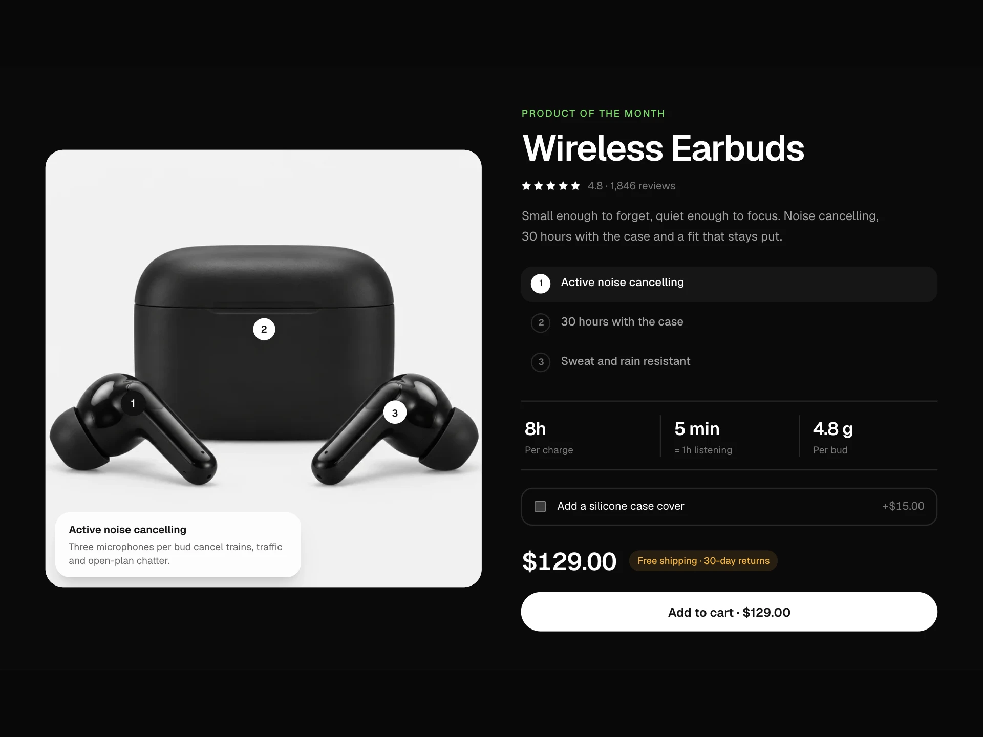
Product Detail is a free product page section: a square main image with up to four thumbnails on the left, and on the right a breadcrumb, title, star rating with review count, price with compare-at price and an optional badge, description, color swatches, size pills, a quantity stepper and an Add to Cart button that confirms with a check. Below it, Description, Specs and Reviews tabs appear for whichever content you pass.
It emits schema.org Product JSON-LD with the gallery images, an Offer when price starts with $, €, £, ₺ or ¥, and an AggregateRating when rating and reviewCount are set. Color and size groups are role="radiogroup" with arrow-key selection, the tabs are a role="tablist" moved with ArrowLeft and ArrowRight, and the breadcrumb is a nav with aria-current on the last item. The layout splits into two columns at 900px of container width.
When to use it
Use it for the product page of an online store, a single-product landing page or a print-on-demand shop, with onAddToCart wired to your cart.
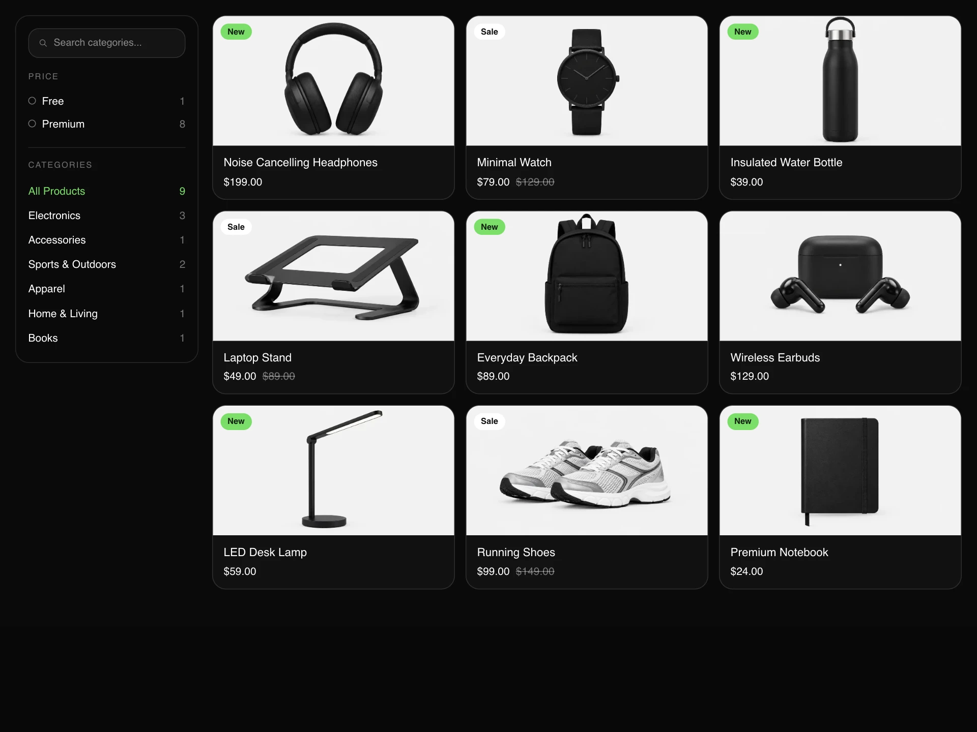
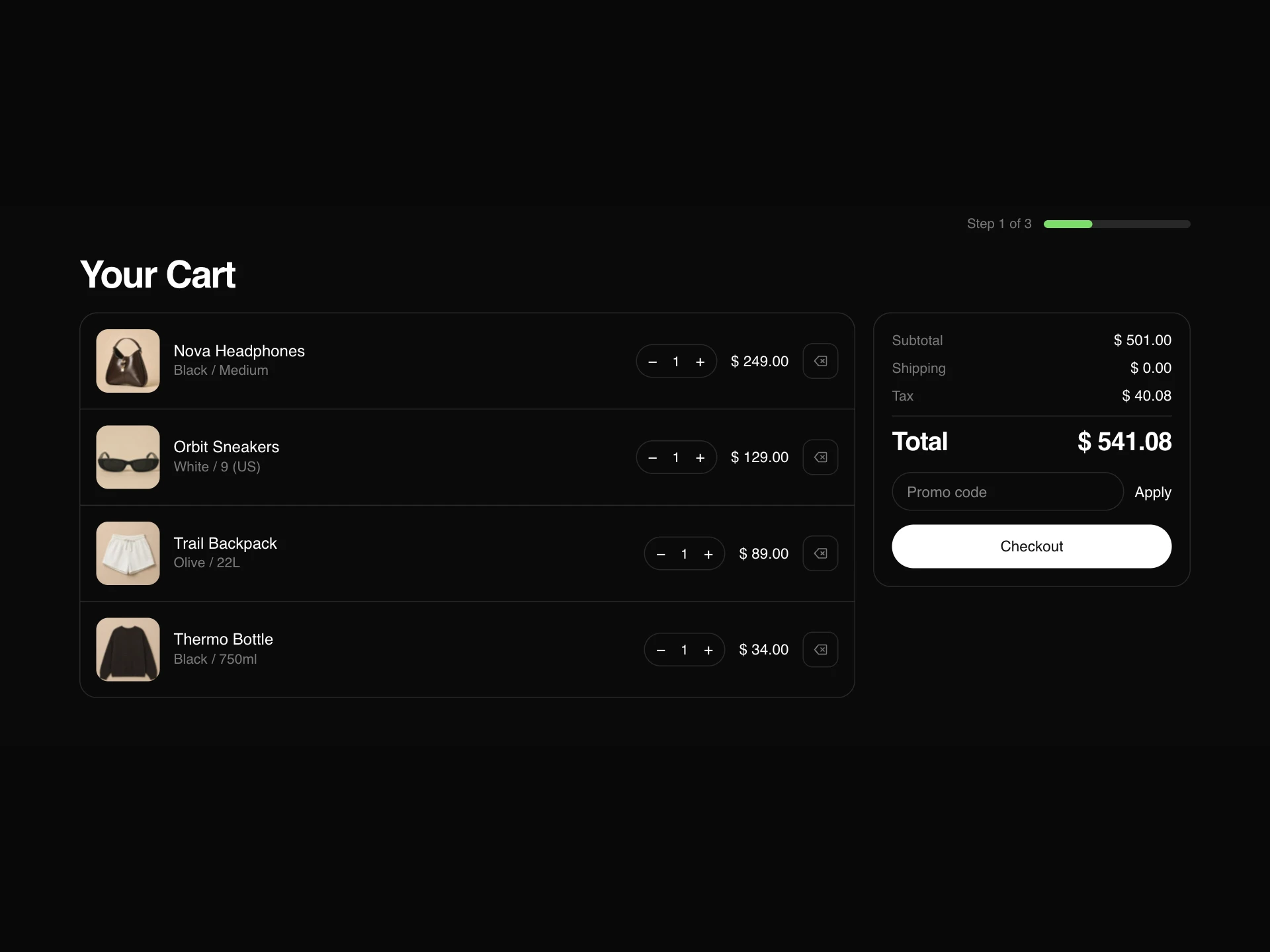
For the catalog page that links here, use Product List; for the cart and checkout, use Your Cart Page.
Installation
Add the Product Detail component to your project with the shadcn CLI. It lands in components/product-detail.tsx as plain React + Tailwind CSS source you own and can edit.
npx shadcn@latest add @reactframe/product-detailOr copy the source by hand and install its dependencies:
npm install motion clsx tailwind-mergeProps
<ProductDetail /> accepts 22 props (required ones are marked *).
| Prop | Type | Default |
|---|---|---|
| breadcrumb Path segments, last one is the current page: ["Home", "Shop", "Watches"]. | string[] | — |
| title* | string | — |
| rating 0–5. | number | 0 |
| reviewCount | number | — |
| price* | string | — |
| compareAtPrice | string | — |
| description | string | — |
| longDescription | string | — |
| reviewsBody | string | — |
| gallery* | { src: string; alt?: string }[] | — |
| colors | { name: string; color: string }[] | [] |
| sizes | string[] | [] |
- breadcrumb
Path segments, last one is the current page: ["Home", "Shop", "Watches"].
string[] - title*string
- rating
0–5.
numberDefault: 0 - reviewCountnumber
- price*string
- compareAtPricestring
- descriptionstring
- longDescriptionstring
- reviewsBodystring
- gallery*{ src: string; alt?: string }[]
- colors{ name: string; color: string }[]Default: []
- sizesstring[]Default: []
Show all 22 propsShow fewer
| specs | { label: string; value: string }[] | [] |
| defaultColorIndex | number | 0 |
| defaultSizeIndex | number | 0 |
| defaultTab | "description" | "specs" | "reviews" | "specs" |
| buttonLabel | string | "Add to Cart" |
| badge Small accent-colored badge next to the price, e.g. "Free shipping". | string | — |
| onAddToCart | (selection: ProductDetailSelection) => void | — |
| theme | "dark" | "light" | "dark" |
| accentColor | string | "#F2A841" |
| className | string | — |
- specs{ label: string; value: string }[]Default: []
- defaultColorIndexnumberDefault: 0
- defaultSizeIndexnumberDefault: 0
- defaultTab"description" | "specs" | "reviews"Default: "specs"
- buttonLabelstringDefault: "Add to Cart"
- badge
Small accent-colored badge next to the price, e.g. "Free shipping".
string - onAddToCart(selection: ProductDetailSelection) => void
- theme"dark" | "light"Default: "dark"
- accentColorstringDefault: "#F2A841"
- classNamestring
Collections
Use-case pages that compare Product Detail with the other components that do a similar job.
npm dependencies
Installed for you by the shadcn CLI.
Product Detail FAQ
- What do I get from Add to Cart?
- onAddToCart receives { color, size, quantity }, using the selected color's name and size label. The button then reads "Added to cart" for 1.8 seconds.
- Why is a tab missing?
- Tabs only render when they have content: Description needs longDescription or description, Specs needs specs, and Reviews needs reviewsBody. defaultTab is "specs".
- Does it output product structured data?
- Yes, Product JSON-LD with name, description, image and offers; aggregateRating is added only when rating is above 0 and reviewCount is set.
- How many gallery images can I pass?
- Any number for the main image, but only the first four appear as thumbnails. Give each image alt text; the title is used when alt is missing.