Product Highlight Block React component
A featured product spotlight: a large photo with numbered hotspots that pulse and sync with a feature list, a floating caption card, rating, key stats, an optional add-on, an animated price and an add-to-cart button with loading and added states.
About the Product Highlight Block component
Product Highlight Block puts one product center stage on a homepage or landing page. Numbered hotspots on the photo point at what makes it special, and the feature list beside it stays in sync, so people learn the product by exploring the picture.
Rating, three headline stats, an optional add-on and a clear price sit right above the add-to-cart button, which confirms the add without sending anyone away from the page.
When to use it
Use it for a hero product, product of the month, launch announcement or a key product in the middle of a homepage.
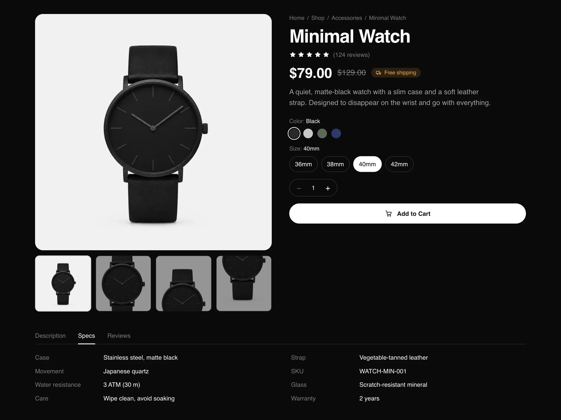
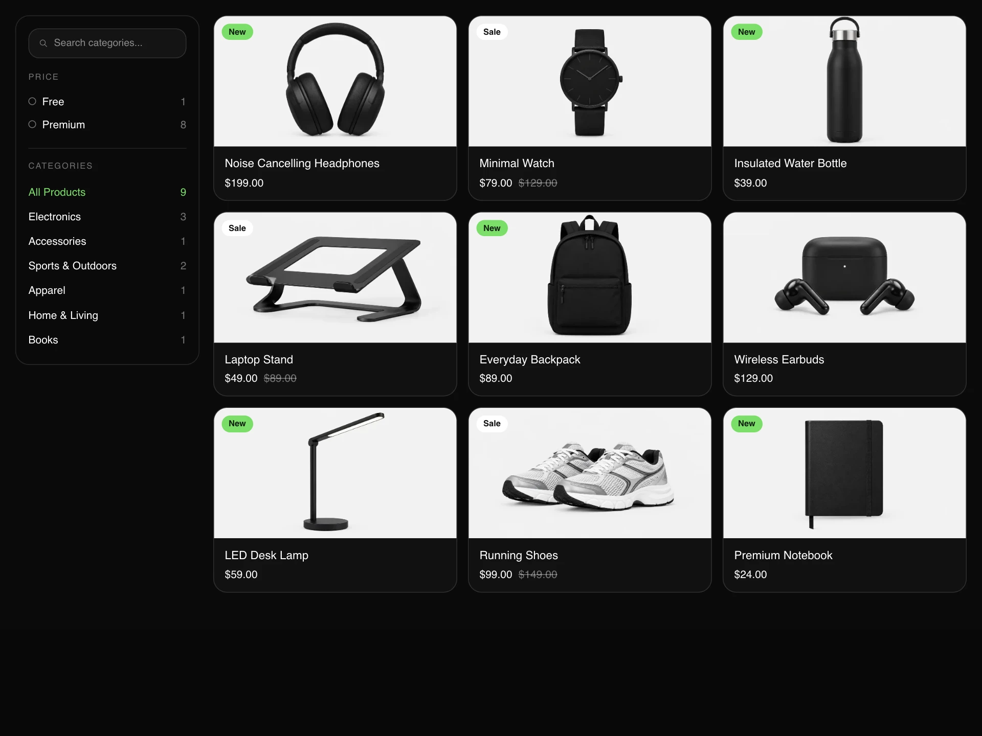
For a full product page with gallery, variants and tabs use the Product Detail block; for several products use a product grid.
Installation
Add the Product Highlight Block component to your project with the shadcn CLI. It lands in components/product-highlight-block.tsx as plain React + Tailwind CSS source you own and can edit.
npx shadcn@latest add @reactframe/product-highlight-blockOr copy the source by hand and install its dependencies:
npm install motion clsx tailwind-mergeProps
<ProductHighlightBlock /> accepts 15 props, all optional.
| Prop | Type | Default |
|---|---|---|
| eyebrow | string | "Product of the month" |
| title | string | "Wireless Earbuds" |
| description | string | "Small enough to forget, quiet enough to focus. Noise cancelling, 30 hours with the case … |
| price | number | 129 |
| compareAtPrice | number | — |
| rating | number | 4.8 |
| reviewCount | number | 1846 |
| image | string | "/demo/wireless-earbuds.webp" |
| features | { title: string; body: string; x: number; y: number }[] | FEATURES |
| stats | { value: string; label: string }[] | STATS |
| addOn | { label: string; price: number } | { label: "Add a silicone case cover", price: 15 } |
| currency | string | "$" |
- eyebrowstringDefault: "Product of the month"
- titlestringDefault: "Wireless Earbuds"
- descriptionstringDefault: "Small enough to forget, quiet enough to focus. Noise cancelling, 30 hours with the case …
- pricenumberDefault: 129
- compareAtPricenumber
- ratingnumberDefault: 4.8
- reviewCountnumberDefault: 1846
- imagestringDefault: "/demo/wireless-earbuds.webp"
- features{ title: string; body: string; x: number; y: number }[]Default: FEATURES
- stats{ value: string; label: string }[]Default: STATS
- addOn{ label: string; price: number }Default: { label: "Add a silicone case cover", price: 15 }
- currencystringDefault: "$"
Show all 15 propsShow fewer
| onAddToCart Return a Promise to keep the button in its loading state until the cart updates. | (item: { title: string; total: number; addOn: boolean }) => void | Promise<void> | — |
| theme | "dark" | "light" | "dark" |
| className | string | — |
- onAddToCart
Return a Promise to keep the button in its loading state until the cart updates.
(item: { title: string; total: number; addOn: boolean }) => void | Promise<void> - theme"dark" | "light"Default: "dark"
- classNamestring
Collections
Use-case pages that compare Product Highlight Block with the other components that do a similar job.
npm dependencies
Installed for you by the shadcn CLI.
Product Highlight Block FAQ
- How do I place the hotspots?
- Each feature has x and y in percent of the image. Open the block, hover the spot you want and adjust the numbers; they scale with the image at any size.
- What happens when someone adds it to the cart?
- onAddToCart receives the title, the total (including the add-on) and whether the add-on was chosen. Return a Promise to keep the spinner until your cart responds.
- Can I remove the add-on row?
- Pass an addOn with price 0 and hide it in your copy of the component, or delete the label block. The price and button text follow the total automatically.
- What if the image doesn't load?
- A neutral tile with the product's first letter takes its place, so the layout never collapses.
- Is it accessible?
- Hotspots are labelled toggle buttons, the caption card is announced when it changes, stars have a text label, and the add-to-cart state changes are announced.