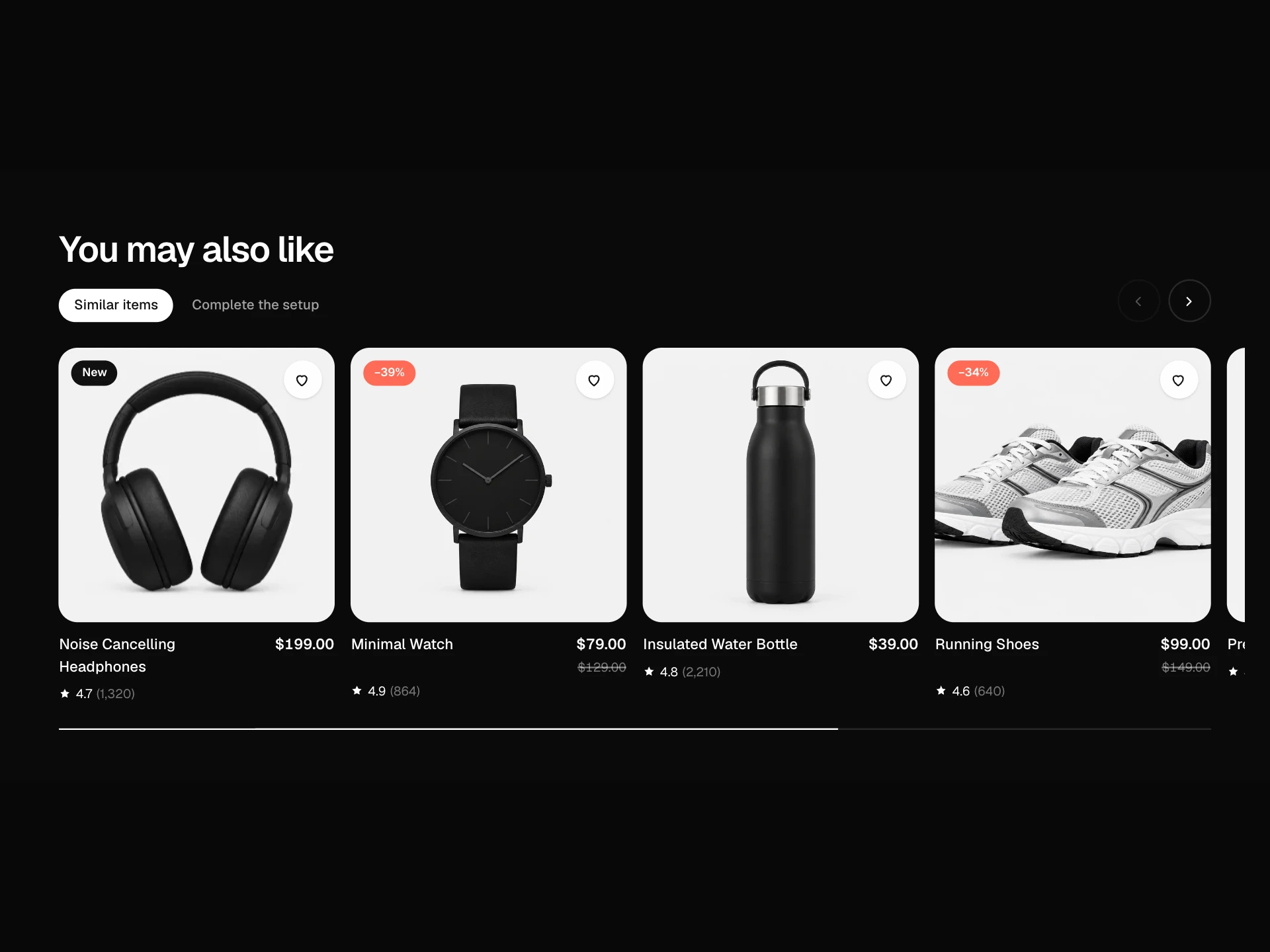
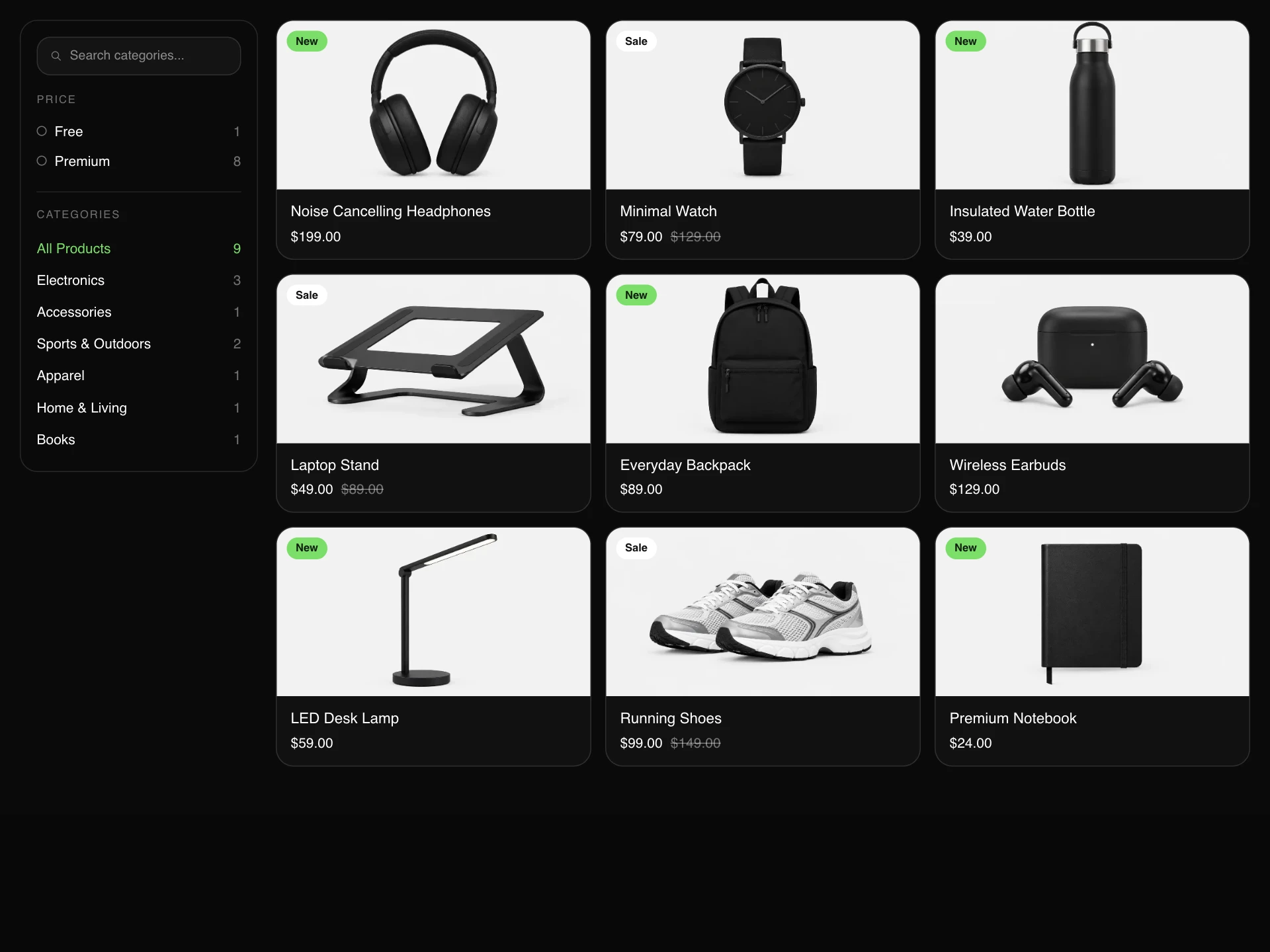
Category Grid Block React component
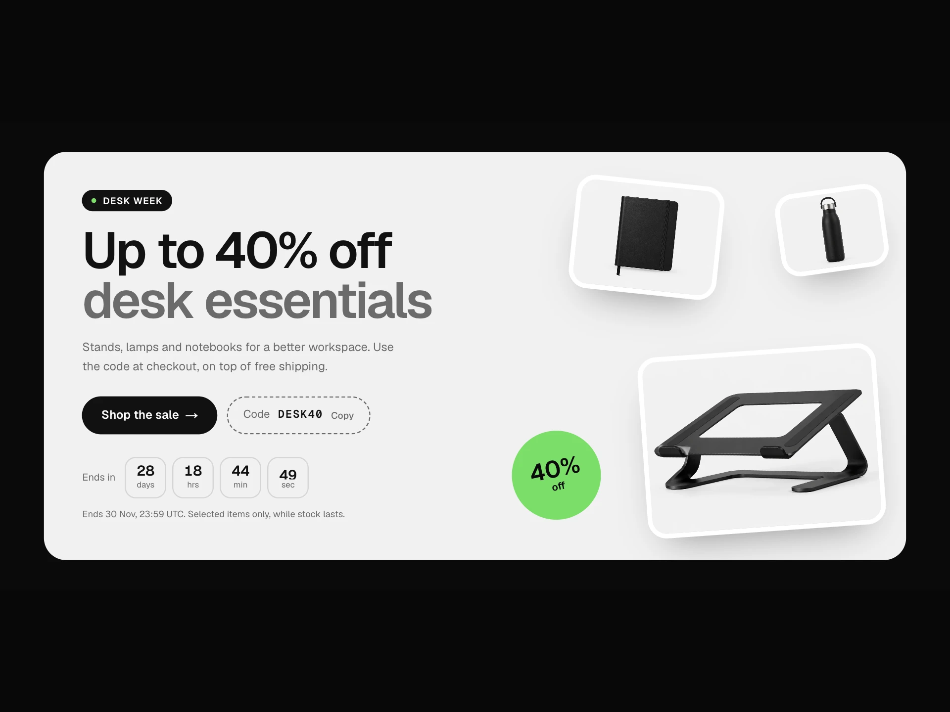
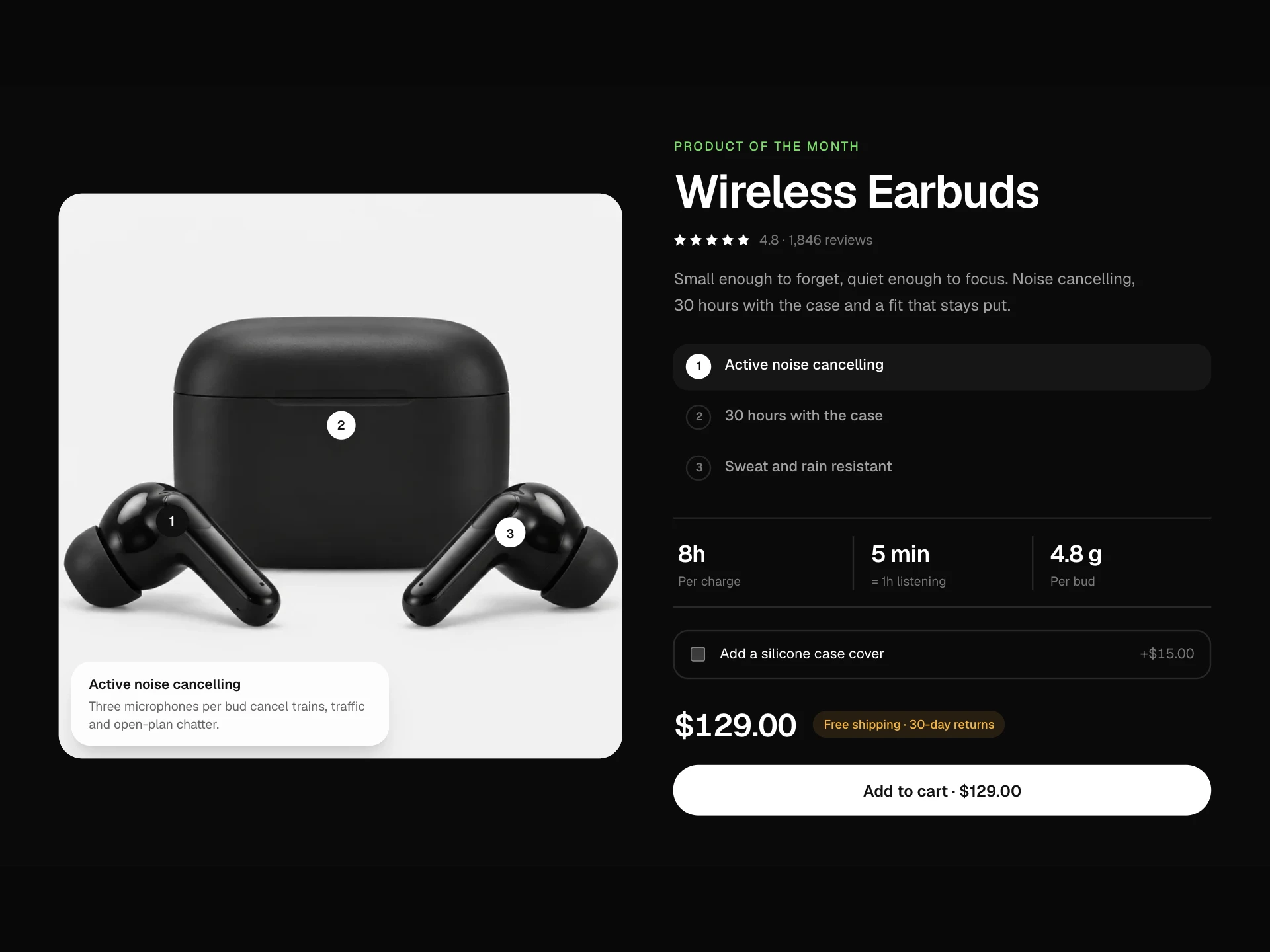
A bento grid of shop categories: one large feature tile, wide and small tiles with product photos on a light surface, product counts and starting prices, badges like 'New season' or 'Up to 40% off', subcategory chips, hover zoom and a rotating arrow, plus an 'All products' link.
About the Category Grid Block component
Category Grid Block is the 'shop by category' section of a store homepage. A bento layout gives the most important category a big tile while the rest stay easy to scan, each with a product photo, how many products it holds and the lowest price.
Badges call out what's new or on sale, subcategory chips hint at what's inside, and the hover zoom and arrow make every tile feel clickable without extra buttons.
When to use it
Use it on store homepages, landing pages and navigation pages that route shoppers into collections.
For a horizontal scroller use the Category Carousel; for a compact icon row use Icon Category Nav.
Installation
Add the Category Grid Block component to your project with the shadcn CLI. It lands in components/category-grid-block.tsx as plain React + Tailwind CSS source you own and can edit.
npx shadcn@latest add @reactframe/category-grid-blockOr copy the source by hand and install its dependencies:
npm install motion clsx tailwind-mergeProps
<CategoryGridBlock /> accepts 8 props, all optional.
| Prop | Type | Default |
|---|---|---|
| title | string | "Shop by category" |
| subtitle | string | "Everyday essentials, designed to last and made to be used." |
| categories | GridCategory[] | CATEGORIES |
| currency | string | "$" |
| viewAllHref | string | "#" |
| onSelect | (category: GridCategory) => void | — |
| theme | "dark" | "light" | "dark" |
| className | string | — |
- titlestringDefault: "Shop by category"
- subtitlestringDefault: "Everyday essentials, designed to last and made to be used."
- categoriesGridCategory[]Default: CATEGORIES
- currencystringDefault: "$"
- viewAllHrefstringDefault: "#"
- onSelect(category: GridCategory) => void
- theme"dark" | "light"Default: "dark"
- classNamestring
Collections
Use-case pages that compare Category Grid Block with the other components that do a similar job.
npm dependencies
Installed for you by the shadcn CLI.
Category Grid Block FAQ
- How do I choose tile sizes?
- Give each category a size: one large tile (2×2), wide tiles (2 columns) and small tiles. A good mix is one large, four small and two wide, which fills a 4-column grid exactly.
- Can tiles be buttons instead of links?
- Pass onSelect. Clicks call it with the category instead of following href, which suits filters inside a single page.
- What kind of photos work best?
- Products on a plain light background, so the tile color and photo blend. Wide landscape shots work for every tile size because images are cropped from the center.
- What if a category has no image?
- A large faint initial fills the tile instead, so the grid stays balanced.
- Is it accessible?
- Every tile is a link with a full label (name, count and price), the arrow is decorative, focus shows the same zoom as hover, and nothing depends on hover to be readable.