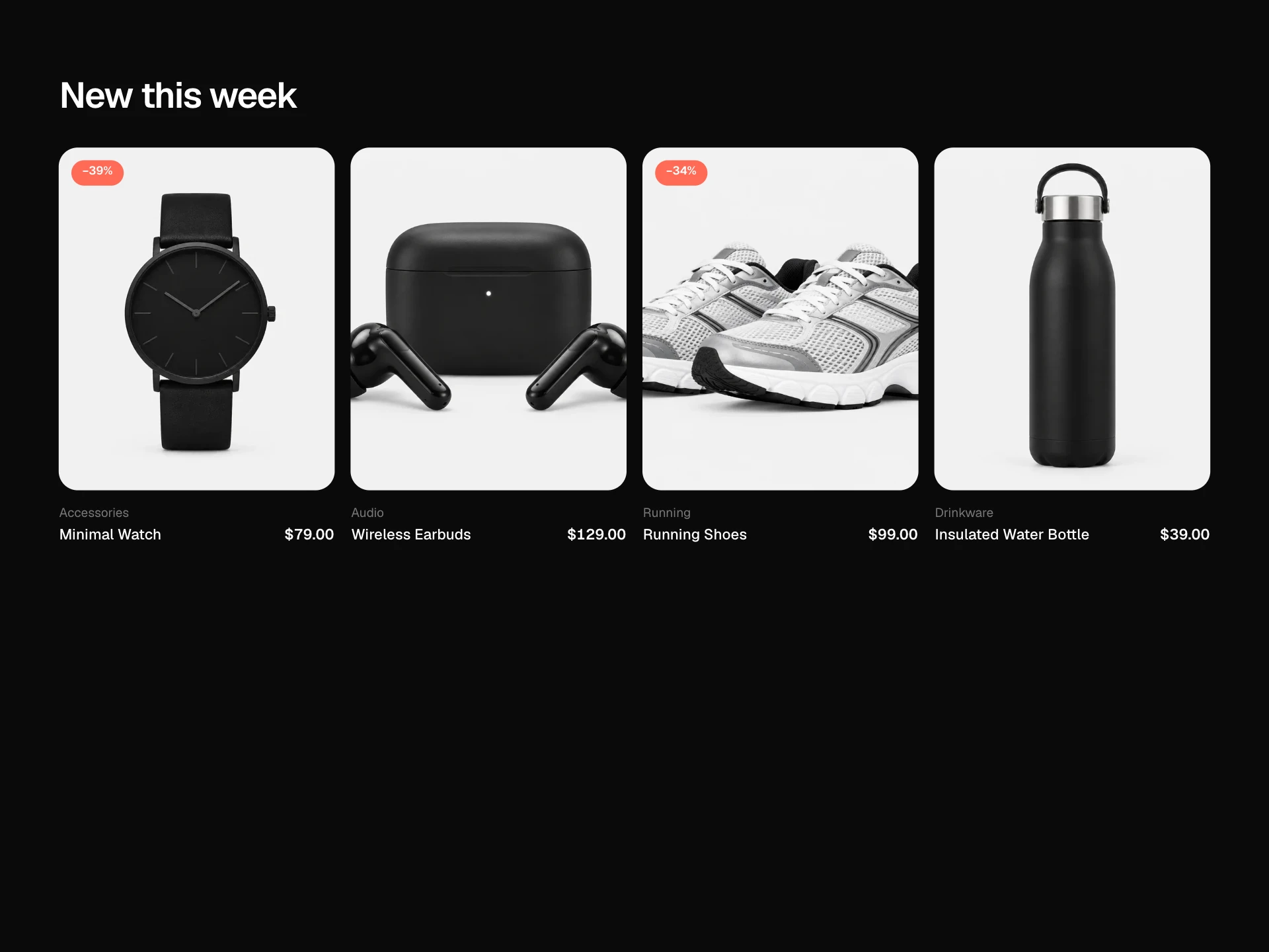
Related Products Block React component
A 'You may also like' product row: tabs for similar items and complete-the-setup picks, a snap-scrolling carousel with arrow buttons and a scroll progress bar, sale and new badges, wishlist hearts, quick add on hover with a running bag count, prices and ratings.
About the Related Products Block component
Related Products Block keeps shoppers browsing after they've seen a product. Two tabs separate 'more like this' from 'what goes with it', and a smooth snap carousel shows four products at a time on desktop and a swipeable row on phones.
Quick add puts items in the bag without leaving the page, the bag count confirms it, and the heart saves products for later. Sale badges and ratings help people decide at a glance.
When to use it
Use it under a product page, in the cart, on an order confirmation page or anywhere you show recommendations.
For a bundle with a combined price use Frequently Bought Together; for a big hero carousel use the Product Carousel Block.
Installation
Add the Related Products Block component to your project with the shadcn CLI. It lands in components/related-products-block.tsx as plain React + Tailwind CSS source you own and can edit.
npx shadcn@latest add @reactframe/related-products-blockOr copy the source by hand and install its dependencies:
npm install motion clsx tailwind-mergeProps
<RelatedProductsBlock /> accepts 7 props, all optional.
| Prop | Type | Default |
|---|---|---|
| title | string | "You may also like" |
| tabs | { id: string; label: string; products: RelatedProduct[] }[] | TABS |
| currency | string | "$" |
| onAddToCart Return a Promise to keep the card button busy until the cart updates. | (product: RelatedProduct) => void | Promise<void> | — |
| onToggleWishlist | (product: RelatedProduct, saved: boolean) => void | — |
| theme | "dark" | "light" | "dark" |
| className | string | — |
- titlestringDefault: "You may also like"
- tabs{ id: string; label: string; products: RelatedProduct[] }[]Default: TABS
- currencystringDefault: "$"
- onAddToCart
Return a Promise to keep the card button busy until the cart updates.
(product: RelatedProduct) => void | Promise<void> - onToggleWishlist(product: RelatedProduct, saved: boolean) => void
- theme"dark" | "light"Default: "dark"
- classNamestring
Collections
Use-case pages that compare Related Products Block with the other components that do a similar job.
npm dependencies
Installed for you by the shadcn CLI.
Related Products Block FAQ
- How do I feed recommendations?
- Pass tabs, each with an id, label and products. Use one tab if you only have one list; the tab row still works with a single item.
- Why animate scrollLeft instead of using scrollBy?
- A motion tween gives the same easing in every browser and respects reduced motion by jumping instead. Swiping and trackpads still scroll natively with snapping.
- Is quick add visible on phones?
- Yes. On narrow layouts the button is always visible because there's no hover; on desktop it slides up on hover or keyboard focus.
- What do the badges mean?
- Products with compareAtPrice show the discount percentage in red; otherwise an optional badge like 'New' appears in black.
- Is it accessible?
- Tabs are real tabs, the list has a label, arrows are labelled and disabled at the ends, hearts use aria-pressed with descriptive labels, and the bag count is announced.