Product Quick View Block React component
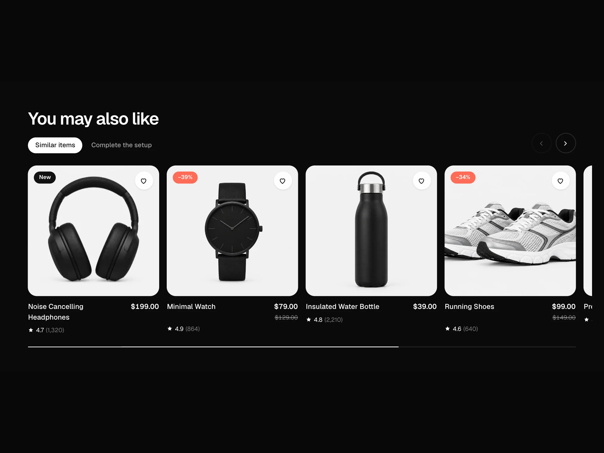
A product grid with quick view: hover a card for a 'Quick view' button that opens a dialog with an image gallery, rating, price, color and size choices, quantity and add to cart, plus previous / next to browse the grid without closing it.
About the Product Quick View Block component
Product Quick View Block lets shoppers check a product's photos, price and options straight from a product grid, without losing their place. The dialog has everything needed to buy, including color, size and quantity.
Previous and next buttons move through the grid inside the dialog, so comparing a few products is quick. Keyboard users get a proper dialog: focus moves in, stays inside and returns to the card on close.
When to use it
Use it on collection pages, search results and homepage product sections.
For a full product page use the Product Detail block; for a cart preview use the Mini Cart Drawer.
Installation
Add the Product Quick View Block component to your project with the shadcn CLI. It lands in components/product-quick-view-block.tsx as plain React + Tailwind CSS source you own and can edit.
npx shadcn@latest add @reactframe/product-quick-view-blockOr copy the source by hand and install its dependencies:
npm install motion clsx tailwind-mergeProps
<ProductQuickViewBlock /> accepts 6 props, all optional.
| Prop | Type | Default |
|---|---|---|
| title | string | "New this week" |
| products | QuickViewProduct[] | PRODUCTS |
| currency | string | "$" |
| onAddToCart Return a Promise to keep the dialog button busy until the cart updates. | (item: { product: QuickViewProduct; color?: string; size?: string; quantity: number }) => void | Promise<void> | — |
| theme | "dark" | "light" | "dark" |
| className | string | — |
- titlestringDefault: "New this week"
- productsQuickViewProduct[]Default: PRODUCTS
- currencystringDefault: "$"
- onAddToCart
Return a Promise to keep the dialog button busy until the cart updates.
(item: { product: QuickViewProduct; color?: string; size?: string; quantity: number }) => void | Promise<void> - theme"dark" | "light"Default: "dark"
- classNamestring
Collections
Use-case pages that compare Product Quick View Block with the other components that do a similar job.
npm dependencies
Installed for you by the shadcn CLI.
Product Quick View Block FAQ
- Why is the dialog inside the section?
- It's positioned over the block so it works anywhere you drop it, including inside previews and scrolling containers. Move the scrim to a portal if you want it to cover the whole page.
- What if a product has one image?
- The thumbnail row is hidden and the single photo fills the gallery.
- How are options chosen by default?
- The first color and the middle size are preselected when the dialog opens, and both reset when you move to another product.
- How do I connect the cart?
- onAddToCart receives the product, color, size and quantity. Return a Promise to keep the spinner until your cart responds; throw to reset the button.
- Is it accessible?
- The dialog is labelled by the product title, Escape and the scrim close it, Tab is trapped inside, focus returns to the trigger, options are radio groups, and add-to-cart changes are announced.