Checkout Form Block React component
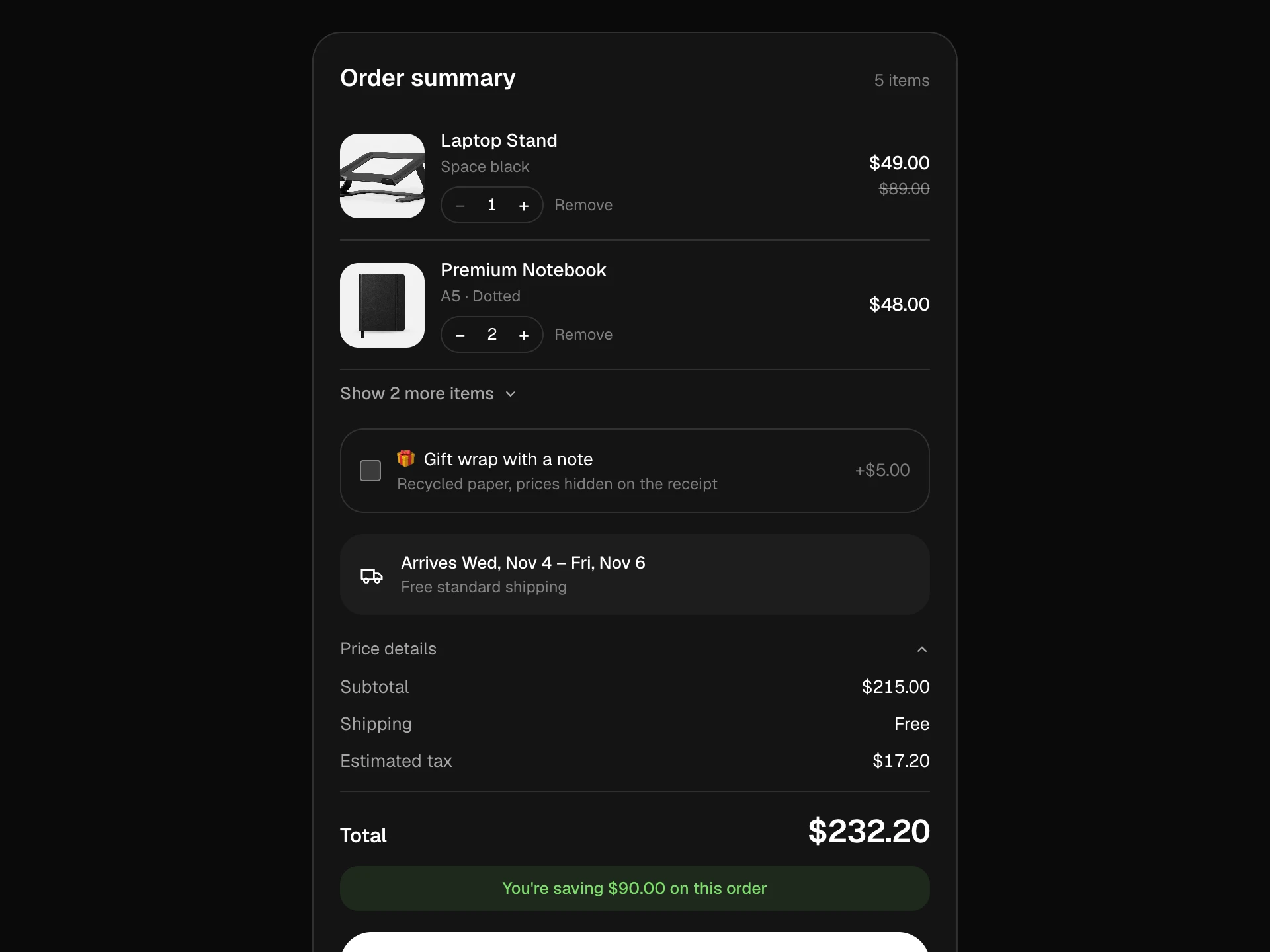
A one-page checkout: contact, delivery with shipping method cards (address fields fold away for pickup), card payment with live formatting and checksum validation, inline errors after blur, discount codes, a sticky order summary with a counting total (collapsible on phones) and a processing → confirmed flow.
About the Checkout Form Block component
Checkout Form Block keeps checkout to one calm page: contact, delivery and payment in three numbered steps, with the order summary always in view on desktop and one tap away on phones.
Fields format themselves (card number in groups, expiry as MM / YY), errors only appear once someone has left a field, and the total counts up or down as shipping and discount codes change, so there are no surprises at the end.
When to use it
Use it as the checkout page of a store, or as a design reference when wiring a payment provider's hosted fields.
For a stepped flow use the Multi-step Checkout Block; for an expanding accordion use Accordion Checkout.
Installation
Add the Checkout Form Block component to your project with the shadcn CLI. It lands in components/checkout-form-block.tsx as plain React + Tailwind CSS source you own and can edit.
npx shadcn@latest add @reactframe/checkout-form-blockOr copy the source by hand and install its dependencies:
npm install motion clsx tailwind-mergeProps
<CheckoutFormBlock /> accepts 7 props, all optional.
| Prop | Type | Default |
|---|---|---|
| items | { id: string; title: string; variant: string; price: number; quantity: number; image?: string }[] | ITEMS |
| currency | string | "$" |
| taxRate | number | 0.08 |
| codes Discount codes the demo accepts: code → percent off. | Record<string, number> | CODES |
| onPlaceOrder Return a Promise; reject with an Error to show its message. Card details are never passed. | (value: CheckoutValue) => void | Promise<void> | — |
| theme | "dark" | "light" | "dark" |
| className | string | — |
- items{ id: string; title: string; variant: string; price: number; quantity: number; image?: string }[]Default: ITEMS
- currencystringDefault: "$"
- taxRatenumberDefault: 0.08
- codes
Discount codes the demo accepts: code → percent off.
Record<string, number>Default: CODES - onPlaceOrder
Return a Promise; reject with an Error to show its message. Card details are never passed.
(value: CheckoutValue) => void | Promise<void> - theme"dark" | "light"Default: "dark"
- classNamestring
Collections
Use-case pages that compare Checkout Form Block with the other components that do a similar job.
npm dependencies
Installed for you by the shadcn CLI.
Checkout Form Block FAQ
- Is it safe to collect cards with these inputs?
- In production, replace the three card fields with your payment provider's secure, hosted fields. The block deliberately never passes card data to onPlaceOrder.
- How are discount codes checked?
- The codes prop maps codes to percent off for the demo. In production, validate on your server and pass the result back into the summary.
- What happens with pickup?
- Choosing 'Pick up in store' folds away the address fields and skips their validation.
- How are errors handled?
- Field errors show after blur and all at once on submit, and the first invalid field gets focus. Throw an Error from onPlaceOrder to show a message above the pay button.
- Is it accessible?
- Inputs have labels and autocomplete hints, errors are linked with aria-describedby, shipping options are a radio group, the summary toggle uses aria-expanded and the confirmation is a status region.