Product Carousel Block React component
A featured product carousel: one product per slide with a big title, specs, price and shop button, photos that glide in, autoplay with filling progress bars (pauses on hover, focus or the pause button), swipe and drag, arrow keys and prev / next buttons.
About the Product Carousel Block component
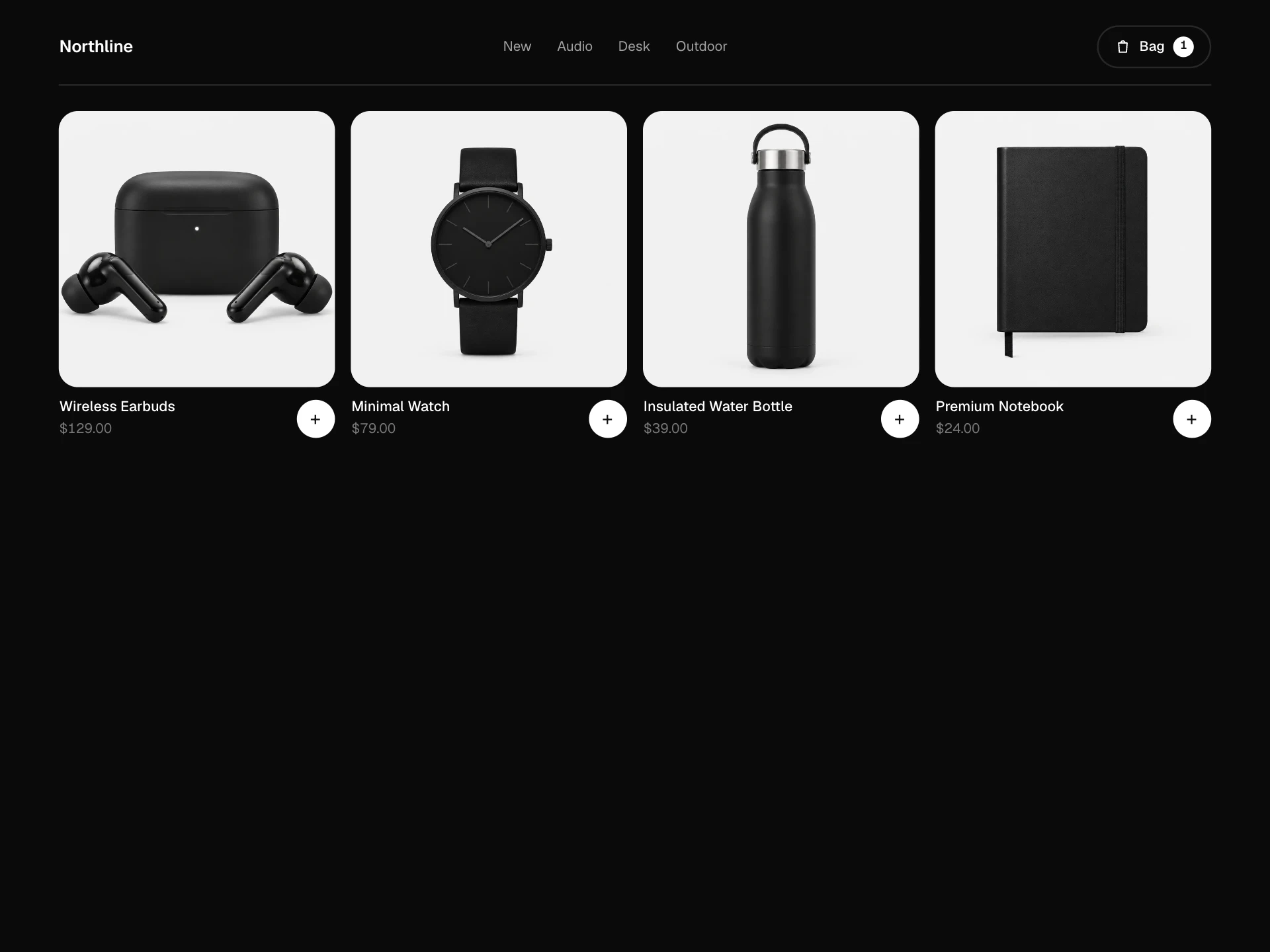
Product Carousel Block showcases a handful of hero products, one at a time, at the top of a store or campaign page. Each slide gets a big title, a few specs, the price and a single shop button, and the photo glides in for a sense of motion.
The progress bars double as navigation and show how long each slide stays. Autoplay politely stops while someone hovers, focuses or presses pause, and on touch screens slides follow a swipe.
When to use it
Use it as a homepage hero, a launch showcase, or a 'best of' section with three to five products.
For a row of many products use the Related Products Block; for a single product spotlight use the Product Highlight Block.
Installation
Add the Product Carousel Block component to your project with the shadcn CLI. It lands in components/product-carousel-block.tsx as plain React + Tailwind CSS source you own and can edit.
npx shadcn@latest add @reactframe/product-carousel-blockOr copy the source by hand and install its dependencies:
npm install motion clsx tailwind-mergeProps
<ProductCarouselBlock /> accepts 7 props, all optional.
| Prop | Type | Default |
|---|---|---|
| slides | CarouselSlide[] | SLIDES |
| interval Seconds per slide when autoplaying. | number | 5 |
| autoplay | boolean | true |
| currency | string | "$" |
| onShop | (slide: CarouselSlide) => void | — |
| theme | "dark" | "light" | "dark" |
| className | string | — |
- slidesCarouselSlide[]Default: SLIDES
- interval
Seconds per slide when autoplaying.
numberDefault: 5 - autoplaybooleanDefault: true
- currencystringDefault: "$"
- onShop(slide: CarouselSlide) => void
- theme"dark" | "light"Default: "dark"
- classNamestring
Collections
Use-case pages that compare Product Carousel Block with the other components that do a similar job.
npm dependencies
Installed for you by the shadcn CLI.
Product Carousel Block FAQ
- Why does the progress use a motion value instead of a timer?
- The bar and the slide change are driven by one motion animation, so they always finish together, pause exactly where they are and resume from the same point.
- How do I turn autoplay off?
- Pass autoplay={false}. With reduced motion it's off automatically and slides only change when people ask.
- What kind of images work best?
- Products on a plain light background the same color as the panel (#F1F1F1 by default). Images are contained, so wide and tall products both fit.
- Can people swipe on phones?
- Yes. Dragging or swiping past about 70px, or flicking quickly, moves to the next or previous slide.
- Is it accessible?
- It follows the carousel pattern: labelled slides, tabs for each product, prev / next and pause buttons, arrow-key support, and a live region that only speaks while autoplay is paused.