Mini Cart Drawer React component
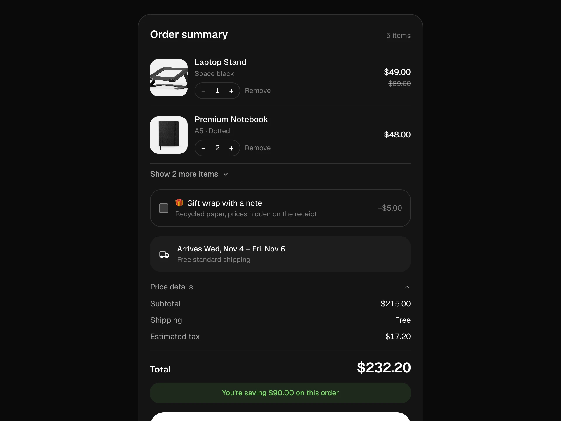
A slide-in cart drawer with a store header and product row: adding a product bumps the bag count and opens the drawer, which shows a free-shipping progress bar, line items with steppers (the last one becomes a remove), a 'goes well with' upsell, an animated subtotal and checkout.
About the Mini Cart Drawer component
Mini Cart Drawer is the cart that slides in after 'add to bag', so shoppers see what they've added without leaving the page. The bag count in the header pops, the new line flashes in, and the free-shipping bar shows how close they are to free delivery.
Quantities can be changed right in the drawer, the last item's minus becomes a remove, and a single 'goes well with' suggestion offers an easy add-on before checkout.
When to use it
Use it in any store header as the add-to-cart confirmation and quick cart.
For a small dropdown under the bag icon use the Mini Cart Dropdown; for a centered confirmation use the Cart Modal.
Installation
Add the Mini Cart Drawer component to your project with the shadcn CLI. It lands in components/mini-cart-drawer.tsx as plain React + Tailwind CSS source you own and can edit.
npx shadcn@latest add @reactframe/mini-cart-drawerOr copy the source by hand and install its dependencies:
npm install motion clsx tailwind-mergeProps
<MiniCartDrawer /> accepts 9 props (required ones are marked *).
| Prop | Type | Default |
|---|---|---|
| store | string | "Northline" |
| products | { id: string; title: string; variant: string; price: number; image?: string }[] | PRODUCTS |
| initialCart | { id: string; quantity: number }[] | [{ id: "notebook", quantity: 1 }] |
| freeShippingAt | number | 150 |
| upsell | object | UPSELL |
| upsell.id* | string | — |
| upsell.title* | string | — |
| upsell.variant* | string | — |
| upsell.price* | number | — |
| upsell.image | string | — |
| currency | string | "$" |
| onCheckout | (lines: { product: DrawerProduct; quantity: number }[]) => void | — |
- storestringDefault: "Northline"
- products{ id: string; title: string; variant: string; price: number; image?: string }[]Default: PRODUCTS
- initialCart{ id: string; quantity: number }[]Default: [{ id: "notebook", quantity: 1 }]
- freeShippingAtnumberDefault: 150
- upsellobjectDefault: UPSELL
- upsell.id*string
- upsell.title*string
- upsell.variant*string
- upsell.price*number
- upsell.imagestring
- currencystringDefault: "$"
- onCheckout(lines: { product: DrawerProduct; quantity: number }[]) => void
Show all 14 propsShow fewer
| theme | "dark" | "light" | "dark" |
| className | string | — |
- theme"dark" | "light"Default: "dark"
- classNamestring
Collections
Use-case pages that compare Mini Cart Drawer with the other components that do a similar job.
npm dependencies
Installed for you by the shadcn CLI.
Mini Cart Drawer FAQ
- How do I connect it to my cart?
- Pass your cart as initialCart and products to look up details. Replace the local cart state with your cart store, keeping add and setQty as the two actions.
- Why is the drawer inside the section?
- It's positioned over the block so it works in previews and any layout. Move the scrim and panel into a portal to cover the whole page.
- How does the free-shipping bar work?
- It compares the subtotal with freeShippingAt, shows the amount still needed and turns green once it's reached.
- Can I hide the upsell?
- It hides automatically once the item is in the cart or when the cart is empty. Remove the upsell prop handling in your copy to drop it entirely.
- Is it accessible?
- The drawer is a labelled modal dialog; Escape and the scrim close it and focus returns to the Bag button. Steppers have per-product labels and the free-shipping message is announced.