Order Bump Block React component
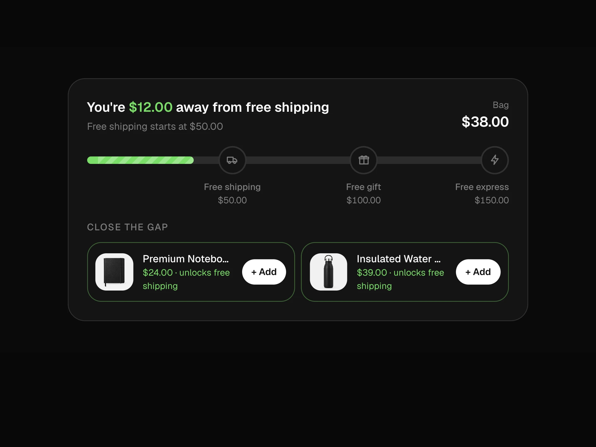
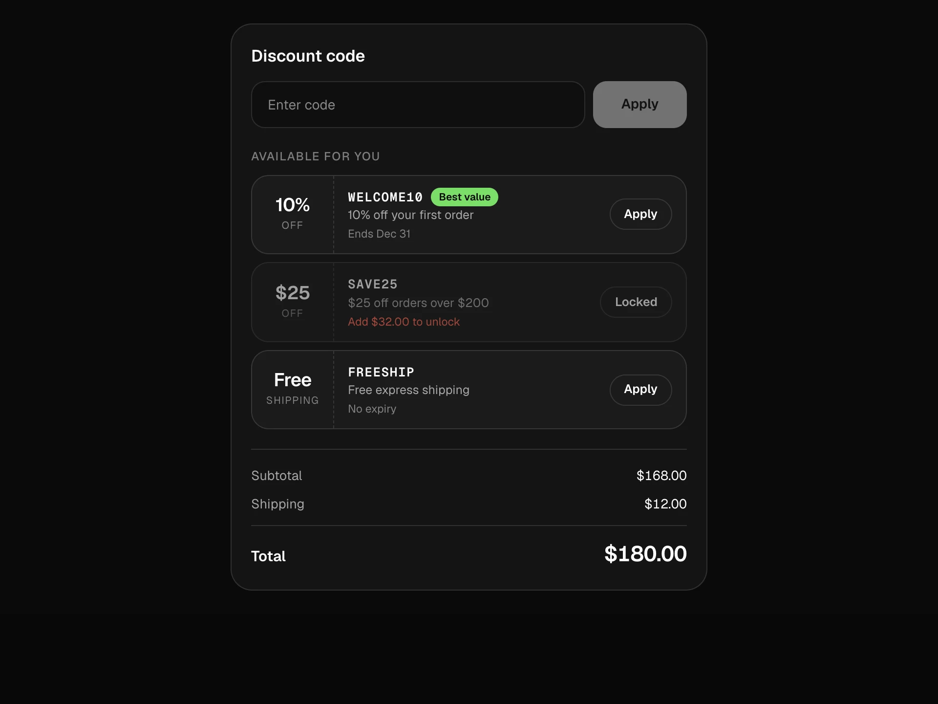
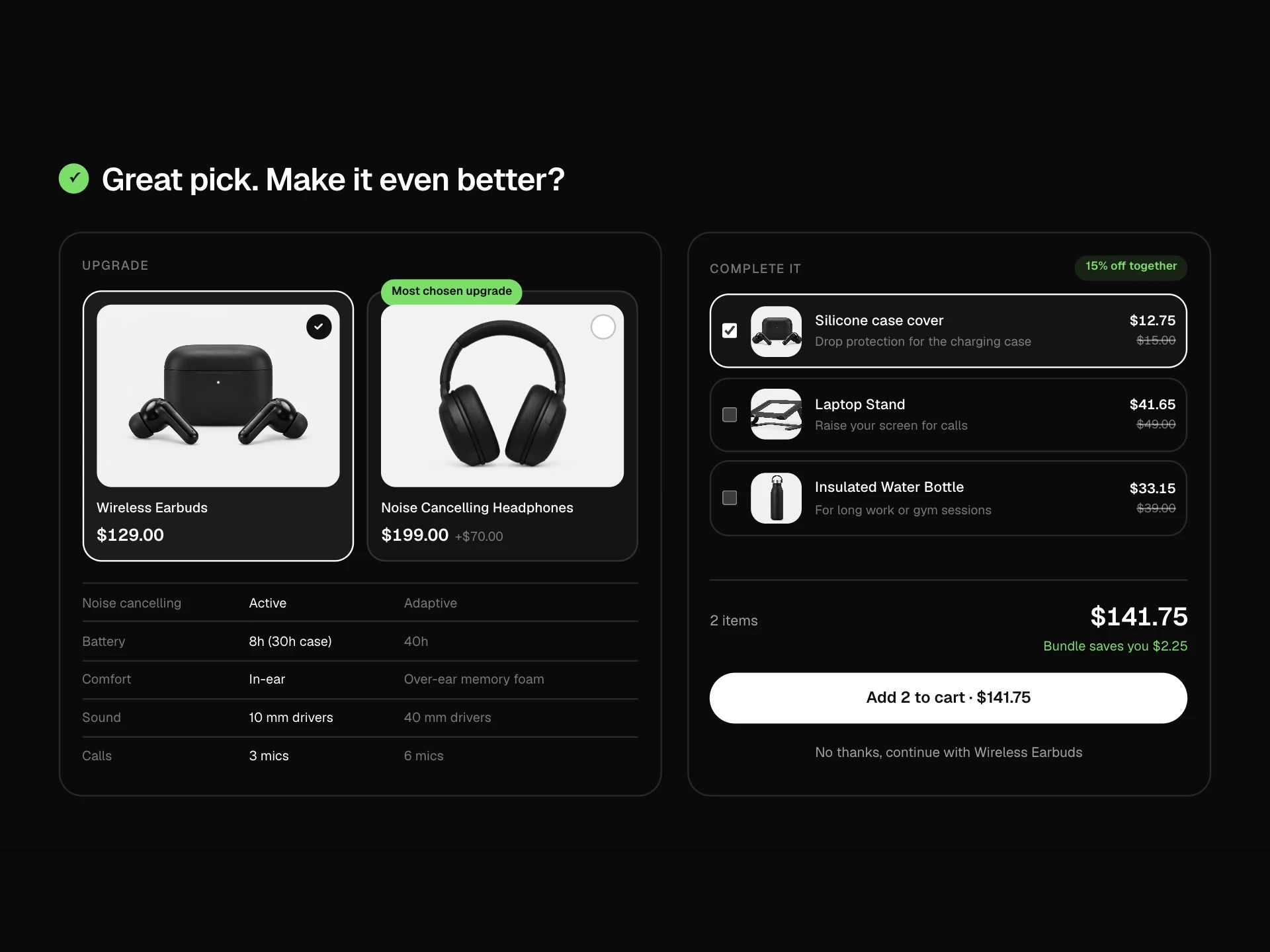
A checkout order bump: the main item plus one-time add-on offers in dashed boxes with a pulsing arrow and a passing shine, a checkbox that draws its check, discounted prices, option pills that unfold once added, summary lines that fold in, a counting total and a savings note.
About the Order Bump Block component
Order Bump Block adds one or two relevant extras right before payment, where a single click is all it takes. Each offer explains why it's worth it, shows the discounted price clearly and can be undone just as easily.
The motion draws the eye without nagging: a nudging arrow and a gentle shine on the first offer, a satisfying check when added, and a total that counts up so the new price is never a surprise.
When to use it
Use it in checkout or the cart for small, related add-ons like accessories, protection plans or refills.
For product recommendations in a carousel use the Related Products Block; for bundles use Frequently Bought Together.
Installation
Add the Order Bump Block component to your project with the shadcn CLI. It lands in components/order-bump-block.tsx as plain React + Tailwind CSS source you own and can edit.
npx shadcn@latest add @reactframe/order-bump-blockOr copy the source by hand and install its dependencies:
npm install motion clsx tailwind-mergeProps
<OrderBumpBlock /> accepts 8 props, all optional.
| Prop | Type | Default |
|---|---|---|
| item | { title: string; variant: string; price: number; image?: string } | ITEM |
| bumps | { id: string; title: string; pitch: string; price: number; compareAtPrice: number; image?: string; options?: string[] }[] | BUMPS |
| shipping | number | 0 |
| currency | string | "$" |
| onChange | (selected: { id: string; option?: string }[]) => void | — |
| onCheckout | (total: number) => void | — |
| theme | "dark" | "light" | "dark" |
| className | string | — |
- item{ title: string; variant: string; price: number; image?: string }Default: ITEM
- bumps{ id: string; title: string; pitch: string; price: number; compareAtPrice: number; image?: string; options?: string[] }[]Default: BUMPS
- shippingnumberDefault: 0
- currencystringDefault: "$"
- onChange(selected: { id: string; option?: string }[]) => void
- onCheckout(total: number) => void
- theme"dark" | "light"Default: "dark"
- classNamestring
Collections
Use-case pages that compare Order Bump Block with the other components that do a similar job.
npm dependencies
Installed for you by the shadcn CLI.
Order Bump Block FAQ
- How many bumps should I show?
- One or two. More than that starts to feel like an upsell wall and lowers conversion on the main order.
- How do I save the choice?
- onChange receives the selected bumps with their chosen option whenever a box is ticked or unticked.
- Can a bump have sizes or colors?
- Yes, give it options. They appear as pills once the bump is added, and the choice shows in the summary line.
- Is the shine distracting?
- It only plays on the first, unselected offer, pauses between sweeps and stops entirely with reduced motion.
- Is it accessible?
- Each offer is a real checkbox with a full label, options are a labelled radio group, decorative motion is hidden from screen readers and the savings note is announced.