What's New / In-app Changelog Widget React component
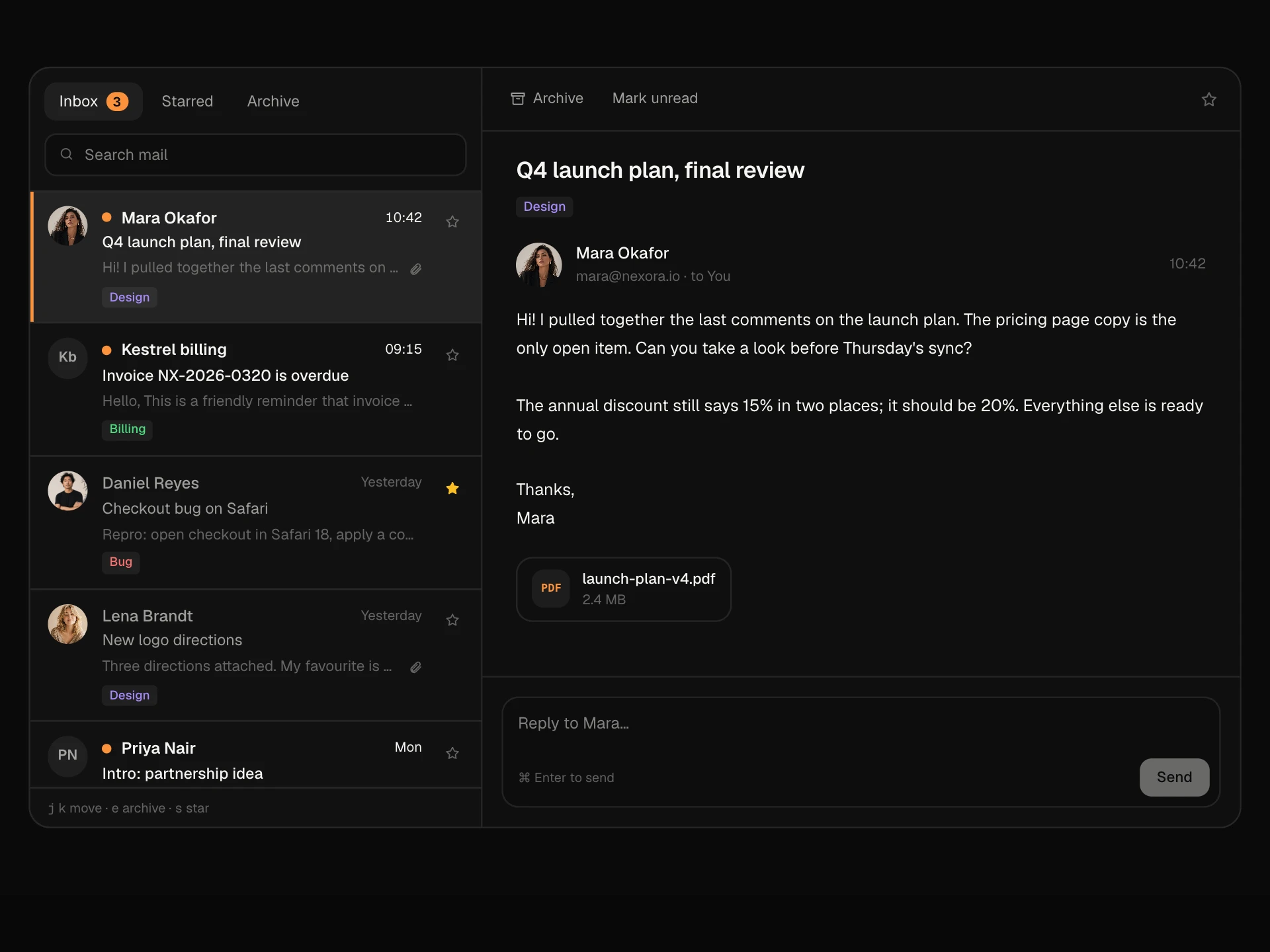
An in-app changelog that opens from a ✦ What's new button with an unread count: a spotlight card for the big release, New, Improved and Fixed tags with filter tabs, entries that expand for details, unread dots, Mark all as read, a Helpful? vote on each update and an email subscription switch.
About the What's New / In-app Changelog Widget component
What's New Widget brings your changelog into the app. A small ✦ What's new button in the header shows how many updates someone hasn't seen and opens a panel with the latest releases: one big spotlight for the headline feature and a tidy list of everything else, each tagged New, Improved or Fixed.
Entries open for details and a link to the full note, unread dots clear as people look at them, and each update asks whether it was helpful so you learn which releases land. People can mark everything as read and turn on product update emails from the same panel.
When to use it
Use it in the header or sidebar of any SaaS product, admin panel or internal tool that ships updates often.
Feature one update at a time, keep summaries to a sentence and link out to the full release note.
Installation
Add the What's New / In-app Changelog Widget component to your project with the shadcn CLI. It lands in components/whats-new-widget.tsx as plain React + Tailwind CSS source you own and can edit.
npx shadcn@latest add @reactframe/whats-new-widgetOr copy the source by hand and install its dependencies:
npm install motion clsx tailwind-mergeProps
<WhatsNewWidget /> accepts 7 props, all optional.
| Prop | Type | Default |
|---|---|---|
| title | string | "What's new" |
| updates | ProductUpdate[] | DEFAULT_UPDATES |
| defaultOpen Start with the panel open. | boolean | true |
| onFeedback | (id: string, helpful: boolean) => void | — |
| onSubscribe | (on: boolean) => void | — |
| theme | "dark" | "light" | "dark" |
| className | string | — |
- titlestringDefault: "What's new"
- updatesProductUpdate[]Default: DEFAULT_UPDATES
- defaultOpen
Start with the panel open.
booleanDefault: true - onFeedback(id: string, helpful: boolean) => void
- onSubscribe(on: boolean) => void
- theme"dark" | "light"Default: "dark"
- classNamestring
npm dependencies
Installed for you by the shadcn CLI.
What's New / In-app Changelog Widget FAQ
- How are unread updates worked out?
- Each update has an unread flag. Set it by comparing the publish date with when the user last opened the panel, and save that time when they open it or press Mark all as read.
- Can I hide the sample app around it?
- Yes. The top bar and skeleton content are there for the demo; lift the trigger button and panel into your own header.
- What does the feedback do?
- Thumbs up or down calls onFeedback with the update id and a boolean, then shows a short thank-you. Send it to your analytics to see which releases people value.
- Which update becomes the spotlight?
- The first update with featured: true, shown only under the All tab. Others appear as compact rows.
- Is it accessible?
- The trigger announces the unread count and whether the panel is open, the panel is a labelled dialog that closes with Escape and returns focus, filters are a tablist, rows use aria-expanded and the email option is a switch.