App Shell, Sidebar Layout React component
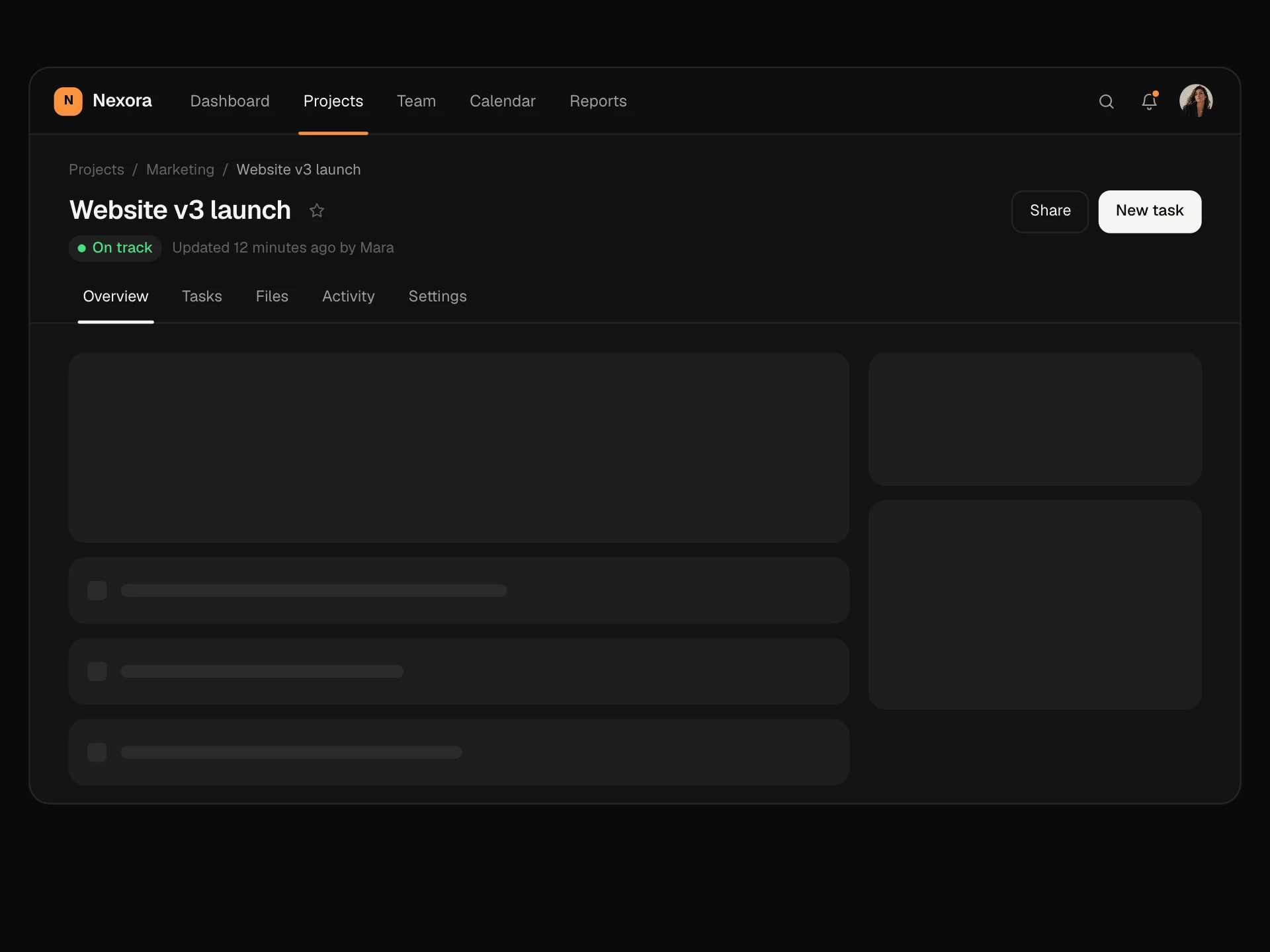
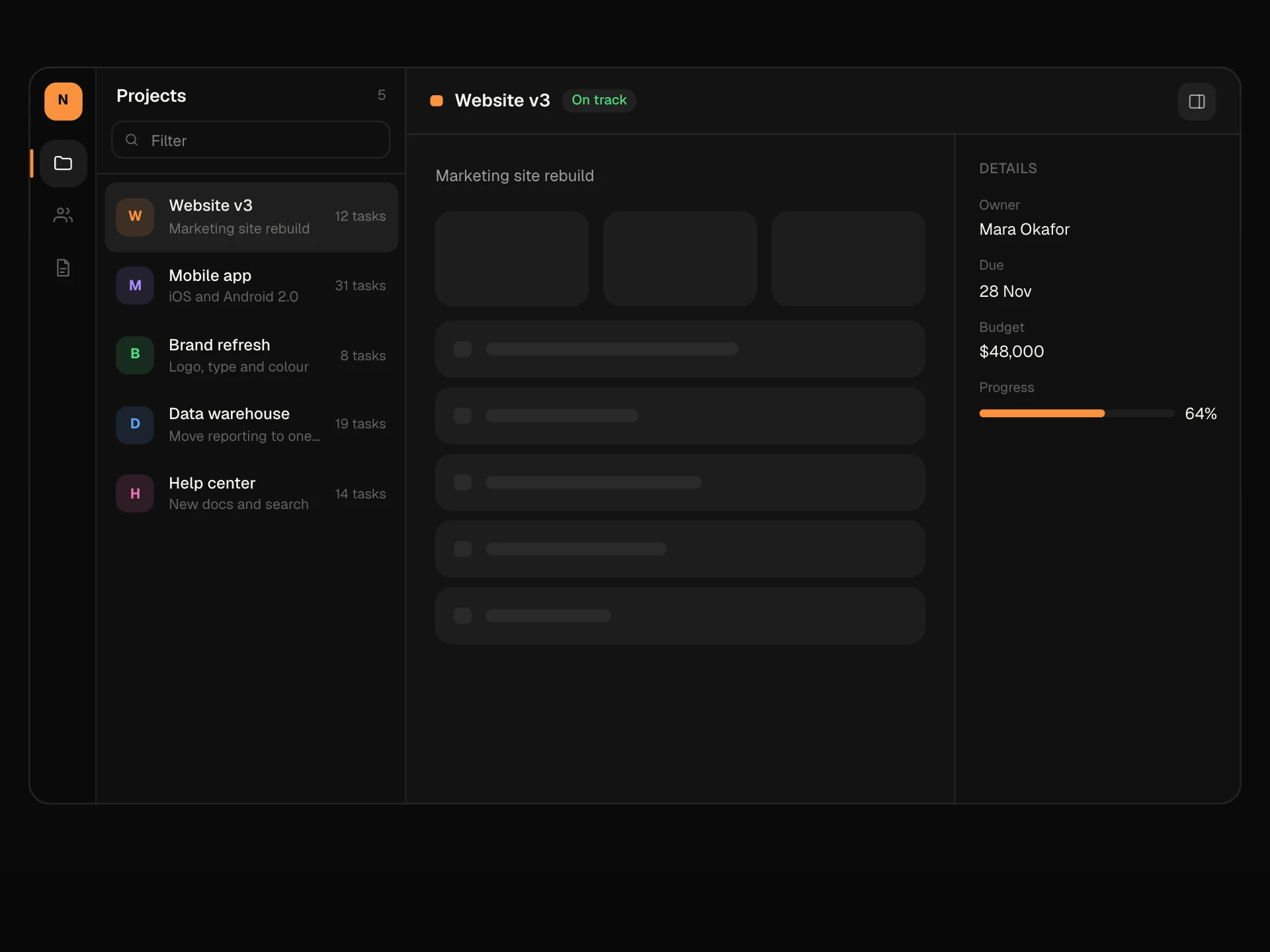
An application shell with a left sidebar: workspace switcher, main navigation with badges and a sliding active highlight, a collapsible Projects group, Docs and Settings, a user menu, a top bar with breadcrumb, ⌘K search and a New button, a sidebar that collapses to icons, and an off-canvas drawer on phones.
About the App Shell, Sidebar Layout component
App Shell, Sidebar Layout is the frame most dashboards are built in: a sidebar on the left with your workspace, navigation and projects, a top bar with breadcrumbs, search and a primary action, and your page in the middle.
The details are in place: switch workspaces from the top of the sidebar, see unread counts on items, fold the Projects group, open the account menu at the bottom, and collapse the whole sidebar to icons to give the page more room. On phones the same sidebar slides in as a drawer.
When to use it
Use it as the layout for SaaS dashboards, admin panels, internal tools and anything with more than five or six sections.
Put rarely used destinations like Docs and Settings at the bottom so the main list stays short.
Installation
Add the App Shell, Sidebar Layout component to your project with the shadcn CLI. It lands in components/app-shell-sidebar.tsx as plain React + Tailwind CSS source you own and can edit.
npx shadcn@latest add @reactframe/app-shell-sidebarOr copy the source by hand and install its dependencies:
npm install motion clsx tailwind-mergeProps
<AppShellSidebar /> accepts 8 props, all optional.
| Prop | Type | Default |
|---|---|---|
| workspaces | { id: string; name: string; plan: string; color: string }[] | DEFAULT_WORKSPACES |
| nav | { id: string; label: string; icon: ShellIcon; badge?: number }[] | DEFAULT_NAV |
| projects | { id: string; name: string; color: string }[] | DEFAULT_PROJECTS |
| user | { name: string; email: string; avatar?: string } | DEFAULT_USER |
| children Page content. A sample page is shown when empty. | React.ReactNode | — |
| defaultCollapsed | boolean | false |
| theme | "dark" | "light" | "dark" |
| className | string | — |
- workspaces{ id: string; name: string; plan: string; color: string }[]Default: DEFAULT_WORKSPACES
- nav{ id: string; label: string; icon: ShellIcon; badge?: number }[]Default: DEFAULT_NAV
- projects{ id: string; name: string; color: string }[]Default: DEFAULT_PROJECTS
- user{ name: string; email: string; avatar?: string }Default: DEFAULT_USER
- children
Page content. A sample page is shown when empty.
React.ReactNode - defaultCollapsedbooleanDefault: false
- theme"dark" | "light"Default: "dark"
- classNamestring
npm dependencies
Installed for you by the shadcn CLI.
App Shell, Sidebar Layout FAQ
- How do I use it as my app layout?
- Wrap your pages with it and pass children; the sample page only shows when there are no children. Wire nav clicks to your router by replacing setActive with navigation and setting active from the current path.
- Can the sidebar collapse?
- Yes. The button in the top bar springs it from 240px to 64px. Collapsed items show only icons, with tooltips and dot badges. Start collapsed with defaultCollapsed.
- What happens on phones?
- Below about 760px the sidebar hides and a menu button opens it as a drawer over the page with a dimmed backdrop. Choosing an item, tapping the backdrop or pressing Escape closes it.
- Can I change the icons?
- The shell ships nine line icons for common sections. Add more to the ICONS map and use their keys in nav.
- Is it accessible?
- The sidebar is a nav landmark, the current item has aria-current='page', the workspace and user menus use menu roles with Escape to close, the collapse toggle is a pressed button and the breadcrumb is a labelled nav.