Detail Screen React component
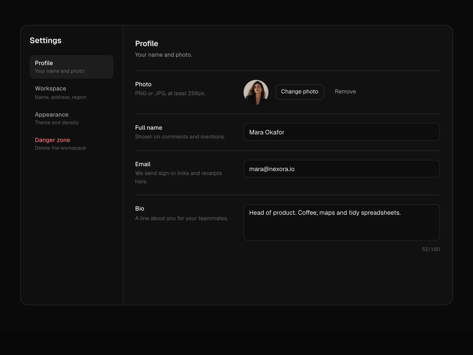
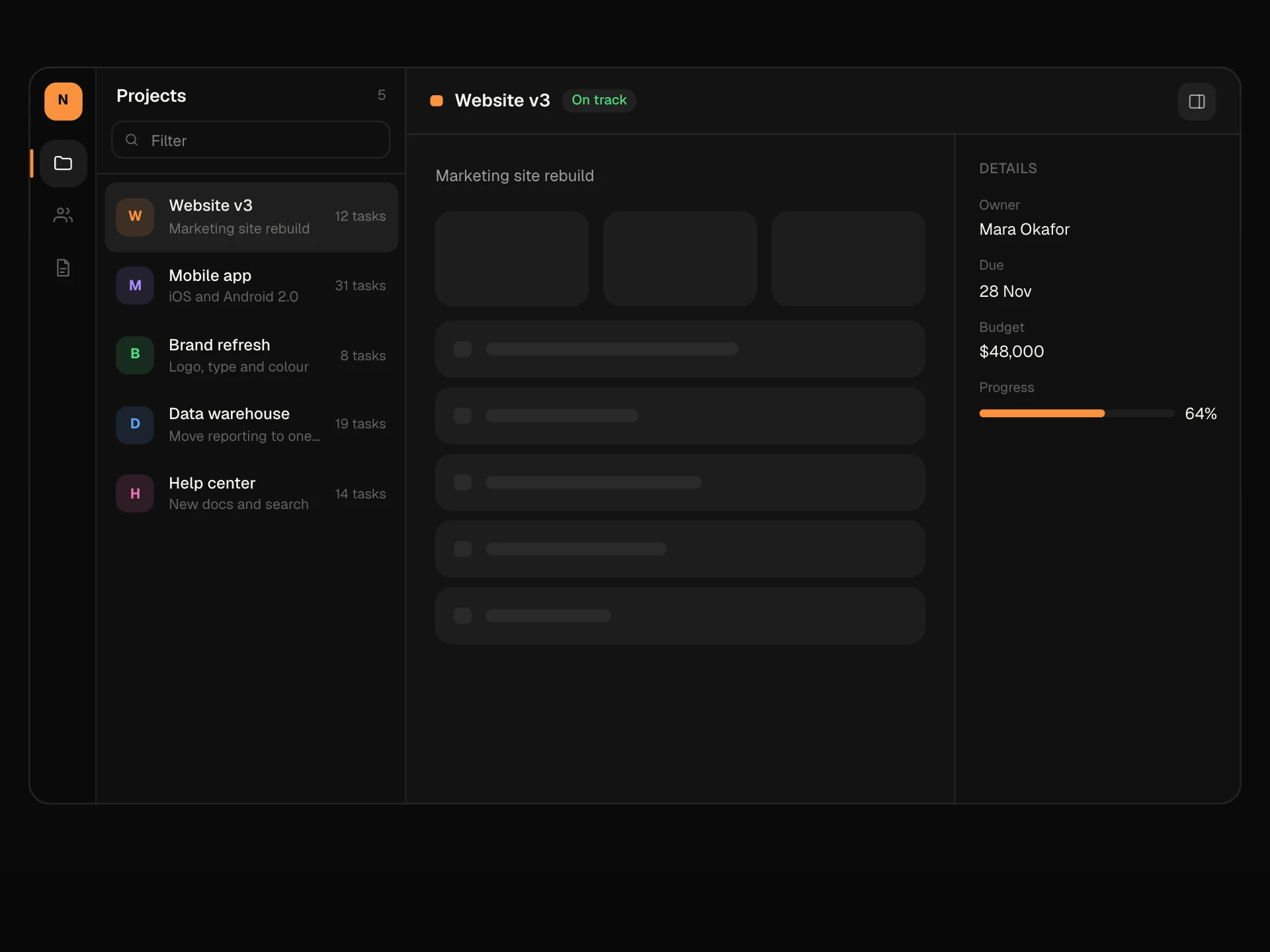
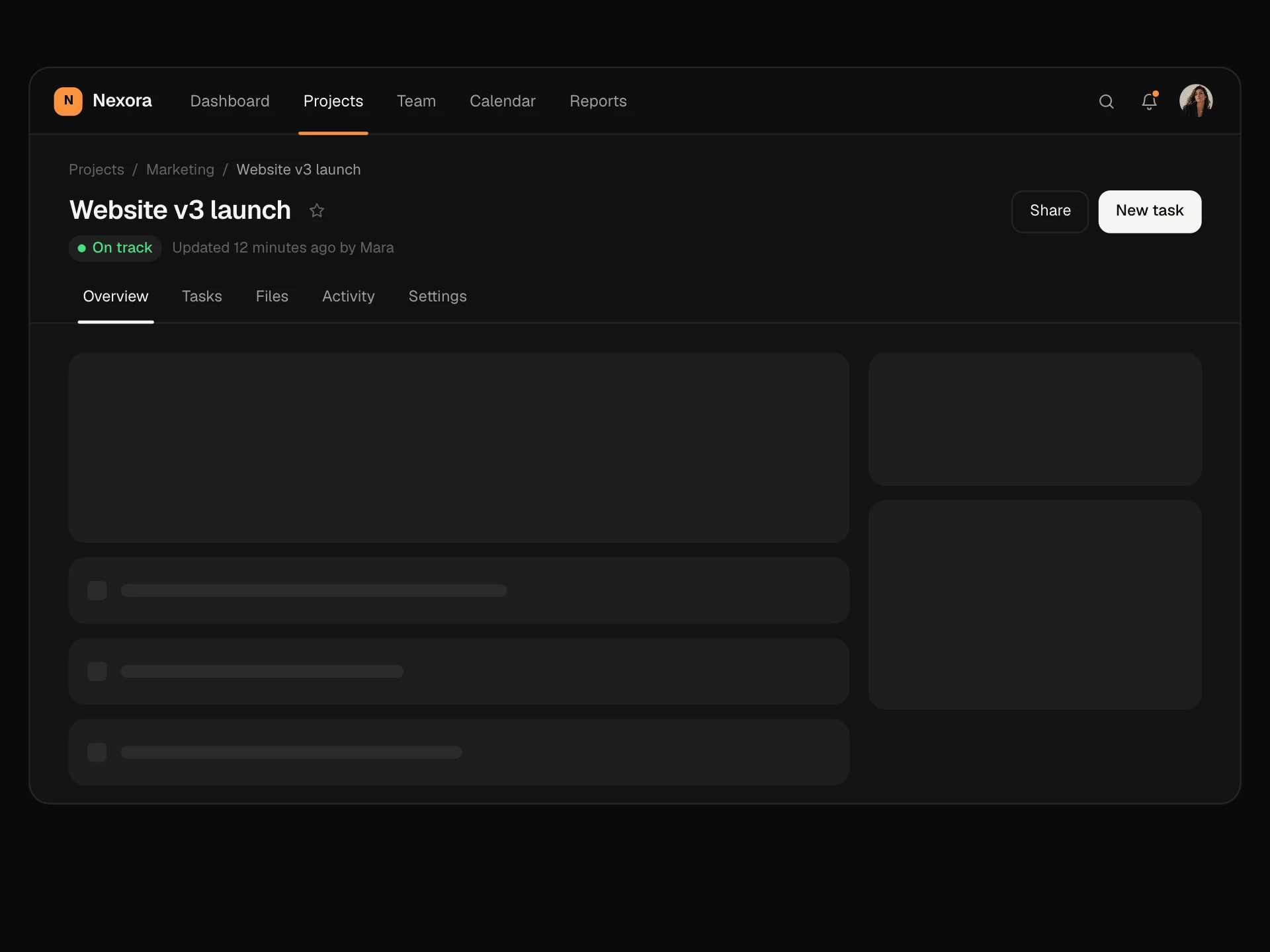
A full record page for a customer, project or account: header with status, Follow, a primary action and a More menu, a stats strip, Overview, Activity and Notes tabs, fields you edit in place with Enter or Escape and a Saved tick, plus a sidebar with owner, removable tags and open deals.
About the Detail Screen component
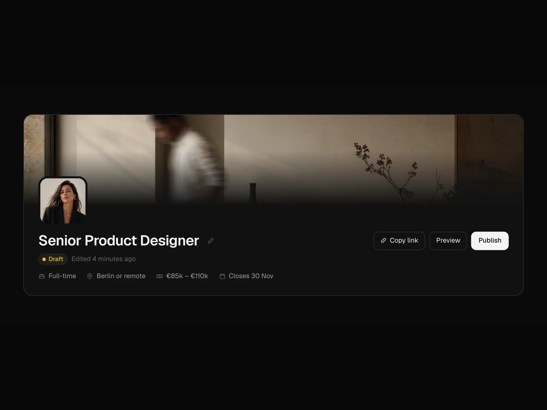
Detail Screen is the page you land on when you open one record: a customer, a project, an account. The header says who or what it is, its status and the key numbers, with the actions you take most next to it and the rest in a More menu.
Details are edited where they sit: click a value, change it and press Enter, and a small Saved confirms it. Activity shows what happened to the record, Notes keeps the team's context, and the sidebar holds the owner, tags you can add or remove on the spot and related deals.
When to use it
Use it for CRM contacts and accounts, project pages, user profiles in an admin panel, orders or tickets.
Keep editable fields in the main column and identifiers like IDs read-only so they never get changed by accident.
Installation
Add the Detail Screen component to your project with the shadcn CLI. It lands in components/detail-screen.tsx as plain React + Tailwind CSS source you own and can edit.
npx shadcn@latest add @reactframe/detail-screenOr copy the source by hand and install its dependencies:
npm install motion clsx tailwind-mergeProps
<DetailScreen /> accepts 9 props, all optional.
| Prop | Type | Default |
|---|---|---|
| record | { name: string; subtitle: string; avatar?: string; status: string; since: string } | DEFAULT_RECORD |
| stats | { label: string; value: string }[] | DEFAULT_STATS |
| fields | { key: string; label: string; value: string; editable?: boolean; type?: "text" | "email" | "url" | "select"; options?: string[] }[] | DEFAULT_FIELDS |
| tags | string[] | ["Enterprise", "Design", "Priority"] |
| owner | { name: string; avatar?: string } | { name: "Mara Okafor", avatar: "/demo/44.webp" } |
| events | { id: string; who: string; what: string; when: string }[] | DEFAULT_EVENTS |
| onFieldChange | (key: string, value: string) => void | — |
| theme | "dark" | "light" | "dark" |
| className | string | — |
- record{ name: string; subtitle: string; avatar?: string; status: string; since: string }Default: DEFAULT_RECORD
- stats{ label: string; value: string }[]Default: DEFAULT_STATS
- fields{ key: string; label: string; value: string; editable?: boolean; type?: "text" | "email" | "url" | "select"; options?: string[] }[]Default: DEFAULT_FIELDS
- tagsstring[]Default: ["Enterprise", "Design", "Priority"]
- owner{ name: string; avatar?: string }Default: { name: "Mara Okafor", avatar: "/demo/44.webp" }
- events{ id: string; who: string; what: string; when: string }[]Default: DEFAULT_EVENTS
- onFieldChange(key: string, value: string) => void
- theme"dark" | "light"Default: "dark"
- classNamestring
npm dependencies
Installed for you by the shadcn CLI.
Detail Screen FAQ
- How does inline editing work?
- Editable values are buttons. Clicking one swaps in an input or select with the text selected. Enter or clicking away saves and calls onFieldChange; Escape cancels. Empty or unchanged values are ignored.
- Can a field be a dropdown?
- Yes. Set type: 'select' and pass options. The select opens in place and saves when you pick or leave it.
- Are tags and notes saved?
- They live in component state in this block. Add callbacks the same way as onFieldChange to send them to your backend.
- What does the More menu do?
- It holds less common actions: Merge, Export, Copy account ID (which copies to the clipboard) and Archive. Replace them with your own actions.
- Is it accessible?
- Editable values have labels like 'Email: priya@halcyon.app. Edit', inputs keep the field label, Saved is announced, sections use the tablist pattern, the More menu uses menu roles with Escape, and tags have named remove buttons.