Section Heading React component
A section heading for inside a page: title with a count, description, a search that expands from an icon, a primary action, status tabs with counts, a sort menu and a grid or list switch, wired to the content under it so filtering, sorting and layout changes animate.
About the Section Heading component
Section Heading is the header that sits above a group of content inside a page, such as a project list or a set of reports. It names the section and says how many items it holds, and gathers the controls people use on that list: search, a primary action, status tabs, sorting and a choice between cards and rows.
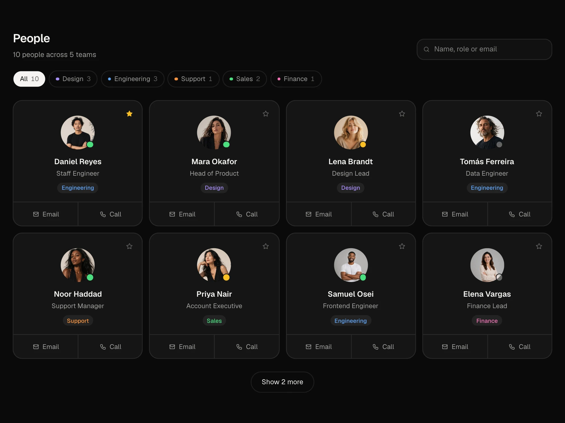
The controls are connected to the content below, so this block shows the whole pattern working: switch a tab and the cards filter, change the sort and they reorder, flip to list and they become compact rows, all with smooth layout animation. The search hides behind an icon until it is needed.
When to use it
Use it above lists, grids and tables in dashboards, settings pages, project tools and admin panels.
Show counts on tabs so people know what each filter holds before clicking it.
Installation
Add the Section Heading component to your project with the shadcn CLI. It lands in components/section-heading.tsx as plain React + Tailwind CSS source you own and can edit.
npx shadcn@latest add @reactframe/section-headingOr copy the source by hand and install its dependencies:
npm install motion clsx tailwind-mergeProps
<SectionHeading /> accepts 7 props, all optional.
| Prop | Type | Default |
|---|---|---|
| title | string | "Projects" |
| description | string | "Everything your team is working on, in one place." |
| items | { id: string; title: string; owner: string; status: "active" | "paused" | "archived"; updated: number; color: string; progress: number }[] | DEFAULT_ITEMS |
| actionLabel | string | "New project" |
| onAction | () => void | — |
| theme | "dark" | "light" | "dark" |
| className | string | — |
- titlestringDefault: "Projects"
- descriptionstringDefault: "Everything your team is working on, in one place."
- items{ id: string; title: string; owner: string; status: "active" | "paused" | "archived"; updated: number; color: string; progress: number }[]Default: DEFAULT_ITEMS
- actionLabelstringDefault: "New project"
- onAction() => void
- theme"dark" | "light"Default: "dark"
- classNamestring
npm dependencies
Installed for you by the shadcn CLI.
Section Heading FAQ
- Can I use just the heading with my own content?
- Yes. Keep the heading and toolbar and replace the list at the bottom with your table or grid, using the tab, sort, view and search state.
- How does the search work?
- The icon expands into an input that gets focus. It matches titles and owners as you type, and collapses again when you leave it empty or press Escape.
- What can people sort by?
- Last updated, name and progress. Add options to the SORTS list and a matching rule in the sort function.
- Does it work on phones?
- The search and action move under the title, tabs scroll sideways if needed and cards drop to one column.
- Is it accessible?
- Filters are a tablist with counts, the sort control opens a listbox with aria-selected options, the layout switch is a radiogroup, the search has a label and the list announces changes politely.