Card Heading React component
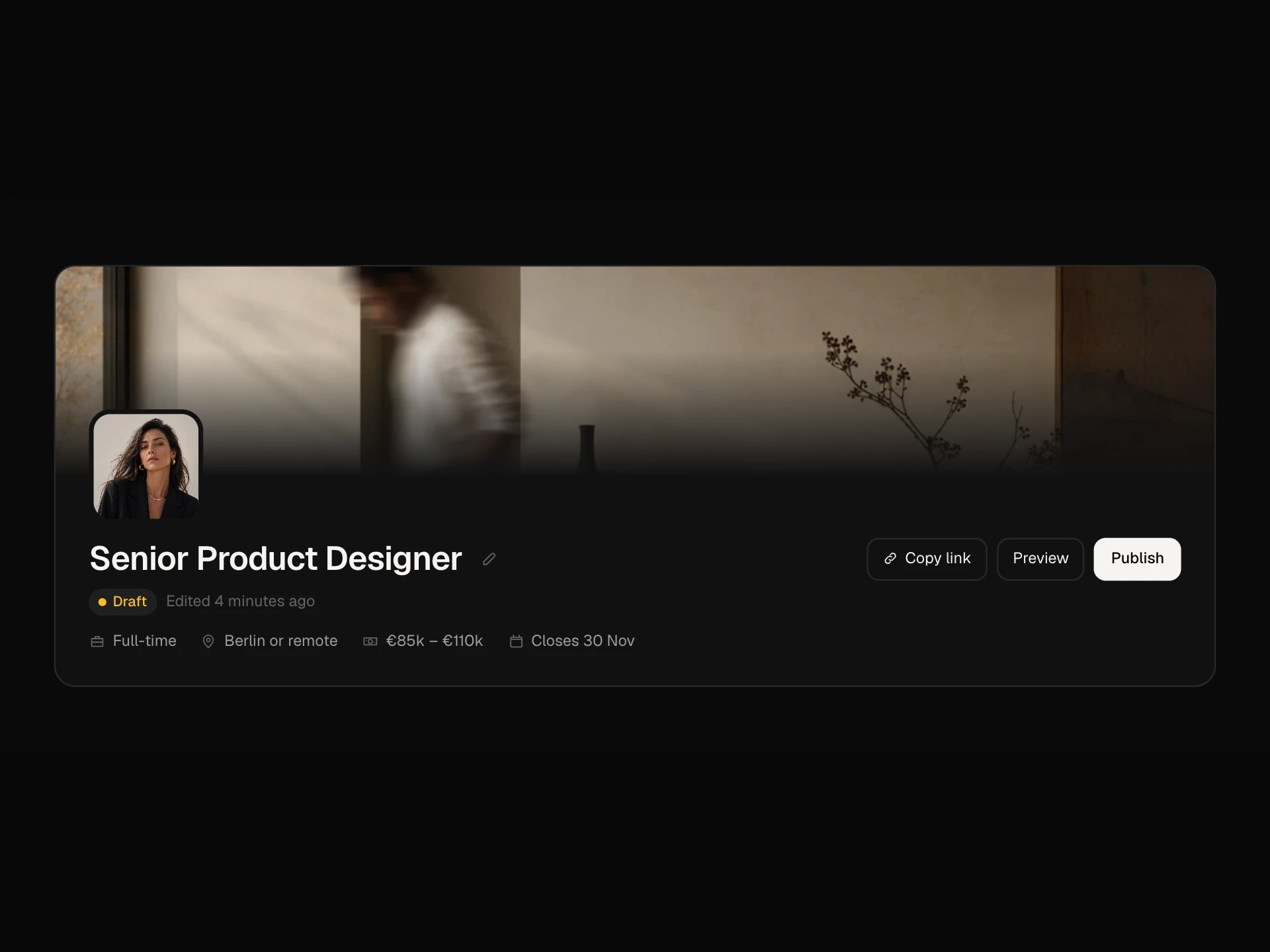
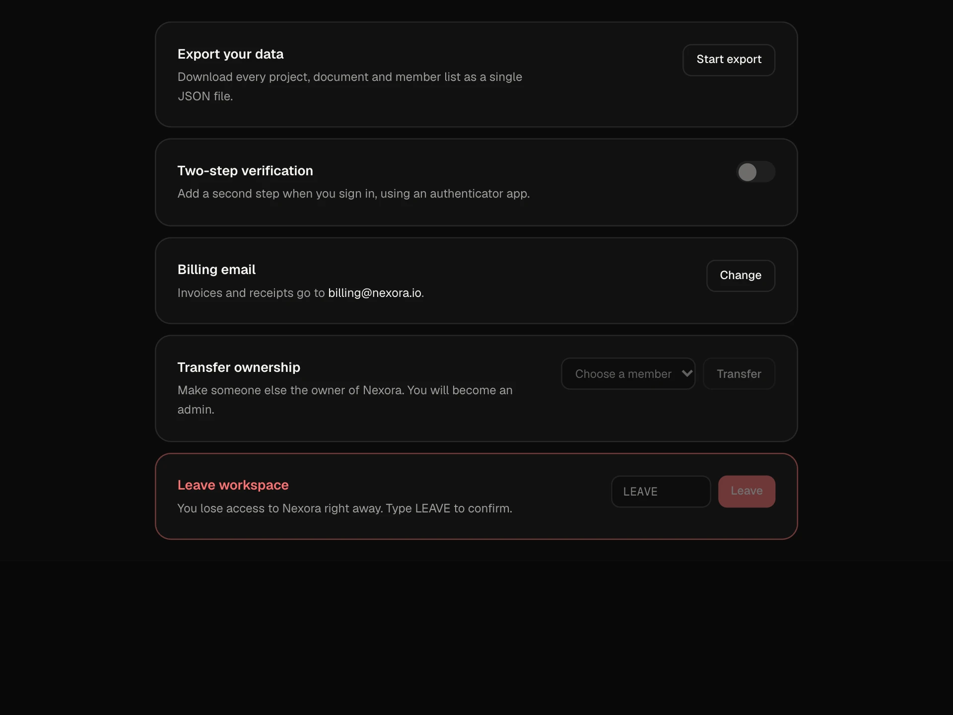
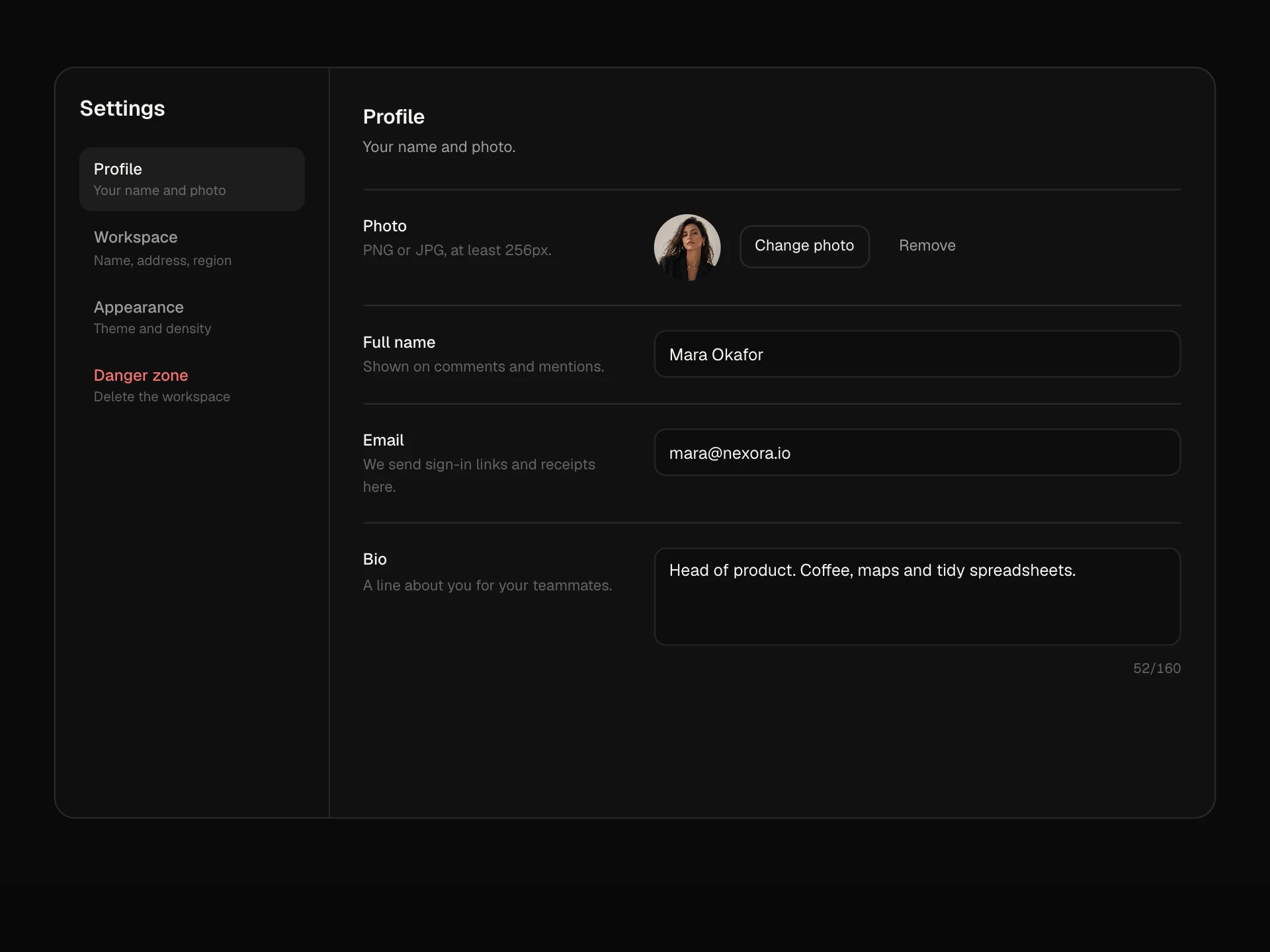
Three working card headings: a person heading with avatar, time, a Follow button and a ⋯ menu (pin, copy link, hide with undo), a title and description heading with a period menu that redraws a chart, and a settings heading with a switch and a collapse toggle.
About the Card Heading component
Card Heading collects the three headers you need most often on dashboard cards, each one working. A person heading for posts, comments and activity, with a Follow button and a menu to pin, copy the link or hide the post; a title heading for metric and chart cards, with a period picker that redraws the chart; and a settings heading with an on/off switch and a fold toggle.
Small touches make them feel finished: labels slide when they change, a Pinned tag pops in, hidden posts can be brought back, and turning a setting off dims and disables its options so it is obvious they no longer apply.
When to use it
Use these headers on feeds, dashboard widgets, analytics cards, settings panels and anywhere cards need a title with actions.
Keep one visible action per card heading and put the rest in the ⋯ menu.
Installation
Add the Card Heading component to your project with the shadcn CLI. It lands in components/card-heading.tsx as plain React + Tailwind CSS source you own and can edit.
npx shadcn@latest add @reactframe/card-headingOr copy the source by hand and install its dependencies:
npm install motion clsx tailwind-mergeProps
<CardHeading /> accepts 6 props, all optional.
| Prop | Type | Default |
|---|---|---|
| author | { name: string; role: string; avatar?: string } | { name: "Lena Brandt", role: "Design lead", avatar: "/demo/55.webp" } |
| post | string | "Shipped the new onboarding flow today. Activation is up 18% in the first cohort, and sup… |
| metric | { title: string; description: string; periods: { id: string; label: string; values: number[]; total: string; delta: string }[] } | DEFAULT_METRIC |
| setting | { title: string; description: string; enabled: boolean } | { title: "Weekly digest", description: "A Monday email with what changed in your workspac… |
| theme | "dark" | "light" | "dark" |
| className | string | — |
- author{ name: string; role: string; avatar?: string }Default: { name: "Lena Brandt", role: "Design lead", avatar: "/demo/55.webp" }
- poststringDefault: "Shipped the new onboarding flow today. Activation is up 18% in the first cohort, and sup…
- metric{ title: string; description: string; periods: { id: string; label: string; values: number[]; total: string; delta: string }[] }Default: DEFAULT_METRIC
- setting{ title: string; description: string; enabled: boolean }Default: { title: "Weekly digest", description: "A Monday email with what changed in your workspac…
- theme"dark" | "light"Default: "dark"
- classNamestring
npm dependencies
Installed for you by the shadcn CLI.
Card Heading FAQ
- Can I use just one of the headers?
- Yes. Each card is self-contained in the source; copy the markup and the bit of state it uses into your own card.
- What happens when a post is hidden?
- The card is replaced by a dashed row saying it was hidden, with Undo to bring it back. Send the change to your API from the same handler.
- How does the period menu work?
- Each period has its own values, total and change. Picking one in the menu updates the number with a crossfade and regrows the bars.
- Why do the digest options fade out?
- The options sit in a fieldset that is disabled when the switch is off, so they dim and cannot be changed until the setting is turned back on.
- Is it accessible?
- Each card is an article labelled by its heading, menus use menu and menuitemradio roles with Escape to close, Follow is a pressed button, the setting is a switch labelled by its title, the collapse button uses aria-expanded and changes are announced.