Grid List React component
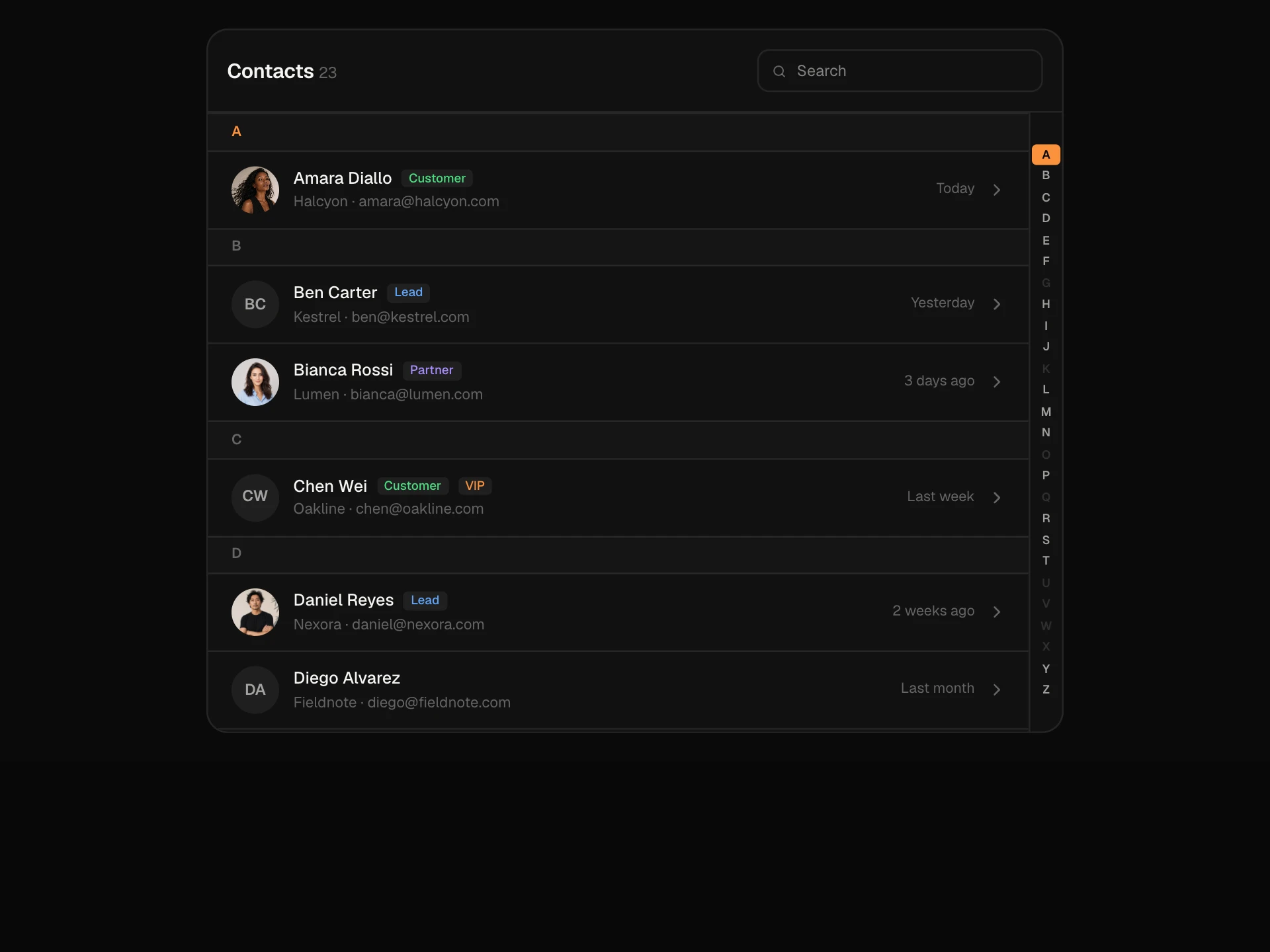
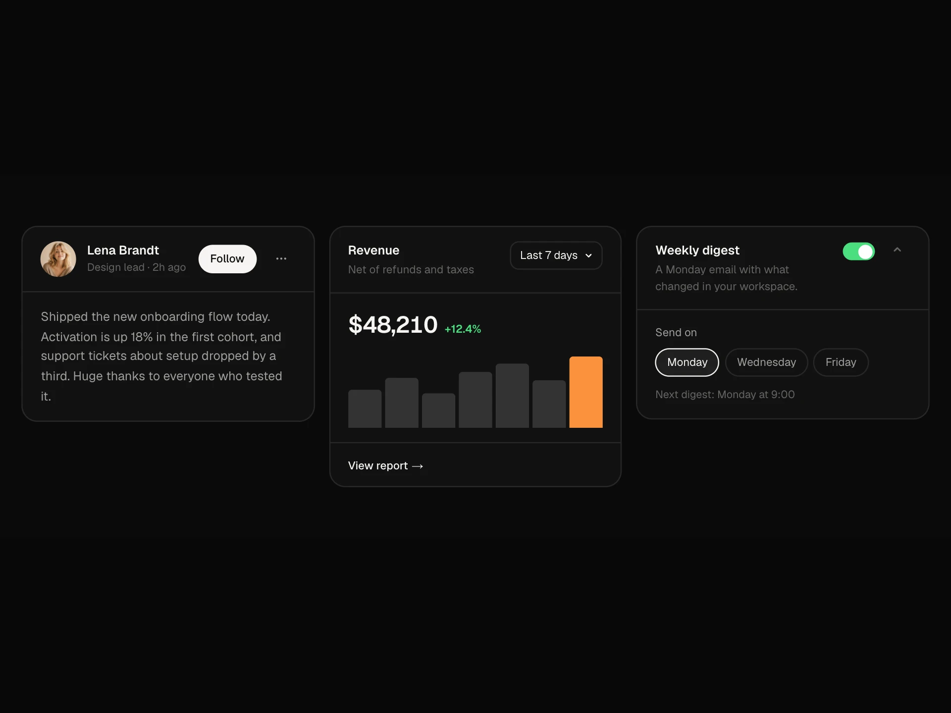
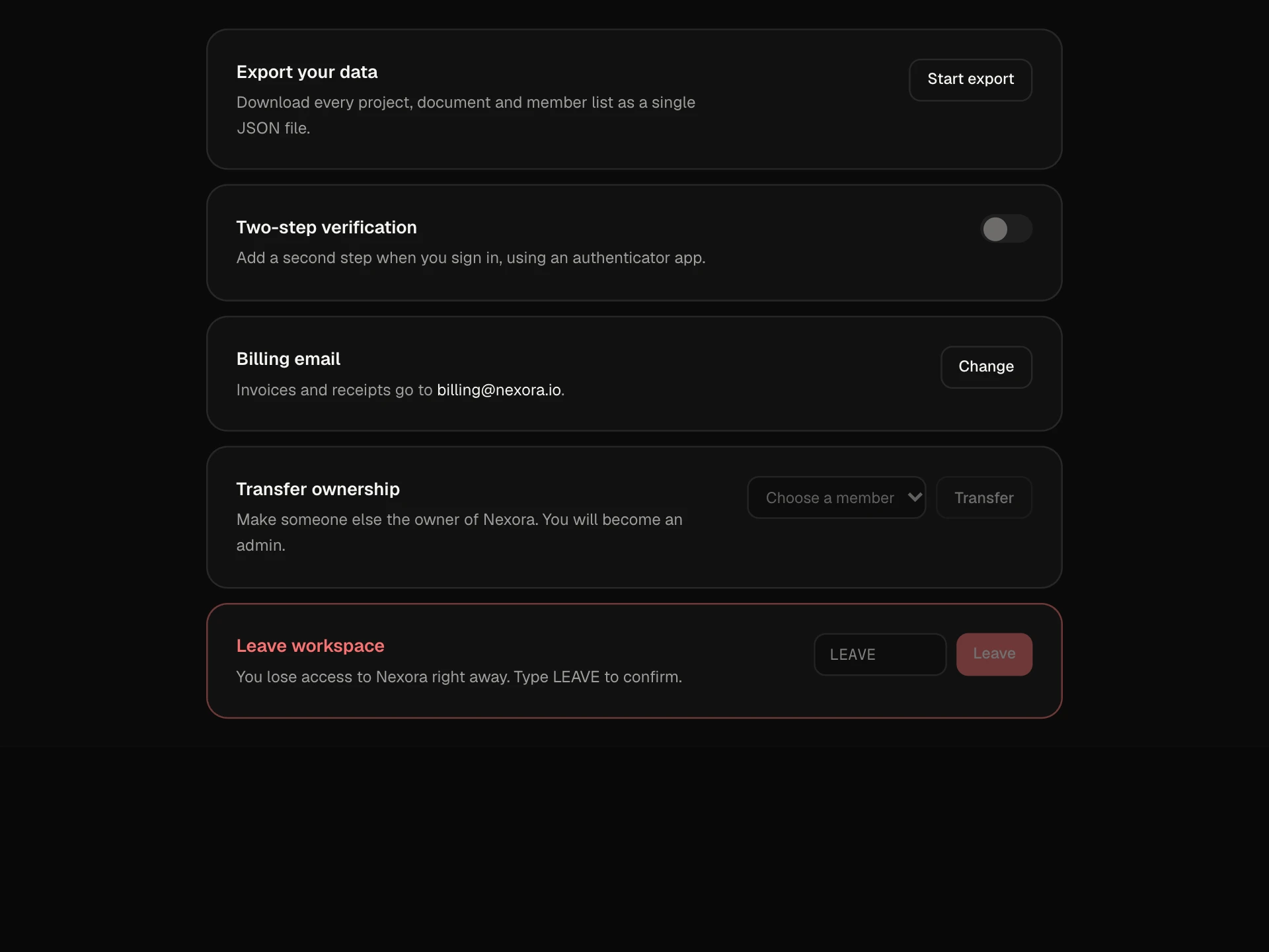
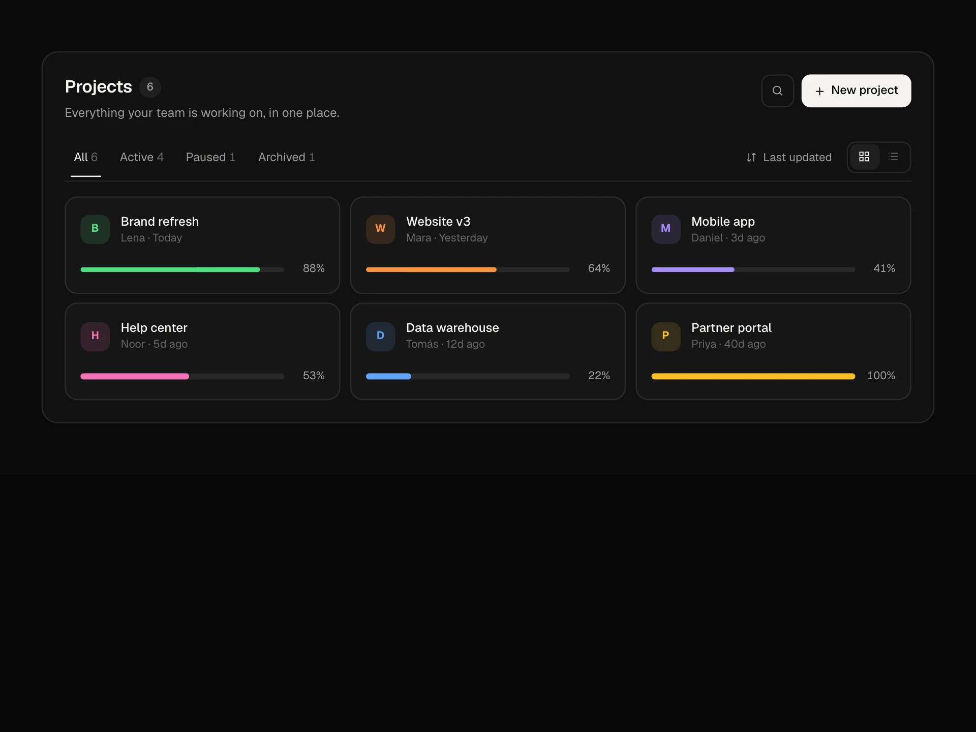
A grid list of people for an app: cards with avatar, presence dot, role and team, Email and Call actions, a star that pins favourites to the front, team filters with counts, search, Show more, and multi-select with a floating bar to message everyone selected.
About the Grid List component
Grid List lays out people as cards: photo with a presence dot, name, role and team, with Email and Call one click away. Team pills filter the grid, search narrows it by name, role or email, and starring someone pins them to the front.
Hover a card and a checkbox appears; tick a few and a bar rises from the bottom to message them all at once. Cards lift a little on hover and slide into place as filters change, and Show more loads the next page.
When to use it
Use it for team directories, contact books, CRM contact views, attendee lists or any collection of people.
Keep cards to the facts people scan for, and put details on the person's own page.
Installation
Add the Grid List component to your project with the shadcn CLI. It lands in components/grid-list.tsx as plain React + Tailwind CSS source you own and can edit.
npx shadcn@latest add @reactframe/grid-listOr copy the source by hand and install its dependencies:
npm install motion clsx tailwind-mergeProps
<GridList /> accepts 6 props, all optional.
| Prop | Type | Default |
|---|---|---|
| title | string | "People" |
| people | GridPerson[] | DEFAULT_PEOPLE |
| pageSize Cards shown before Load more. | number | 8 |
| onMessage | (ids: string[]) => void | — |
| theme | "dark" | "light" | "dark" |
| className | string | — |
- titlestringDefault: "People"
- peopleGridPerson[]Default: DEFAULT_PEOPLE
- pageSize
Cards shown before Load more.
numberDefault: 8 - onMessage(ids: string[]) => void
- theme"dark" | "light"Default: "dark"
- classNamestring
npm dependencies
Installed for you by the shadcn CLI.
Grid List FAQ
- How does selection work on phones?
- Checkboxes are always visible on touch screens. On desktop they appear on hover or keyboard focus, and stay visible on every card once anything is selected.
- What do the Email and Call buttons do?
- They are real mailto and tel links, so they open the person's email app or phone dialler.
- Where do starred people go?
- To the front of the grid, in every filter. Store the favourites yourself if they should persist.
- What does Message do?
- It calls onMessage with the selected ids, shows a short confirmation and clears the selection. Open your composer or a new conversation from there.
- Is it accessible?
- Team filters are a radiogroup, checkboxes and stars are named after the person, presence dots have text labels, email and call links say who they contact and the selection bar is a labelled region.