Page Heading React component
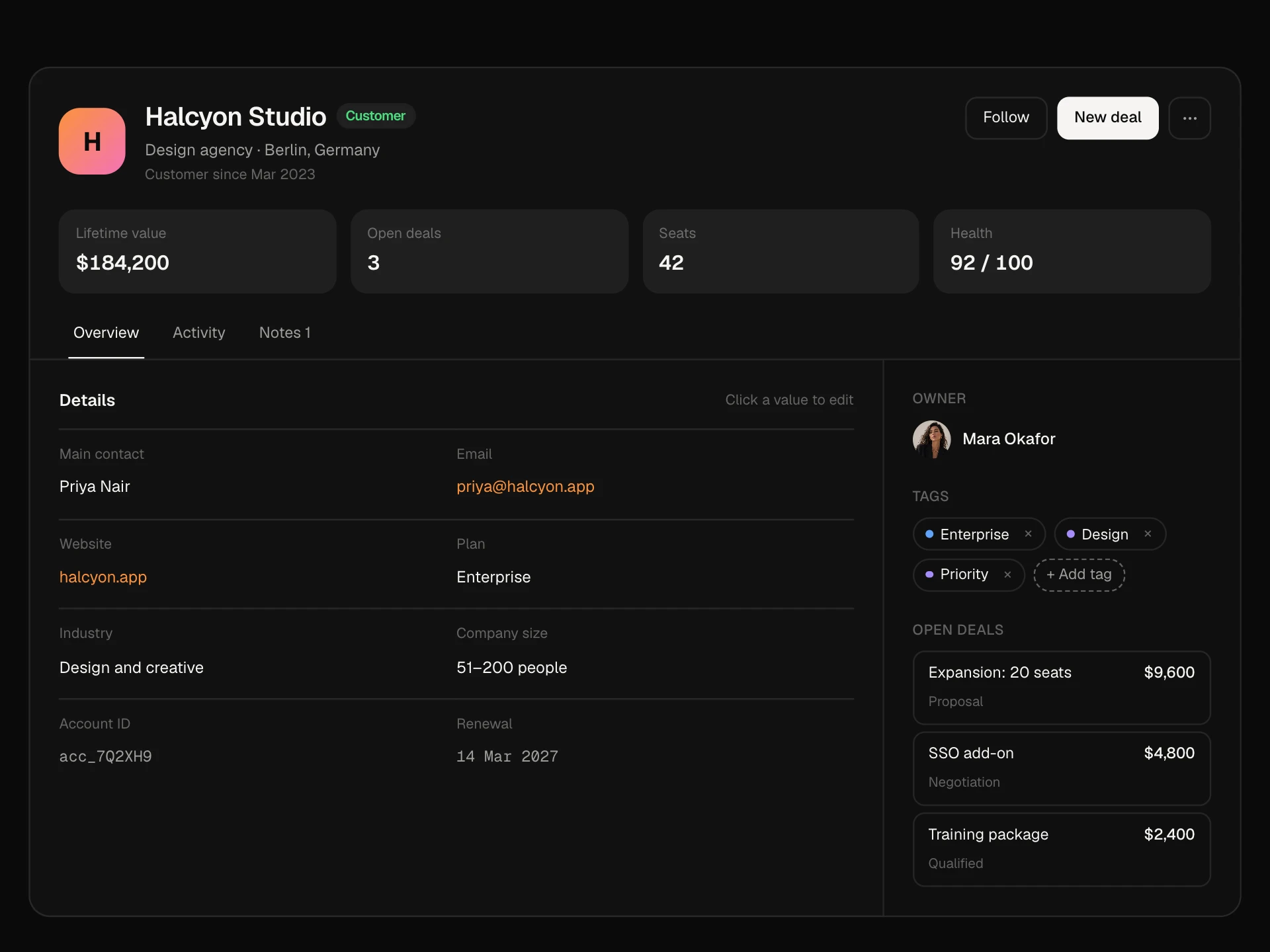
A page heading in three variants (simple, with meta details, with a cover and avatar): breadcrumb, a title you can rename in place, a Draft or Published status, Copy link that confirms, Preview, a Publish button that flips its label, and a More menu that holds actions on narrow screens.
About the Page Heading component
Page Heading is the top of a page in an app: where you are, what the page is called, its status and the actions that matter. It comes in three looks: a simple heading with a breadcrumb, one with a row of details like location and salary, and one with a cover image and avatar.
The title can be renamed in place, the link copied with one click, and the page published or unpublished with a button whose label slides to the new action. On narrow screens the secondary actions fold into a ⋯ menu so the heading never wraps awkwardly.
When to use it
Use it at the top of record pages, job posts, projects, documents, profiles or any page people edit and publish.
Keep one primary action; everything else belongs in secondary buttons or the More menu.
Installation
Add the Page Heading component to your project with the shadcn CLI. It lands in components/page-heading.tsx as plain React + Tailwind CSS source you own and can edit.
npx shadcn@latest add @reactframe/page-headingOr copy the source by hand and install its dependencies:
npm install motion clsx tailwind-mergeProps
<PageHeading /> accepts 12 props, all optional.
| Prop | Type | Default |
|---|---|---|
| variant | "simple" | "meta" | "banner" | "meta" |
| title | string | "Senior Product Designer" |
| breadcrumb | string[] | ["Jobs", "Design"] |
| meta | { icon: MetaIcon; label: string }[] | DEFAULT_META |
| cover Image behind the banner variant. | string | "/demo/9.webp" |
| avatar | string | "/demo/44.webp" |
| status | "draft" | "published" | "draft" |
| link | string | "https://nexora.io/jobs/senior-product-designer" |
| onTitleChange | (title: string) => void | — |
| onPublish | (published: boolean) => void | — |
| theme | "dark" | "light" | "dark" |
| className | string | — |
- variant"simple" | "meta" | "banner"Default: "meta"
- titlestringDefault: "Senior Product Designer"
- breadcrumbstring[]Default: ["Jobs", "Design"]
- meta{ icon: MetaIcon; label: string }[]Default: DEFAULT_META
- cover
Image behind the banner variant.
stringDefault: "/demo/9.webp" - avatarstringDefault: "/demo/44.webp"
- status"draft" | "published"Default: "draft"
- linkstringDefault: "https://nexora.io/jobs/senior-product-designer"
- onTitleChange(title: string) => void
- onPublish(published: boolean) => void
- theme"dark" | "light"Default: "dark"
- classNamestring
npm dependencies
Installed for you by the shadcn CLI.
Page Heading FAQ
- Which variant should I use?
- Simple for most app pages, meta when a few facts help people decide (jobs, events, listings) and banner for profiles, teams or anything with a picture.
- How does renaming work?
- The pencil swaps the title for an input with the text selected. Enter or clicking away saves and calls onTitleChange; Escape cancels. Focus returns to the pencil afterwards.
- Does Copy link really copy?
- Yes, it writes the link prop to the clipboard and shows Copied for a moment.
- What happens on phones?
- Copy link and Preview move into the ⋯ menu, the title truncates and the Publish button stays visible.
- Is it accessible?
- The breadcrumb is a labelled nav with aria-current, the pencil and ⋯ buttons have names, the title input has a label, status changes are announced and the More menu uses menu roles with Escape to close.