App Shell, Multi-column Layout React component
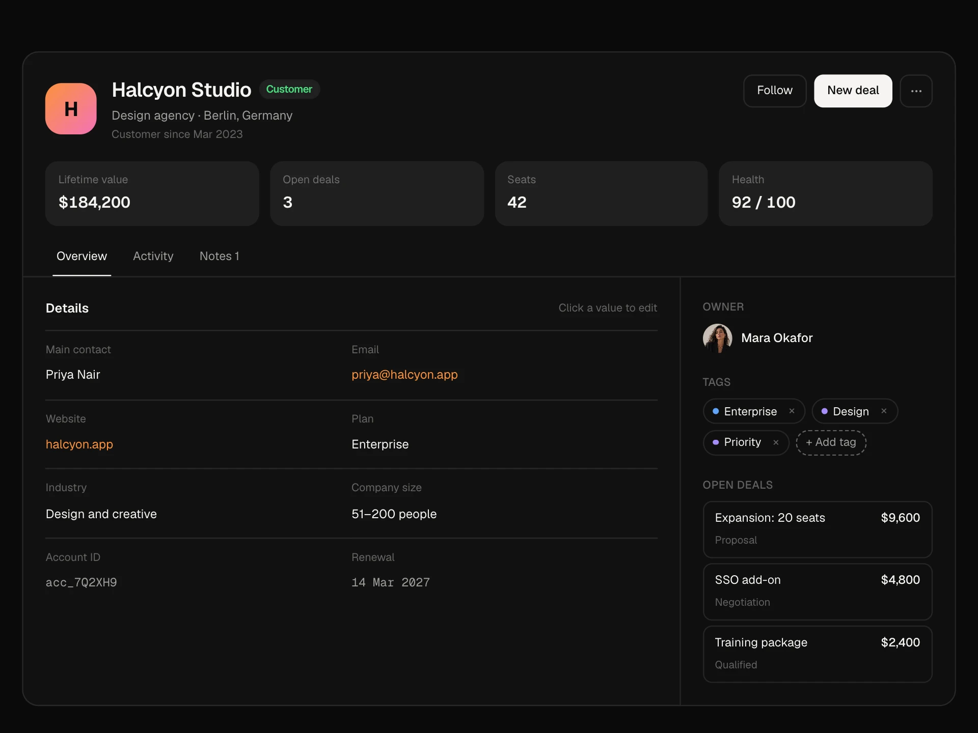
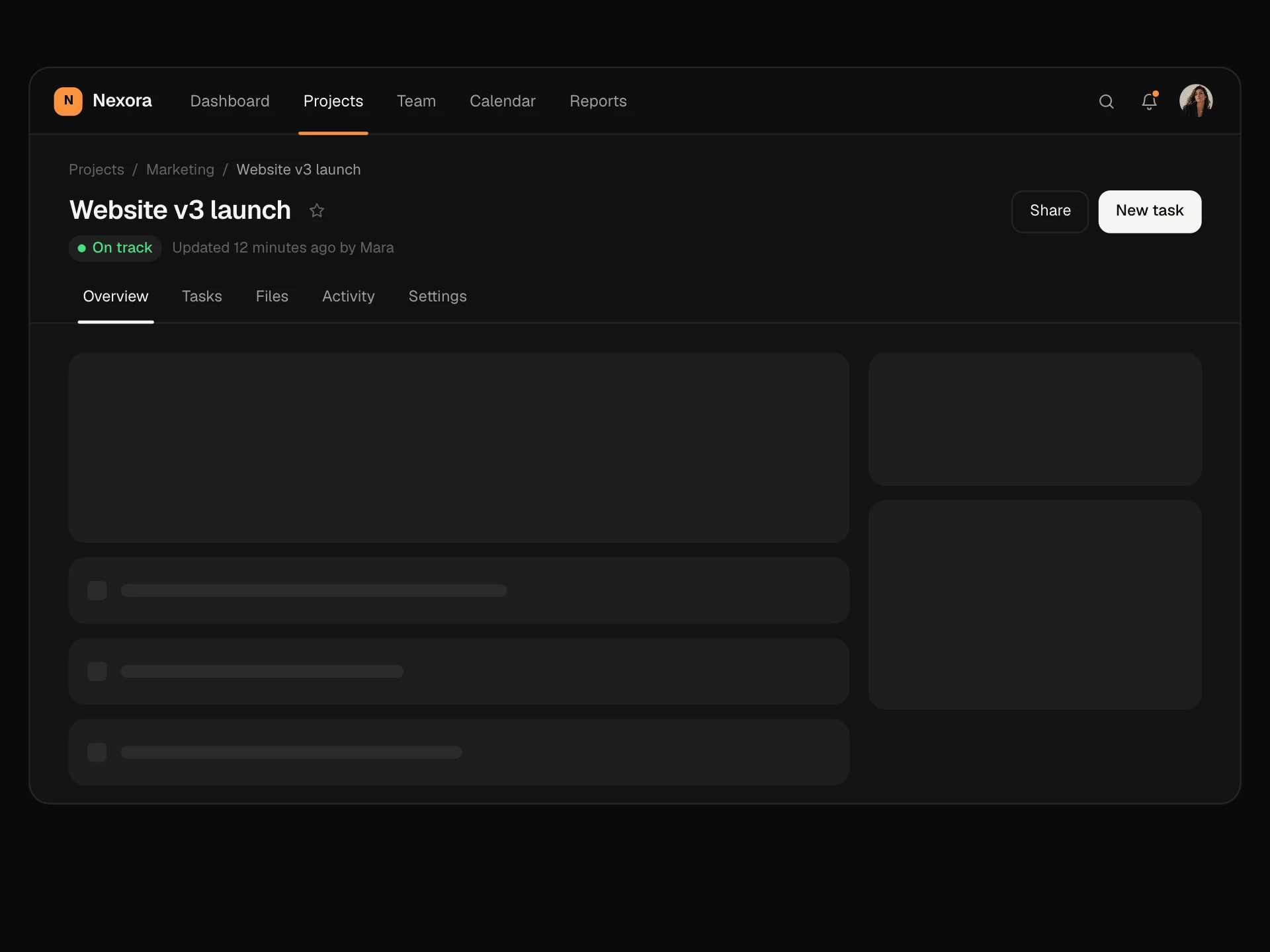
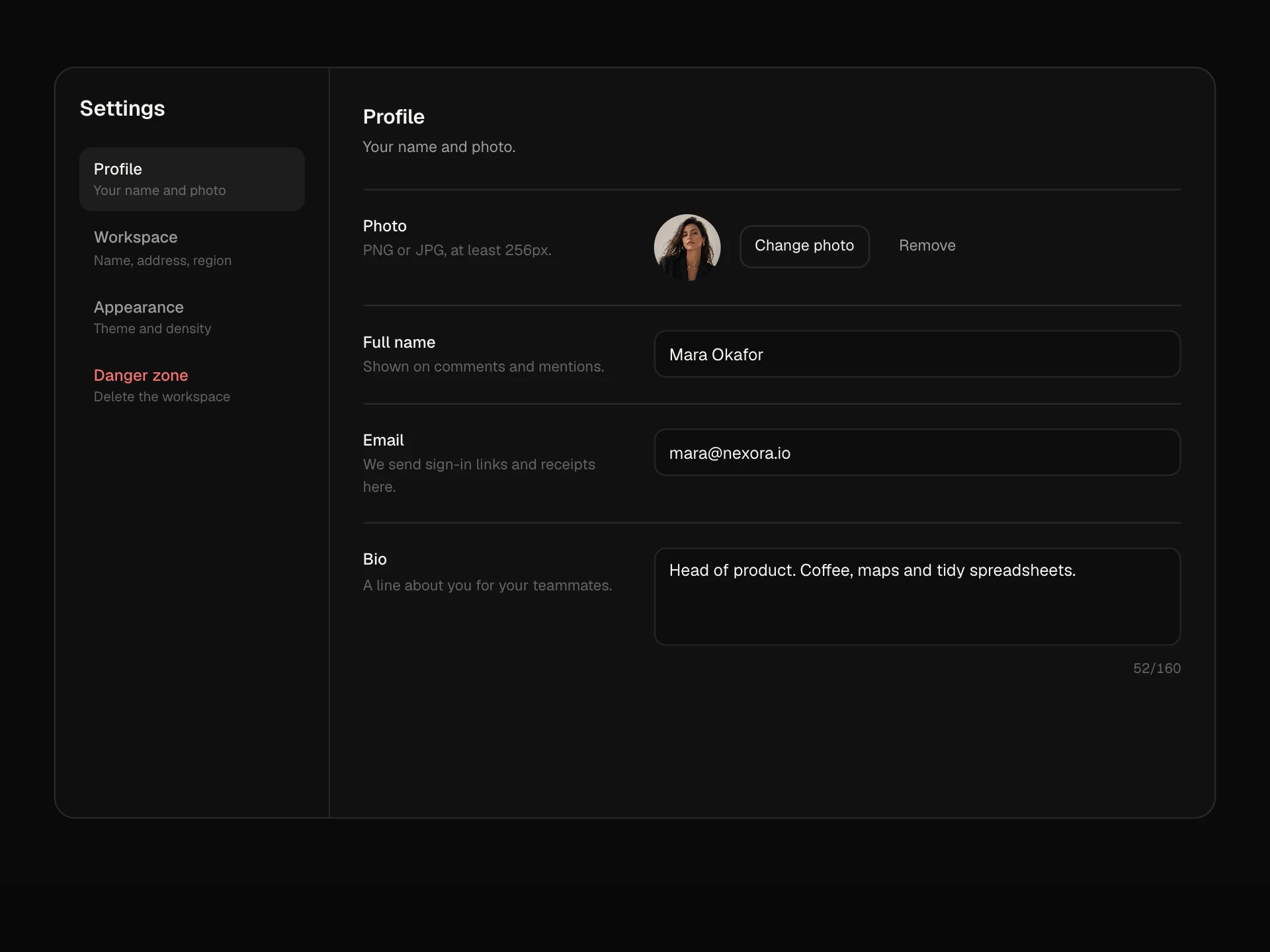
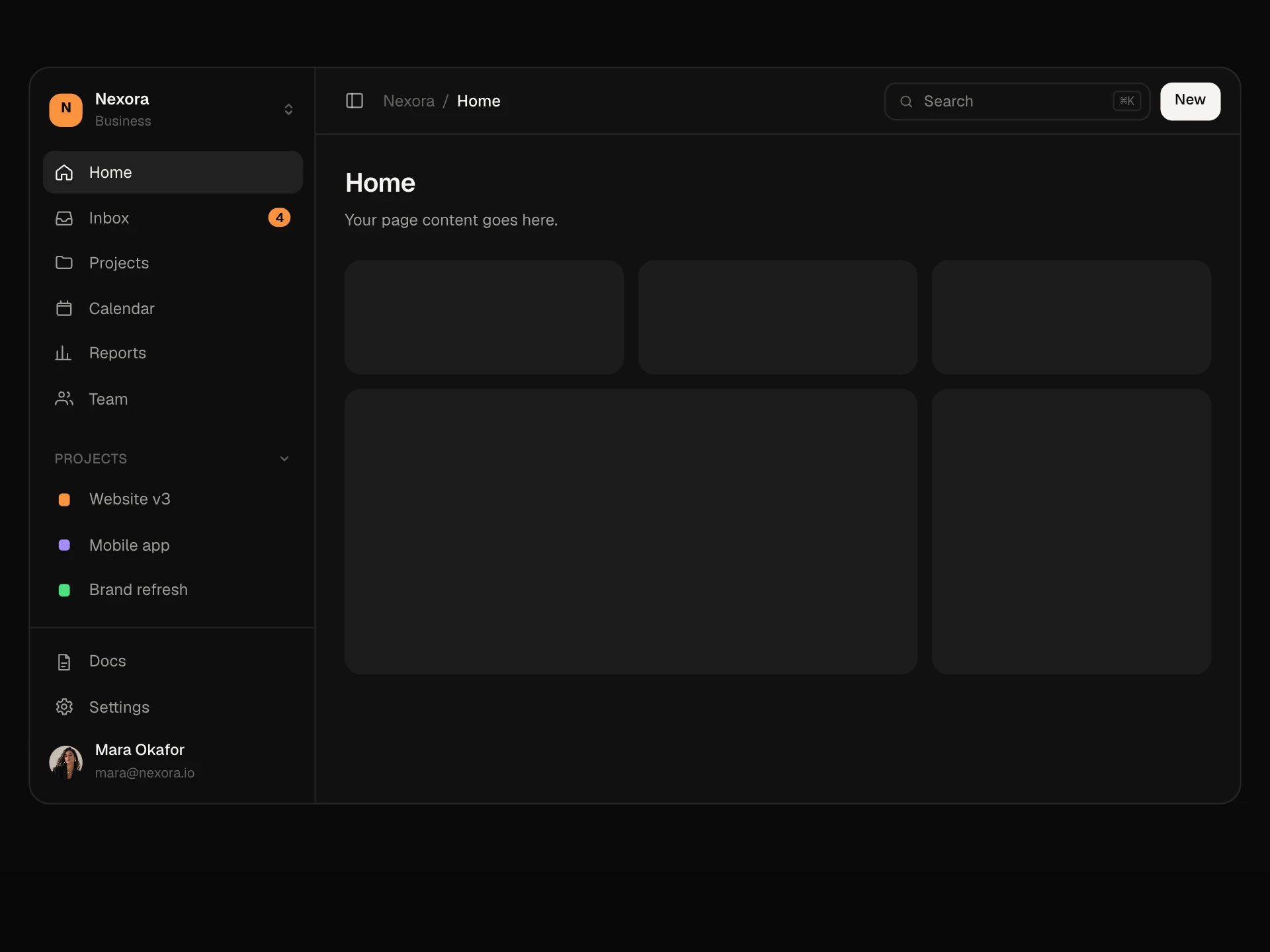
A multi-column application shell: an icon rail for sections with tooltips, a filterable list column, the selected item in the main pane and a details column you can show or hide. Switching sections swaps the list with a stagger, and on phones the list and detail take turns.
About the App Shell, Multi-column Layout component
App Shell, Multi-column Layout is the frame of apps where you pick something from a list and work on it next to the list: projects, clients, documents, tickets. A thin rail on the far left switches between sections, the list in the next column changes with them, and the selected item fills the main pane.
A details column on the right holds owner, dates, budget and progress and can be folded away when you need room. Each section remembers what you had selected, the list can be filtered, and on phones the layout becomes a list that opens into a detail screen with a back button.
When to use it
Use it for CRMs, project tools, file and document apps, email and chat products, or admin panels with master-detail screens.
Keep the rail to four or five sections and use the details column for facts people check, not for actions.
Installation
Add the App Shell, Multi-column Layout component to your project with the shadcn CLI. It lands in components/app-shell-multi-column.tsx as plain React + Tailwind CSS source you own and can edit.
npx shadcn@latest add @reactframe/app-shell-multi-columnOr copy the source by hand and install its dependencies:
npm install motion clsx tailwind-mergeProps
<AppShellMultiColumn /> accepts 4 props, all optional.
| Prop | Type | Default |
|---|---|---|
| sections | { id: string; label: string; icon: "projects" | "clients" | "docs" | "calendar"; items: MultiColumnItem[] }[] | DEFAULT_SECTIONS |
| children | (item: MultiColumnItem) => React.ReactNode | — |
| theme | "dark" | "light" | "dark" |
| className | string | — |
- sections{ id: string; label: string; icon: "projects" | "clients" | "docs" | "calendar"; items: MultiColumnItem[] }[]Default: DEFAULT_SECTIONS
- children(item: MultiColumnItem) => React.ReactNode
- theme"dark" | "light"Default: "dark"
- classNamestring
npm dependencies
Installed for you by the shadcn CLI.
App Shell, Multi-column Layout FAQ
- How do I render my own page for the selected item?
- Pass a function as children. It receives the selected item and returns whatever you want in the main pane, such as a board or a form.
- Does each section remember its selection?
- Yes. Switching from Projects to Clients and back returns you to the project you had open.
- When does the details column show?
- On containers wider than about 960px. The toggle in the header opens and closes it with a spring, and the main pane takes the space.
- What happens on phones?
- The rail stays, and the list and the main pane take turns: tapping an item opens it, and a back button returns to the list.
- Is it accessible?
- The rail is a labelled nav whose icon buttons have names and aria-current, tooltips show on hover and focus, list items mark the open one, the filter has a label, the details toggle is a pressed button and the aside is a labelled landmark.