App Shell, Stacked Layout React component
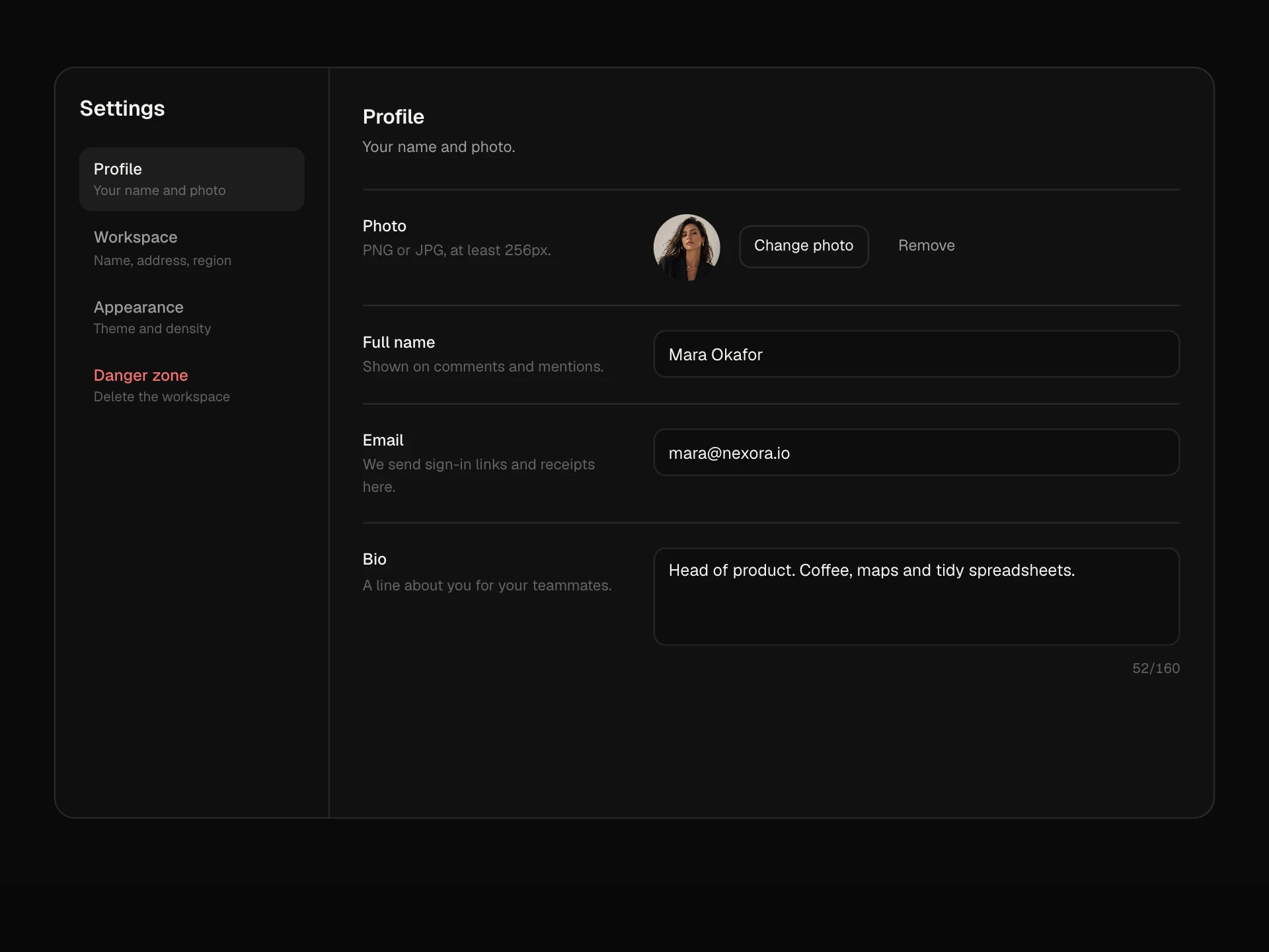
An application shell with everything stacked on top: a top bar with brand, main navigation and a sliding underline, search, a notifications dropdown with unread dots and an account menu, then a page header with breadcrumb, title, favourite star, status, actions and section tabs, and a hamburger menu on phones.
About the App Shell, Stacked Layout component
App Shell, Stacked Layout puts navigation across the top instead of down the side, which leaves the full width for the page. The top bar holds your brand, the main sections, search, notifications and the account menu, and a header band below it names the page with its breadcrumb, status, actions and tabs.
Moving between sections slides an underline along the bar and updates the breadcrumb, notifications can be read one by one or all at once, and the page can be starred. On phones the sections move into a menu that unfolds under the bar.
When to use it
Use it for products with four to six top-level sections, record and project pages, settings areas or any app where content needs the full width.
Prefer the sidebar shell when there are many sections or nested navigation.
Installation
Add the App Shell, Stacked Layout component to your project with the shadcn CLI. It lands in components/app-shell-stacked.tsx as plain React + Tailwind CSS source you own and can edit.
npx shadcn@latest add @reactframe/app-shell-stackedOr copy the source by hand and install its dependencies:
npm install motion clsx tailwind-mergeProps
<AppShellStacked /> accepts 9 props, all optional.
| Prop | Type | Default |
|---|---|---|
| brand | string | "Nexora" |
| nav | string[] | ["Dashboard", "Projects", "Team", "Calendar", "Reports"] |
| tabs | string[] | ["Overview", "Tasks", "Files", "Activity", "Settings"] |
| page | { title: string; breadcrumb: string[]; status: string; meta: string } | DEFAULT_PAGE |
| notifications | { id: string; text: string; time: string; unread?: boolean }[] | DEFAULT_NOTIFS |
| user | { name: string; email: string; avatar?: string } | DEFAULT_USER |
| children | React.ReactNode | — |
| theme | "dark" | "light" | "dark" |
| className | string | — |
- brandstringDefault: "Nexora"
- navstring[]Default: ["Dashboard", "Projects", "Team", "Calendar", "Reports"]
- tabsstring[]Default: ["Overview", "Tasks", "Files", "Activity", "Settings"]
- page{ title: string; breadcrumb: string[]; status: string; meta: string }Default: DEFAULT_PAGE
- notifications{ id: string; text: string; time: string; unread?: boolean }[]Default: DEFAULT_NOTIFS
- user{ name: string; email: string; avatar?: string }Default: DEFAULT_USER
- childrenReact.ReactNode
- theme"dark" | "light"Default: "dark"
- classNamestring
npm dependencies
Installed for you by the shadcn CLI.
App Shell, Stacked Layout FAQ
- When should I pick stacked over sidebar?
- Stacked works best with a handful of top-level sections and wide content like tables or boards. Pick the sidebar layout when you have many sections, nested groups or a project list.
- How do I plug in my router?
- Replace setNavActive and setTab with navigation and derive the active section and tab from the current path. Pass your page as children.
- What happens on phones?
- Below about 760px the section links collapse behind a menu button that unfolds a vertical list with the current item marked, plus the signed-in user.
- How do notifications work?
- Pass notifications with unread flags. The bell shows a dot and wiggles while any are unread; clicking a row marks it read and 'Mark all read' clears them all.
- Is it accessible?
- Navigation is a labelled nav with aria-current='page', the bell's label includes the unread count, menus close with Escape, the star is a pressed button, the breadcrumb is its own nav and page sections use the tablist pattern.