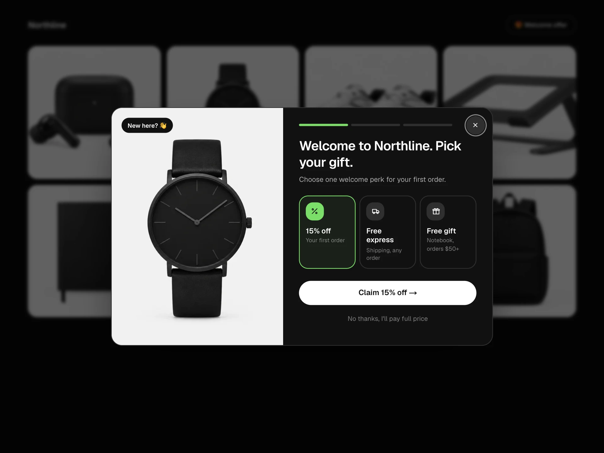
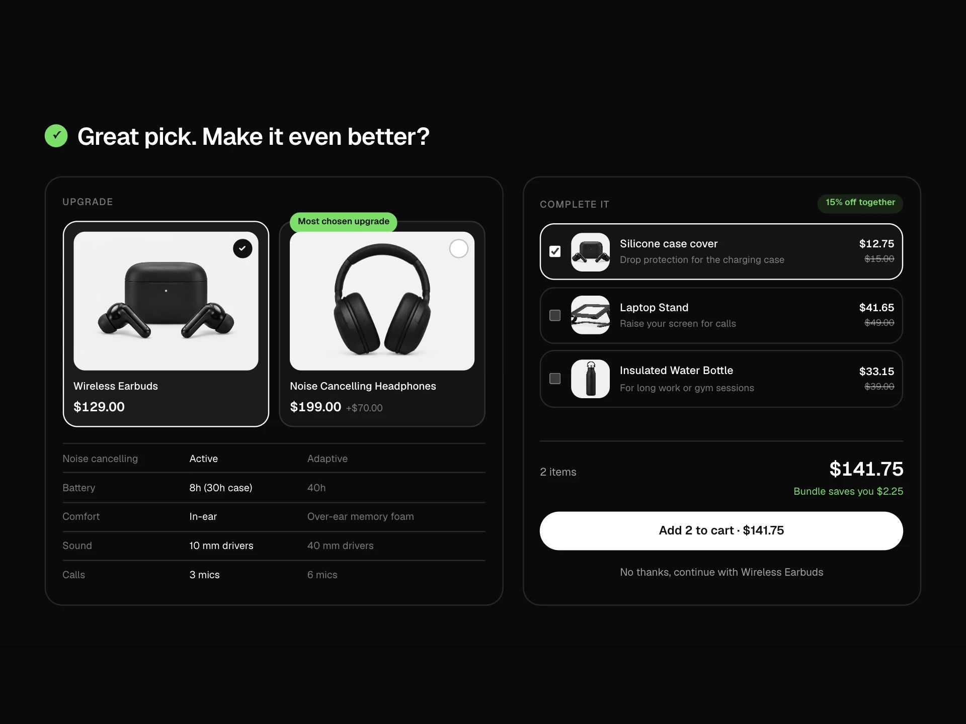
Product Features Block React component
A product feature tour: a vertical list of features with progress bars that autoplay through them, a large photo that crossfades and slowly zooms toward the part being described, a floating stat card, and a compact spec grid underneath.
About the Product Features Block component
Product Features Block tells a product's story one feature at a time. Each feature gets its own photo, a short explanation and one memorable number, and the block plays through them on its own like a guided tour.
Visitors can take over at any moment by clicking a feature or hovering to pause, and a spec grid underneath keeps the hard facts close for anyone comparing.
When to use it
Use it on a product page under the buy section, or on a launch landing page for a hero product.
For hotspots on a single photo use the Product Highlight Block; for a side-by-side comparison use the Product Comparison Table.
Installation
Add the Product Features Block component to your project with the shadcn CLI. It lands in components/product-features-block.tsx as plain React + Tailwind CSS source you own and can edit.
npx shadcn@latest add @reactframe/product-features-blockOr copy the source by hand and install its dependencies:
npm install motion clsx tailwind-mergeProps
<ProductFeaturesBlock /> accepts 7 props, all optional.
| Prop | Type | Default |
|---|---|---|
| eyebrow | string | "Minimal Watch" |
| title | string | "Designed to disappear on your wrist" |
| features | { id: string; title: string; body: string; image: string; focus?: { x: number; y: number }; stat?: { value: string; label: string } }[] | FEATURES |
| specs | { label: string; value: string }[] | SPECS |
| interval Seconds each feature stays before the next one plays. | number | 5 |
| theme | "dark" | "light" | "dark" |
| className | string | — |
- eyebrowstringDefault: "Minimal Watch"
- titlestringDefault: "Designed to disappear on your wrist"
- features{ id: string; title: string; body: string; image: string; focus?: { x: number; y: number }; stat?: { value: string; label: string } }[]Default: FEATURES
- specs{ label: string; value: string }[]Default: SPECS
- interval
Seconds each feature stays before the next one plays.
numberDefault: 5 - theme"dark" | "light"Default: "dark"
- classNamestring
Collections
Use-case pages that compare Product Features Block with the other components that do a similar job.
npm dependencies
Installed for you by the shadcn CLI.
Product Features Block FAQ
- How do I choose the photos?
- One image per feature, ideally the same product from different angles or close-ups. Set focus to the point the slow zoom should move toward.
- Can I turn off autoplay?
- Set a long interval, or remove the effect that animates progress. With reduced motion it never autoplays.
- How many features work best?
- Three to five. More than that makes the tour long and the list hard to scan.
- Why one motion value for the progress?
- The bar, the timing and the move to the next feature come from a single animation, so pausing on hover freezes everything exactly where it is.
- Is it accessible?
- Features are a vertical tablist with arrow-key support, the active body is the tabpanel, the photo has descriptive alt text and the spec grid is a definition list.