Welcome Offer Modal React component
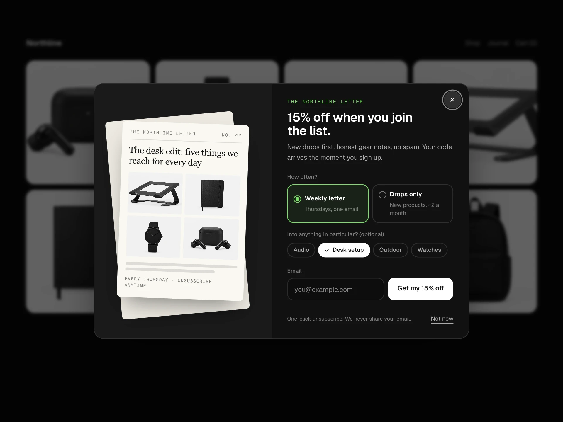
A first-visit welcome modal in three steps: pick one of three welcome perks (discount, free express shipping or a free gift), enter an email, then reveal a copyable code, with a split photo layout, progress bar, and calm exits.
About the Welcome Offer Modal component
Welcome Offer Modal greets first-time visitors with a choice instead of a demand. Letting people pick the perk they actually want, a discount, free express shipping or a free gift, makes the email request feel like a fair trade.
The flow is three short steps with a visible progress bar, the code is shown immediately as well as emailed, and every step has an easy way out.
When to use it
Use it for first visits to a store, ideally after a delay or some scrolling rather than instantly.
For an offer tied to the cart use the Cart Offer Modal; for a plain sign-up use the Newsletter Discount Modal.
Installation
Add the Welcome Offer Modal component to your project with the shadcn CLI. It lands in components/welcome-offer-modal.tsx as plain React + Tailwind CSS source you own and can edit.
npx shadcn@latest add @reactframe/welcome-offer-modalOr copy the source by hand and install its dependencies:
npm install motion clsx tailwind-mergeProps
<WelcomeOfferModal /> accepts 7 props, all optional.
| Prop | Type | Default |
|---|---|---|
| store | string | "Northline" |
| perks | { id: string; title: string; detail: string; code: string; icon: "percent" | "truck" | "gift" }[] | PERKS |
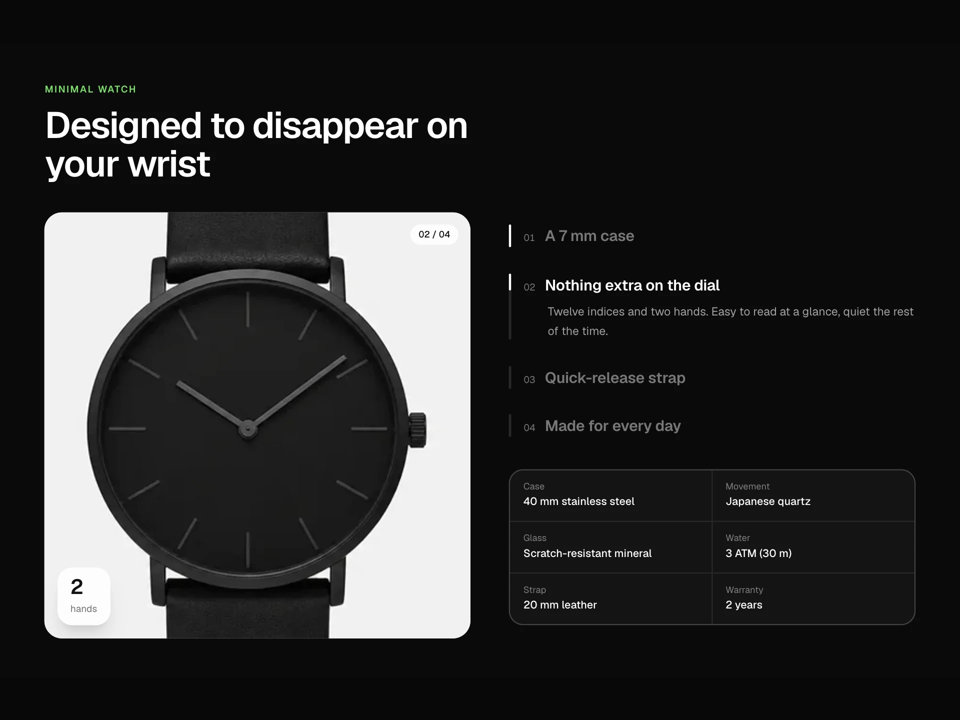
| image | string | "/demo/minimal-watch.webp" |
| openAfter Open automatically after this many milliseconds. Set to null to wait for the button. | number | null | 900 |
| onClaim Return a Promise to keep the button busy while you subscribe the email. | (value: { email: string; perk: string }) => void | Promise<void> | — |
| theme | "dark" | "light" | "dark" |
| className | string | — |
- storestringDefault: "Northline"
- perks{ id: string; title: string; detail: string; code: string; icon: "percent" | "truck" | "gift" }[]Default: PERKS
- imagestringDefault: "/demo/minimal-watch.webp"
- openAfter
Open automatically after this many milliseconds. Set to null to wait for the button.
number | nullDefault: 900 - onClaim
Return a Promise to keep the button busy while you subscribe the email.
(value: { email: string; perk: string }) => void | Promise<void> - theme"dark" | "light"Default: "dark"
- classNamestring
Collections
Use-case pages that compare Welcome Offer Modal with the other components that do a similar job.
npm dependencies
Installed for you by the shadcn CLI.
Welcome Offer Modal FAQ
- When does it open?
- After openAfter milliseconds. Pass null to only open it from your own button. Show it once per visitor by remembering that it was seen.
- How do I subscribe the email?
- onClaim receives the email and the chosen perk id. Subscribe the address and create or assign the code on your server.
- Are the codes real?
- The demo shows the code from each perk. Generate unique codes per email in production so they can't be shared widely.
- Why is there a 'No thanks' link?
- Giving people a clear, polite way out builds trust. Avoid guilt-trip wording if you change it.
- Is it accessible?
- It's a labelled modal dialog: focus moves to Close (and to the email field on step two), Escape and the scrim close it, perks are a radio group, errors use role=alert and focus returns to the trigger.