Category Carousel React component
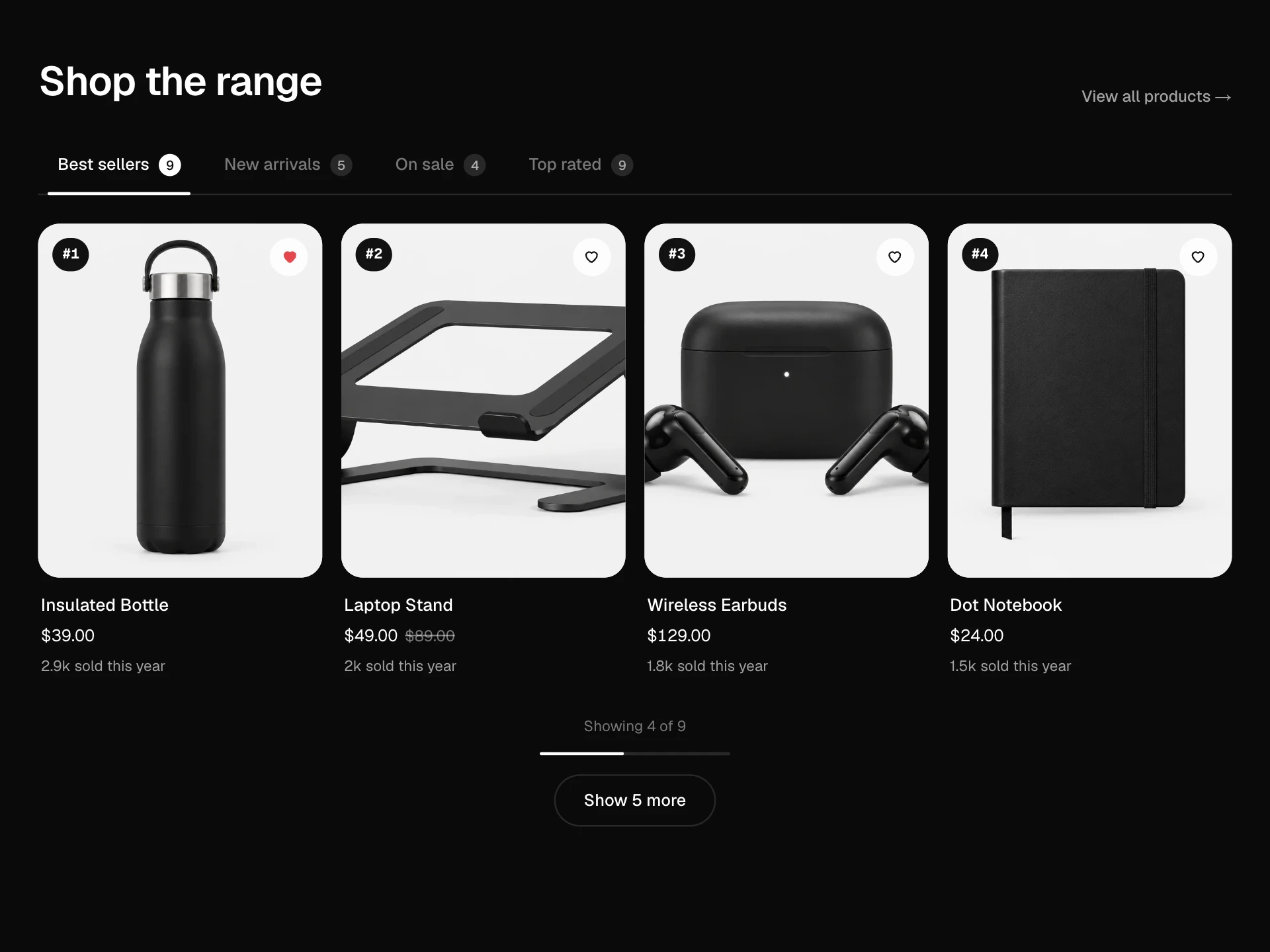
A shop-by-category row of round photo bubbles that scrolls, drags and snaps, with arrows, a scroll progress bar, New badges and a Sale bubble; picking a category slides a ring onto it and swaps in that category's products with quick add buttons.
About the Category Carousel component
Category Carousel is the round 'shop by category' row you see near the top of many store home pages, especially on mobile. Each category is a photo bubble with its name and how many items it has, and the row scrolls sideways with a swipe, a mouse drag or the arrow buttons, with a thin bar showing how far along you are.
Tap a category and a green ring slides onto it while the products from that category appear underneath, so people can browse without leaving the page. Each product card shows the price, any sale discount and a quick add button.
When to use it
Use it on a store home page, at the top of a collection page or in a mobile app-like storefront where there are more categories than fit on one screen.
Use photos with the product centred on a plain background and set zoom per category so every item fills its circle about the same amount.
Installation
Add the Category Carousel component to your project with the shadcn CLI. It lands in components/category-carousel.tsx as plain React + Tailwind CSS source you own and can edit.
npx shadcn@latest add @reactframe/category-carouselOr copy the source by hand and install its dependencies:
npm install motion clsx tailwind-mergeProps
<CategoryCarousel /> accepts 10 props, all optional.
| Prop | Type | Default |
|---|---|---|
| title | string | "Shop by category" |
| subtitle | string | "Ten corners of the store, one tap away." |
| categories | { id: string; name: string; count: number; image?: string; zoom?: number; isNew?: boolean; label?: string }[] | CATEGORIES |
| products | { id: string; name: string; price: number; was?: number; image: string; categories: string[] }[] | PRODUCTS |
| defaultCategory | string | "audio" |
| currency | string | "$" |
| onSelect | (category: CarouselCategory) => void | — |
| onAdd | (product: CarouselProduct) => void | — |
| theme | "dark" | "light" | "dark" |
| className | string | — |
- titlestringDefault: "Shop by category"
- subtitlestringDefault: "Ten corners of the store, one tap away."
- categories{ id: string; name: string; count: number; image?: string; zoom?: number; isNew?: boolean; label?: string }[]Default: CATEGORIES
- products{ id: string; name: string; price: number; was?: number; image: string; categories: string[] }[]Default: PRODUCTS
- defaultCategorystringDefault: "audio"
- currencystringDefault: "$"
- onSelect(category: CarouselCategory) => void
- onAdd(product: CarouselProduct) => void
- theme"dark" | "light"Default: "dark"
- classNamestring
Collections
Use-case pages that compare Category Carousel with the other components that do a similar job.
npm dependencies
Installed for you by the shadcn CLI.
Category Carousel FAQ
- How do I make the photos fill the circles evenly?
- Each category has an optional zoom. Product photos with a lot of empty space around them look small in a circle, so raise zoom (1.5 to 2.2 works for most) until the product fills it.
- Can I link categories to real pages instead of showing products?
- Yes. Use onSelect to navigate to the collection, or pass products for the categories you want to preview and leave the rest to the Shop all link.
- Does it work with touch and a mouse?
- Touch and trackpads scroll natively with snapping. With a mouse you can drag the row; a drag never counts as a click, so you won't pick a category by accident.
- What does the progress bar show?
- The thumb is as wide as the part of the row you can see, and it moves as you scroll, so people know there are more categories off screen.
- Is it accessible?
- The row is a tablist with one tab in the tab order, arrow keys, Home and End move between categories, the products are its tabpanel and the product count is announced. The arrow buttons have names and disable at the ends, and motion is reduced when the visitor asks for it.