Icon Category Nav React component
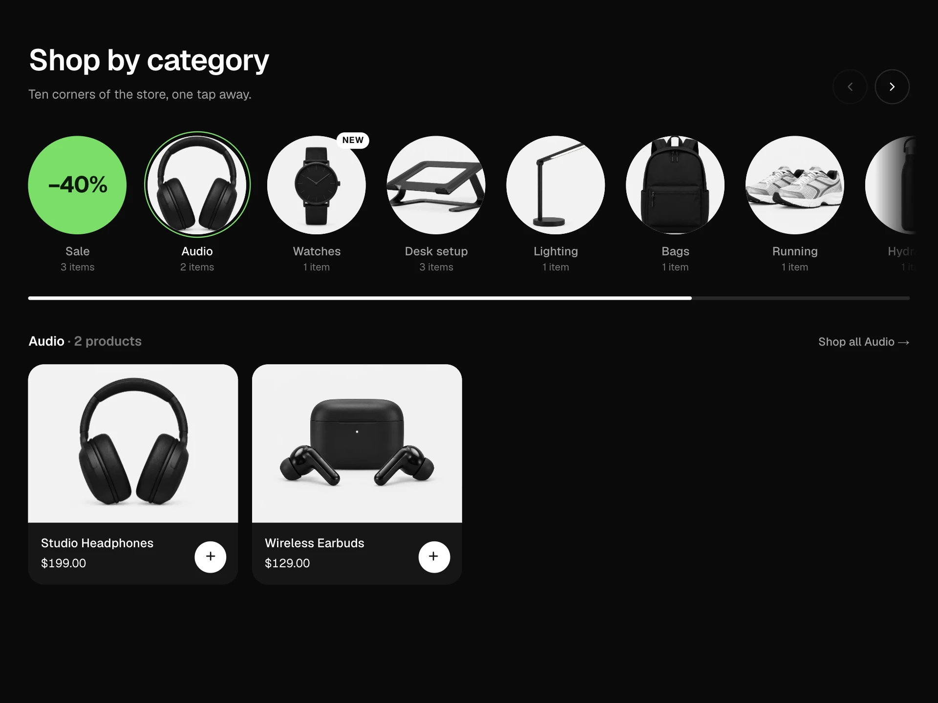
A store category bar of line icons with labels that keeps as many categories as fit and folds the rest into a More menu as the width changes, with a little hover animation per icon, a sliding underline on the current category and a subcategory strip below.
About the Icon Category Nav component
Icon Category Nav is the row of small icons with labels that sits under a store's header: Audio, Watches, Desk, Sale and so on. It always fits the screen: when there isn't room for every category, the ones at the end move into a More menu with a count, and they come back as the window gets wider.
Each icon has its own small hover move, a line slides under the category you're in, and the strip underneath shows where you are, how many products there are and the subcategories to narrow things down.
When to use it
Use it as the category bar on a store home page or the top of collection pages, especially for shops with eight or more categories.
Order categories by how much people use them; the first ones are the ones that stay visible on small screens. Mark sales or seasonal categories with highlight so they stand out in green.
Installation
Add the Icon Category Nav component to your project with the shadcn CLI. It lands in components/icon-category-nav.tsx as plain React + Tailwind CSS source you own and can edit.
npx shadcn@latest add @reactframe/icon-category-navOr copy the source by hand and install its dependencies:
npm install motion clsx tailwind-mergeProps
<IconCategoryNav /> accepts 7 props, all optional.
| Prop | Type | Default |
|---|---|---|
| store | string | "Northline" |
| categories | { id: string; name: string; icon: IconName; count: number; subcategories?: string[]; highlight?: boolean }[] | CATEGORIES |
| defaultCategory | string | "audio" |
| onSelect | (category: NavCategory) => void | — |
| onSubcategory | (category: NavCategory, sub: string) => void | — |
| theme | "dark" | "light" | "dark" |
| className | string | — |
- storestringDefault: "Northline"
- categories{ id: string; name: string; icon: IconName; count: number; subcategories?: string[]; highlight?: boolean }[]Default: CATEGORIES
- defaultCategorystringDefault: "audio"
- onSelect(category: NavCategory) => void
- onSubcategory(category: NavCategory, sub: string) => void
- theme"dark" | "light"Default: "dark"
- classNamestring
Collections
Use-case pages that compare Icon Category Nav with the other components that do a similar job.
npm dependencies
Installed for you by the shadcn CLI.
Icon Category Nav FAQ
- How does it decide what goes into More?
- It measures every item in a hidden copy of the bar, then shows as many as fit next to the More button and moves the rest into the menu. A ResizeObserver repeats this whenever the bar's width changes.
- What if the selected category is in the More menu?
- It is swapped into the last visible slot so the current category is always in the bar with its underline, and the one it replaced goes into the menu.
- Can I use my own icons?
- The block ships with eleven stroke icons. To add one, add its paths and a hover motion to the ICONS map; any SVG drawn on a 24px grid with a 1.6 stroke will match.
- Where do the subcategory chips come from?
- From each category's subcategories array. Picking one updates the heading and breadcrumb and calls onSubcategory so you can filter your product list.
- Is it accessible?
- It's a labelled nav, the current category has aria-current, the More button is a menu button with arrow-key navigation, Escape and outside clicks close it, and the chips are toggle buttons. Icon animations also play on keyboard focus and are turned off for reduced motion.