Masonry Product Grid React component
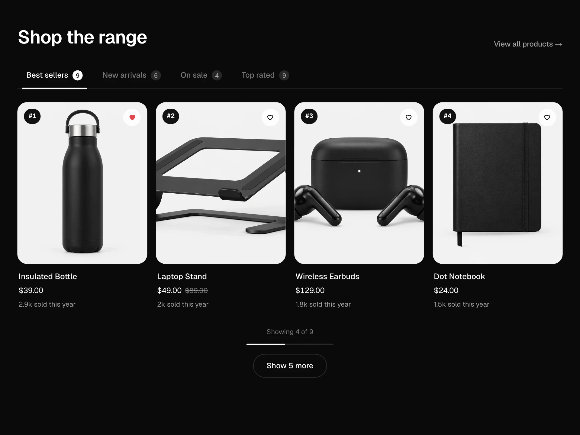
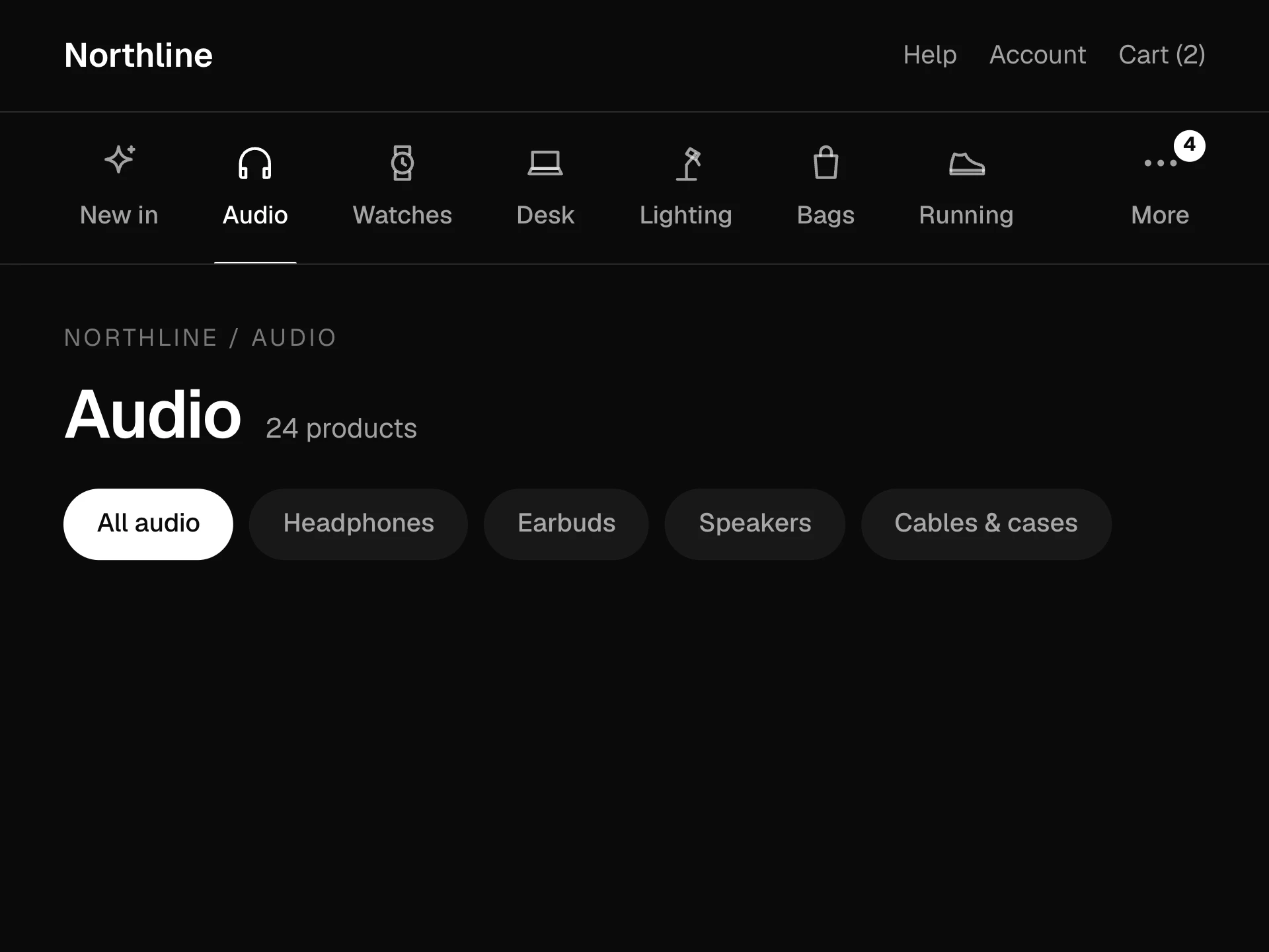
A Pinterest-style product wall of mixed-height photos with a collection card, customer quotes and a shipping note woven in, category filters that reflow the columns with animation, a Cozy / Compact density switch, wishlist hearts and a hover bar to add to cart.
About the Masonry Product Grid component
Masonry Product Grid lays products out like a mood board: photos of different heights packed into columns, with a collection card, a couple of customer quotes and a shipping note mixed in so the wall feels curated rather than like a spreadsheet.
Filter by category and the tiles reflow into new columns with a smooth animation. Switch between Cozy and Compact to change how many columns there are. Each product shows its price at rest; hover it for the name, price and an add to cart button, and save it with the heart.
When to use it
Use it for lookbooks, 'new in' or 'fresh finds' sections, gift guides and lifestyle stores where browsing matters more than comparing specs.
Mix ratios on purpose (tall, square, wide) and keep editorial tiles to about one in five so products stay the focus.
Installation
Add the Masonry Product Grid component to your project with the shadcn CLI. It lands in components/masonry-product-grid.tsx as plain React + Tailwind CSS source you own and can edit.
npx shadcn@latest add @reactframe/masonry-product-gridOr copy the source by hand and install its dependencies:
npm install motion clsx tailwind-mergeCollections
Use-case pages that compare Masonry Product Grid with the other components that do a similar job.
npm dependencies
Installed for you by the shadcn CLI.
Masonry Product Grid FAQ
- How does it build the columns?
- A small function walks the tiles in order and drops each one into the shortest column so far, using the tile's aspect ratio. It doesn't measure anything in the browser, so the server render matches and the layout never jumps.
- Why are there several copies of the grid in the HTML?
- The 2, 3 and 4 column layouts (3, 4 and 5 in Compact) are all rendered and container queries show the one that fits. That keeps the masonry stable without JavaScript measuring. Hidden copies use display none, so screen readers only meet one.
- What can go between the products?
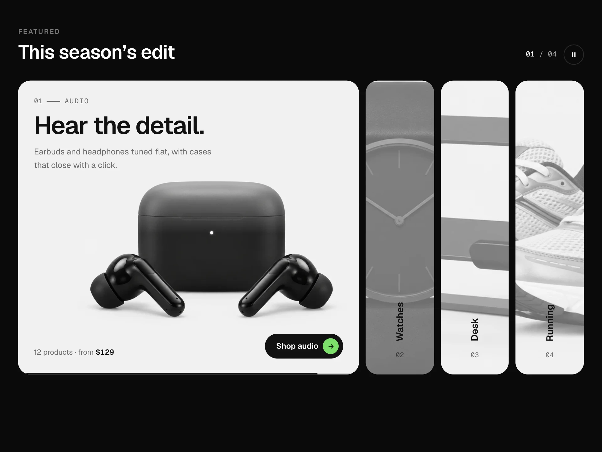
- Story tiles (a coloured card linking to a collection), quote tiles (a customer review) and note tiles (shipping or returns info). Give them a category to show them only under that filter; a note without one shows everywhere.
- How do I keep the product in view when the tile crops it?
- Each product takes focus, used as the photo's object-position, for example "40% 50%" to shift a pair of shoes into the tile.
- Is it accessible?
- Filters and density are radio groups, the product count is announced politely, hearts and add buttons have names that follow their state, the hover bar also appears on keyboard focus, and quotes use figure, blockquote and figcaption.