Tabbed Product List React component
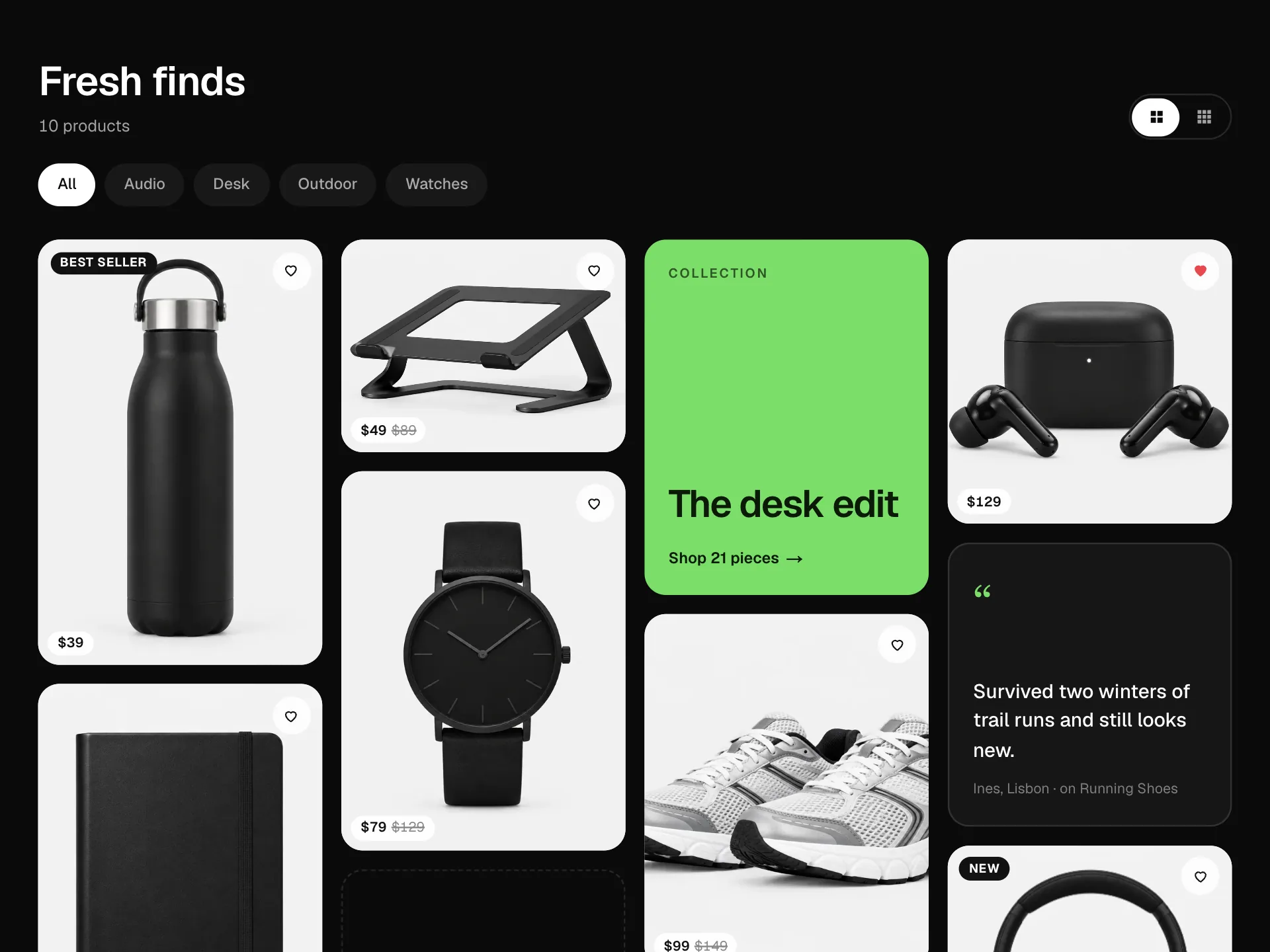
A product grid with Best sellers, New arrivals, On sale and Top rated tabs: each tab sorts the products its own way and shows its own badge and detail line, cards reshuffle into place when you switch, with a hover quick add bar, a wishlist heart and Show more.
About the Tabbed Product List component
Tabbed Product List is the 'shop the range' section of a store home page: one product grid with tabs for Best sellers, New arrivals, On sale and Top rated. Every tab sorts the same products differently and tells you why each one is there, with a rank, a New badge, the discount or the star rating.
Switch tabs and products that appear in both glide to their new place while the rest fade in. Hover a product for a quick add bar, save it to the wishlist with the heart, and use Show more to see the whole list.
When to use it
Use it on a store home page or a category landing page where you want to show several angles on the catalogue without four separate sections.
Pass real sales, review and date data so the tabs are honest; the New arrivals tab only shows products added in the last 30 days.
Installation
Add the Tabbed Product List component to your project with the shadcn CLI. It lands in components/tabbed-product-list.tsx as plain React + Tailwind CSS source you own and can edit.
npx shadcn@latest add @reactframe/tabbed-product-listOr copy the source by hand and install its dependencies:
npm install motion clsx tailwind-mergeProps
<TabbedProductList /> accepts 9 props, all optional.
| Prop | Type | Default |
|---|---|---|
| title | string | "Shop the range" |
| products | { id: string; name: string; price: number; was?: number; image: string; rating: number; reviews: number; sold: number; addedDays: number }[] | PRODUCTS |
| defaultTab | "best" | "new" | "sale" | "rated" | "best" |
| initial How many products show before "Show more". | number | 4 |
| currency | string | "$" |
| onAdd | (product: TabbedProduct) => void | — |
| onWishlist | (product: TabbedProduct, saved: boolean) => void | — |
| theme | "dark" | "light" | "dark" |
| className | string | — |
- titlestringDefault: "Shop the range"
- products{ id: string; name: string; price: number; was?: number; image: string; rating: number; reviews: number; sold: number; addedDays: number }[]Default: PRODUCTS
- defaultTab"best" | "new" | "sale" | "rated"Default: "best"
- initial
How many products show before "Show more".
numberDefault: 4 - currencystringDefault: "$"
- onAdd(product: TabbedProduct) => void
- onWishlist(product: TabbedProduct, saved: boolean) => void
- theme"dark" | "light"Default: "dark"
- classNamestring
Collections
Use-case pages that compare Tabbed Product List with the other components that do a similar job.
npm dependencies
Installed for you by the shadcn CLI.
Tabbed Product List FAQ
- How is each tab sorted?
- Best sellers by units sold, New arrivals by days since added (30 days or less), On sale by the biggest percentage off, and Top rated by rating and then number of reviews. You can change the rules in the TABS array.
- Why do some cards move instead of fading?
- The grid sits in a LayoutGroup and each card keeps its product id as the key, so a product that is in both tabs animates from its old spot to its new one.
- How does quick add work on phones?
- On screens without hover the quick add bar is always visible at the bottom of the photo. On desktop it slides up on hover and also when the card gets keyboard focus.
- Can I show more products at first?
- Set initial, for example initial={8}. The Show more button only appears when a tab has more products than that.
- Is it accessible?
- The tabs follow the tablist pattern with arrow keys and a roving tab stop, the grid is the tabpanel, the heart and quick add buttons have names that change with their state, Show more says whether it is expanded and a live region announces what is shown.