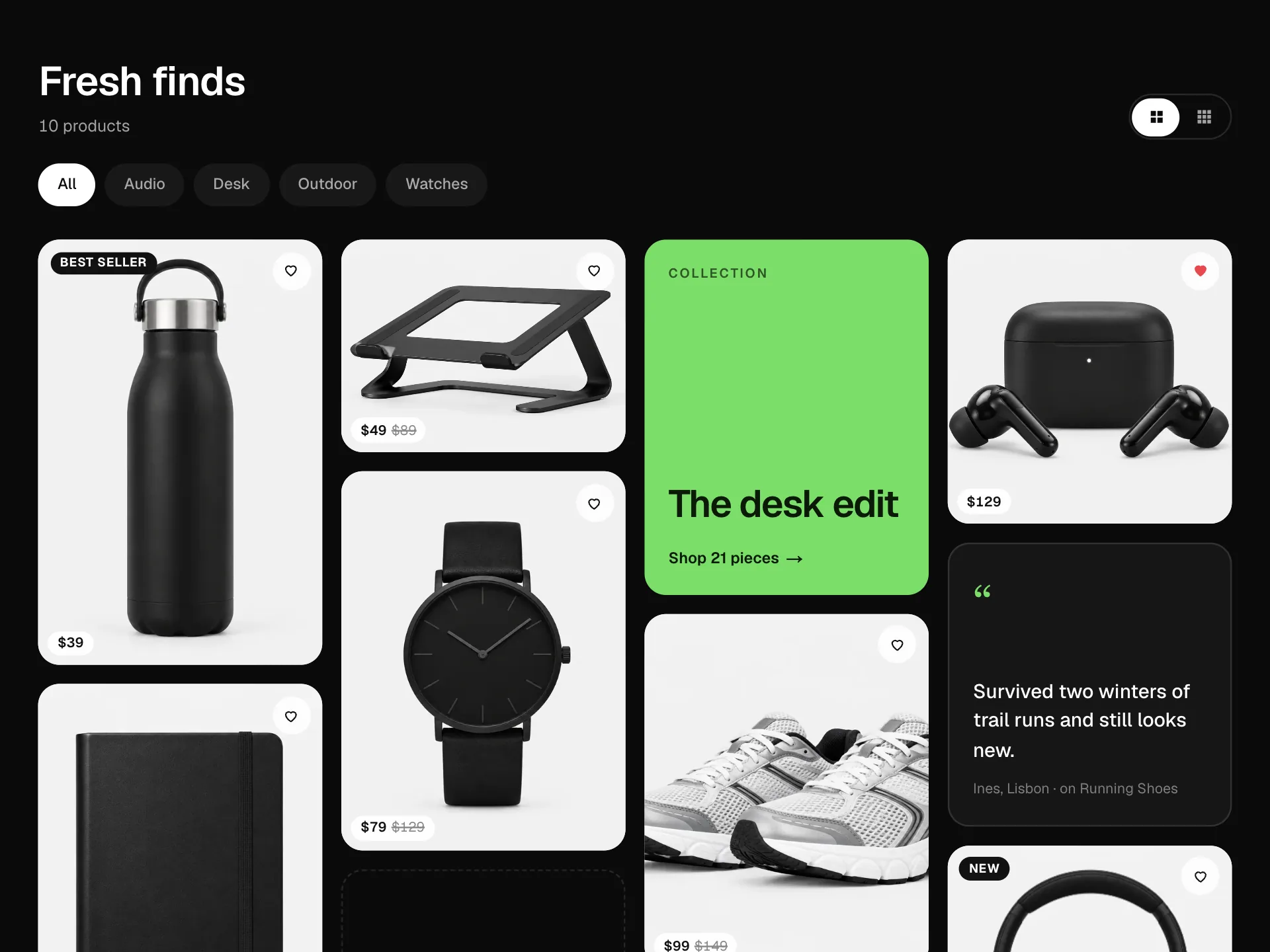
Featured Categories Banner React component
A banner of expanding category panels: the open one grows to show its photo, headline, tagline, product count and a Shop button while the others shrink to vertical labels, rotating on a timer with a progress line that pauses on hover; on phones it becomes a vertical accordion.
About the Featured Categories Banner component
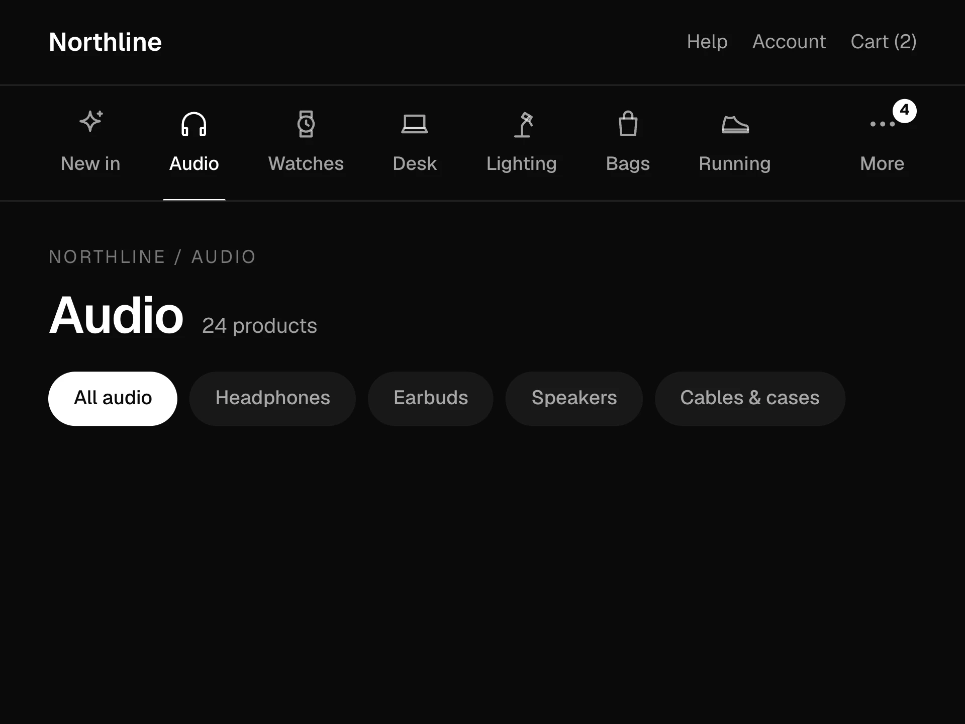
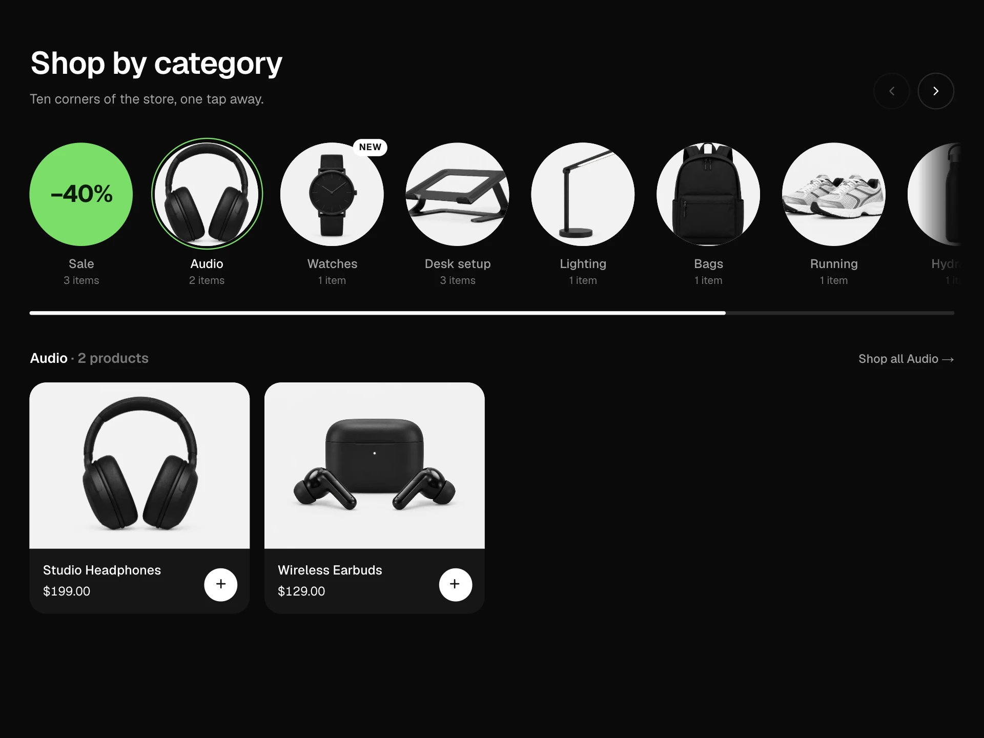
Featured Categories Banner puts three to five categories side by side as tall photo panels. One is open at a time: it widens to show the photo, a short headline, a line about what's inside, how many products there are and the starting price, with a Shop button. The others shrink to slim strips with their names written vertically.
It moves on to the next category on a timer, with a thin line showing how long is left, and stops while someone is hovering or using the keyboard inside it. Hover or tap any strip to open it. On phones the panels stack into an accordion that works the same way.
When to use it
Use it on a store home page under the main hero, or at the top of a seasonal landing page, to push a handful of categories you want people to notice.
Keep headlines to three or four words and pick photos with the product in the middle, since closed panels only show a slice of the image.
Installation
Add the Featured Categories Banner component to your project with the shadcn CLI. It lands in components/featured-categories-banner.tsx as plain React + Tailwind CSS source you own and can edit.
npx shadcn@latest add @reactframe/featured-categories-bannerOr copy the source by hand and install its dependencies:
npm install motion clsx tailwind-mergeProps
<FeaturedCategoriesBanner /> accepts 8 props, all optional.
| Prop | Type | Default |
|---|---|---|
| kicker | string | "Featured" |
| title | string | "This season’s edit" |
| panels | { id: string; name: string; headline: string; tagline: string; image: string; from: number; count: number; href?: string; focus?: string }[] | PANELS |
| interval Milliseconds per panel. Set to 0 to turn autoplay off. | number | 5000 |
| currency | string | "$" |
| onShop | (panel: FeaturedPanel) => void | — |
| theme | "dark" | "light" | "dark" |
| className | string | — |
- kickerstringDefault: "Featured"
- titlestringDefault: "This season’s edit"
- panels{ id: string; name: string; headline: string; tagline: string; image: string; from: number; count: number; href?: string; focus?: string }[]Default: PANELS
- interval
Milliseconds per panel. Set to 0 to turn autoplay off.
numberDefault: 5000 - currencystringDefault: "$"
- onShop(panel: FeaturedPanel) => void
- theme"dark" | "light"Default: "dark"
- classNamestring
Collections
Use-case pages that compare Featured Categories Banner with the other components that do a similar job.
npm dependencies
Installed for you by the shadcn CLI.
Featured Categories Banner FAQ
- How many panels work best?
- Three to five. With more, the closed strips get too narrow on laptops and the stacked version gets long on phones.
- Can I turn off the rotation?
- Set interval={0}. People can also pause it with the button in the header, and it never rotates for visitors who prefer reduced motion.
- How do I control what part of the photo shows?
- Each panel takes a focus value that is used as the photo's object-position, for example "60% 40%" to keep the product in view when the panel is narrow or short.
- Where does the Shop button go?
- To the panel's href. If you leave it out, the link does nothing and onShop is called instead, so you can route in your app.
- Is it accessible?
- Each strip is a heading with a button that says whether it is expanded, the open panel is a labelled region, the open panel is announced politely, rotation pauses on hover and focus, and there is a pause button.