Mini Cart Dropdown React component
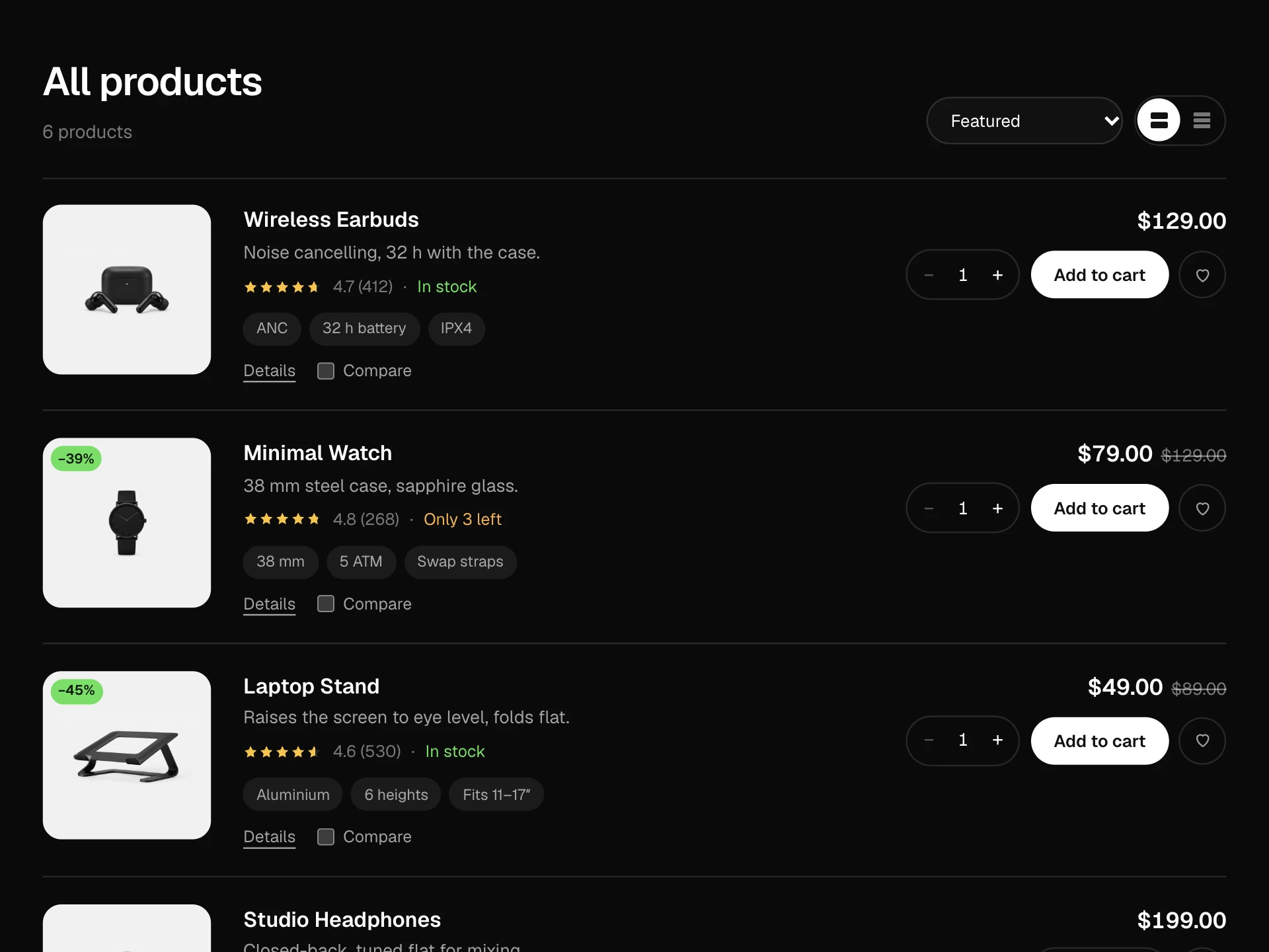
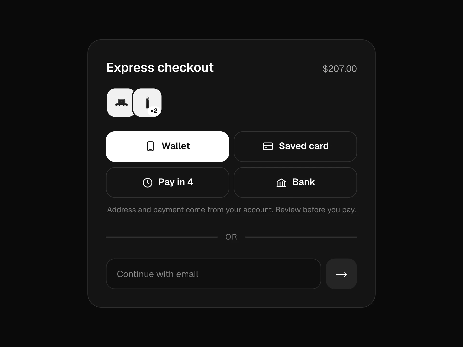
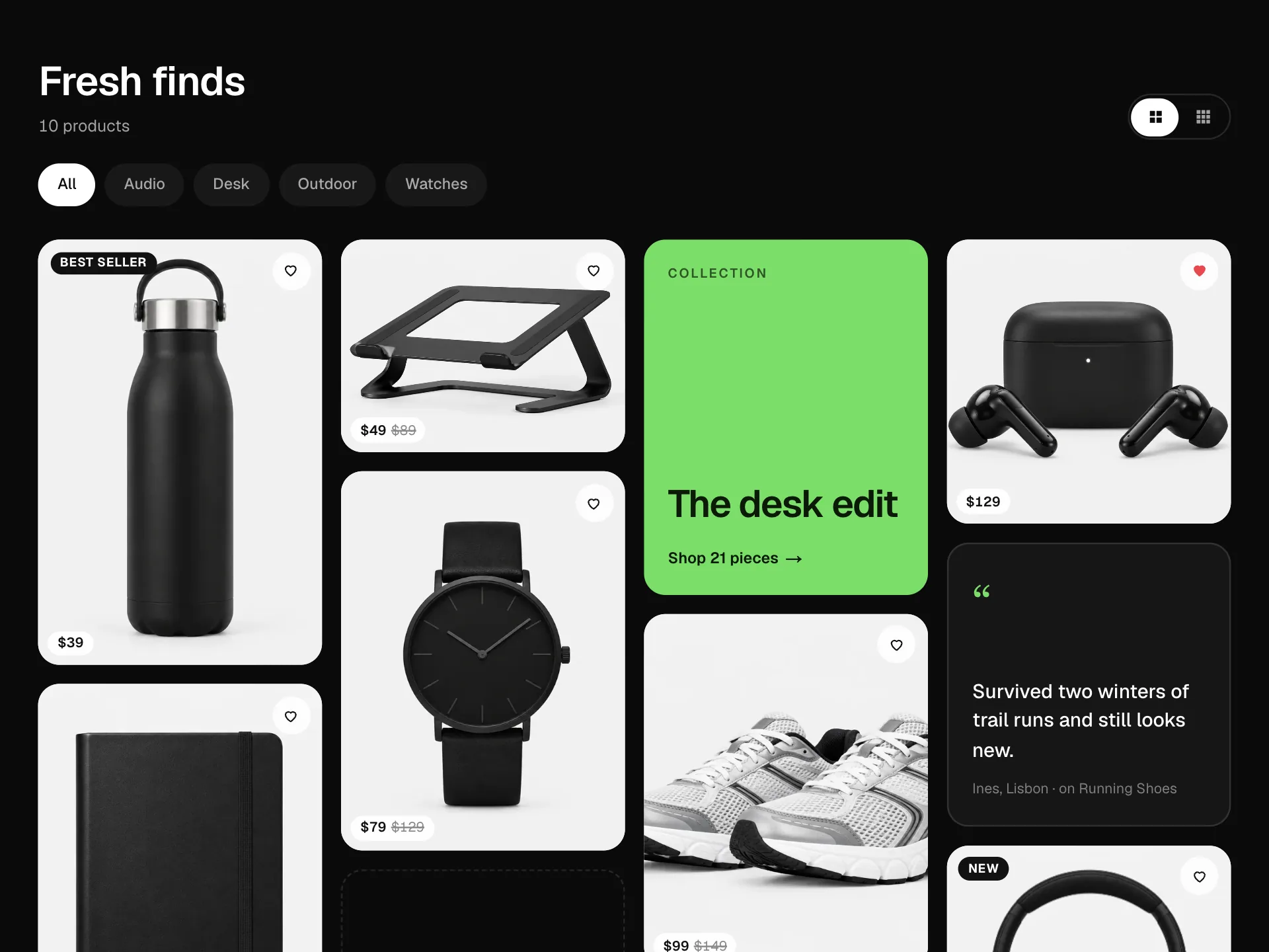
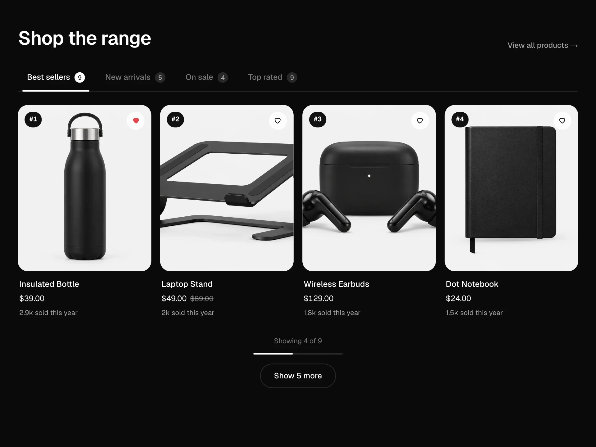
A store header with a cart icon that opens a dropdown cart: badge that bumps on add, free-shipping progress, line items with quantity steppers and remove with undo, subtotal, view cart and checkout; adding from the picks below opens it, highlights the new line and closes it again after a few seconds.
About the Mini Cart Dropdown component
Mini Cart Dropdown is the small cart that hangs from the bag icon in a store header. It lets shoppers check what's in their cart, change quantities and head to checkout without leaving the page they're on.
When something is added from the page, the badge bumps, the dropdown opens on its own, the new line glows for a moment and the cart closes again after a few seconds, so the add feels confirmed without trapping the shopper in a modal. A progress bar shows how far they are from free shipping.
When to use it
Use it in store headers where people add several things from listing pages and want a quick look before checkout. For carts with many lines or upsells, a side drawer gives more room.
Keep the auto-close: a cart that pops open and stays open after every add gets in the way; set autoCloseMs to 0 only where adds are rare and deliberate.
Installation
Add the Mini Cart Dropdown component to your project with the shadcn CLI. It lands in components/mini-cart-dropdown.tsx as plain React + Tailwind CSS source you own and can edit.
npx shadcn@latest add @reactframe/mini-cart-dropdownOr copy the source by hand and install its dependencies:
npm install motion clsx tailwind-mergeCollections
Use-case pages that compare Mini Cart Dropdown with the other components that do a similar job.
npm dependencies
Installed for you by the shadcn CLI.
Mini Cart Dropdown FAQ
- When does it close by itself?
- Only after an add from the page, after autoCloseMs (3.5 s by default). If the pointer is over the cart it waits until it leaves. Opening it with the cart button keeps it open until Escape, the close button or a click outside.
- How does remove work?
- At quantity 1 the minus button turns into a trash icon. Removing a line shows a small Removed · Undo row that puts it back in the same place.
- How do I connect it to a real cart?
- Pass your lines as items and listen to onChange, which receives the full list after every change. onViewCart and onCheckout are plain callbacks for navigation.
- Does the free-shipping bar have to show?
- No. Set freeShippingAt to 0 to hide it. Otherwise it shows how much is left in amber and turns green with a check once the subtotal reaches the threshold.
- Is it accessible?
- The cart button says how many items are inside and exposes aria-expanded, the panel is a labelled dialog, Escape closes it and returns focus to the button, quantity buttons are named per product and the free-shipping text is announced politely.